Cracking a Power BI Interview is a hard nut to crack due to the high competition. Interviewers are not limited to just concept-based Power BI interview questions. They also ask trending and scenrio based to check your practical skills in fields like data analytics and business intelligence.
Employers want to see how well you understand data modeling, visualization, and Power BI's core features. If you're preparing for a Power BI interview, it's essential to be ready for both conceptual and scenario-based questions. This guide will help you do that. It includes the best Power BI interview questions and answers you actually need to prepare with.
Let's begin!
Here are a few frequently asked Power BI interview questions and answers for beginners. Going through these will help you get your basic questions sorted out.
It is one of the best BI tools that facilitates companies in visualizing and sharing insights from their valuable data. It enables businesses to enhance their competitiveness and efficiency by aiding them in making informed and data-driven decisions.
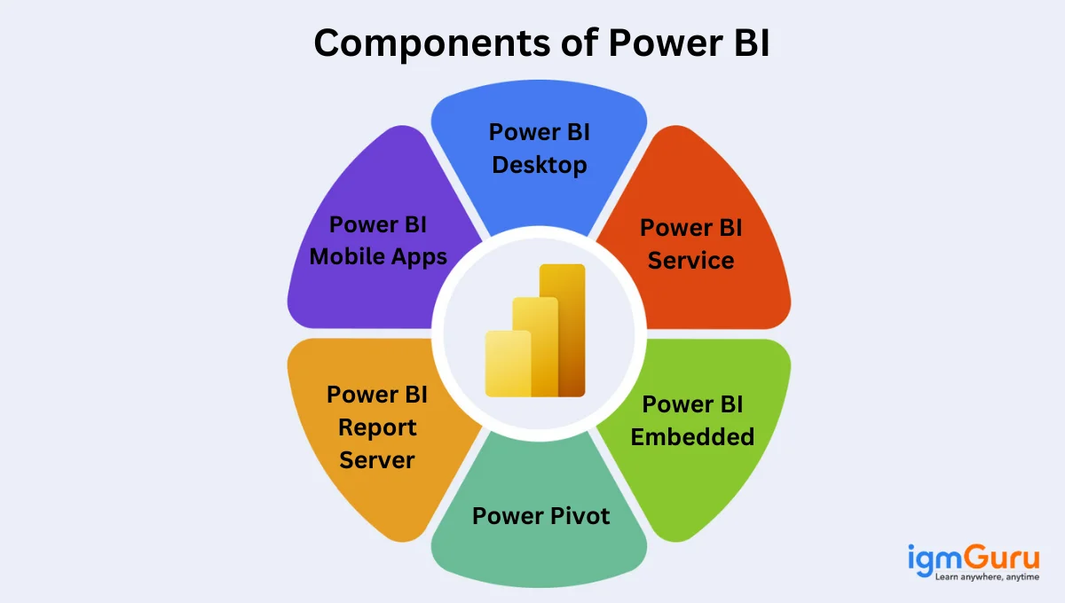
The major components of this BI tool are:
Various data sources supported by this BI tool include:
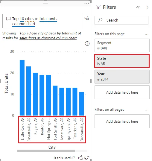
There are many different types of filters in Power BI reports namely,
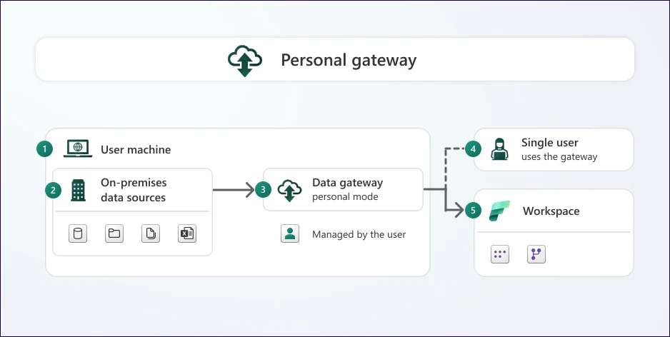
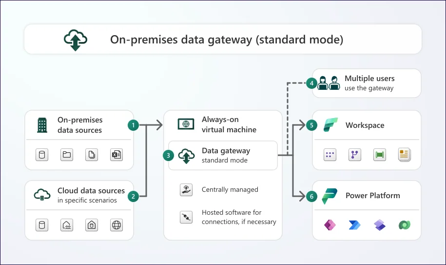
Data gateway is a service. It aids businesses in securely transferring data between Power BI Service and on-premises data sources. This service plays the role of a connector between these two. The data can be assessed from on-premises sources directly by Power BI, without exposing it to the internet.
There are two data gateways named - Personal Mode and Standard Mode (On-premises data gateway).
There are only two prerequisites for installing Power BI. First, a web browser is essential and second, a work or school email address (personal email domains like Gmail, Yahoo are not supported now).
The four types of cardinality in this BI tool are:
Ans. Power Query is an Excel integration developed by Microsoft. It helps to collect and transform data from different sources to make it ready for analysis. It is primarily ETL (Extract, Transform, Load) tool that simplifies data preparation for analysis and reporting.
Ans. The following are some of the common advantages of this platform -
Explore Top Power BI Benefits and Advantages in this article.
Before we move on to Power BI interview questions for experienced professionals, let's take a look at some for the intermediate level.
There are three distinct views in Power BI Desktop. Each of these serves a unique purpose.
Advanced Editor facilitates us to view the code that has been created with Power Query Editor at every step of the editing process. Hence, at any point during the entire editing process, we can click on Advanced Editor to see the updated code. It runs on the Power Query Formula language, also called 'M'.
A dashboard in Power BI refers to a single page that often states a story using visualizations. Often also referred to as a canvas, it is a well-defined representation that only depicts the highlights. For in-depth reports, additional related reports can be viewed.
This BI tool facilitates users in tracking, reporting, and analyzing KPIs and other metrics. It is a collection of graphs, maps, and charts to ensure stakeholders comprehend, collaborate, and share information.
There are plenty of options available in this BI tool to refresh data. However, the most often used ones are:
It runs on four key steps. These are:
General formatting should be applied to data for the following reasons:
The M query language is used in the Query Editor. It aids in preparing the data prior to being loaded into the Power BI model. Power Query's key function is to merge data from different supported sources, which are then expressed by using Power Query M Formula Language.
Here is the key difference between them-
| Calculated Tables | Calculated Columns | Measures |
| It uses DAX formulas to define values. | It uses DAX to create new columns derived from existing data. | I use DAX functions to perform complicated calculations. |
| Both data and reports are used to create. | It uses DAX formulas to query values in additional columns. | Both data and reports are used to create. |
| It is best for storing intermediate calculations and user-requested data in the model. | It can be useful when datasets do not include structured data. | It is best for sales forecasting and sales comparison by highlighting running totals. |
Related Article- How to Become a Power BI Developer?
Are you an experienced professional who is looking for a job change? Well, this is the list of the top Power BI interview questions for experienced professionals. Let's get started!
Query folding in Power Query is a process wherein certain set steps are translated into SQL. These are then executed by the source database, and not by the client machine.
This process is important because it ensures scalability and optimizes performance in data processing.
Power Pivot is an in-memory data modeling technology used in Excel and Power BI. It allows users to create relationships, build calculated columns and measures using DAX, and handle millions of rows efficiently.
In modern Power BI architecture, many Power Pivot concepts are integrated directly into semantic models and tabular modeling.
CORR() functions or correlation functions are used to find the relationship shared by any two given attributes or values. There are numerous correlation functions, of which, the Pearson correlation is the most widely used and popular.
Correlation can be positive or negative. Positive correlation implies that the values that are being compared increase simultaneously. Alternatively, a negative correlation implies that one value will decrease and one will increase.
Note: Power BI does not have a built-in CORR function, correlation is calculated using custom DAX or via statistical tools like Python or R integration
The schedule refresh feature automates the updating process of a database at specific intervals. This ensures that all reports and dashboards within the platform always show the current data without any human intervention.
This platform connects with the data stores using credentials and login information stored in a semantic model. Then, it query for the new or any changes in data and update them to a semantic model. These changes are also reflected in the visualizations.
This platform is available in three types of formats including -
The advanced editor is a component that lets developers see the program created in Power Query with each step. It also lets them create their own programs in M language. This provides granular control and enables complicated data manipulation. They can access it by opening Power Query Editor > clicking on the View tab > and selecting the Advanced Editor.
Custom visuals are third-party or developer-generated visualizations that extend the capabilities of this BI tool. These are available in the form of .pbiviz files and can be used in reports.
Custom visuals allow developers to create more unique and impressive data representations, way better than standard chart types. These can range from simple bar charts to more complex gauges, maps and advanced charts or even HTML embedding and support for other data visualization languages.
Power Maps is an older Excel-based 3D visualization feature and is no longer relevant in modern Power BI implementations. Today, Power BI uses map visuals such as:
Related Article- Power BI Tutorial
Let's now jump to the Power BI DAX interview questions and answers. These are very important for individuals seeking a career in business intelligence and data analysis.
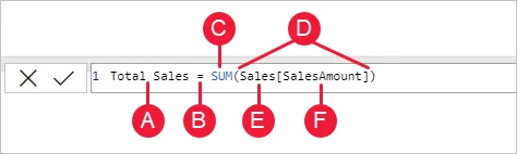
DAX, which is an abbreviation for Data Analysis Expression, is a library of formulas that are employed for data analysis and calculations. It consists of operators, constants, and functions for performing calculations and driving out results. With DAX, data sets can be used to their optimum potential and churn out insightful reports.
There are three fundamental concepts of DAX. These are:
Most common DAX functions on this platform are the following -
| Category | Subtype | Examples | Description |
| Aggregation Functions | Basic Aggregations | SUM(), AVERAGE(), MIN(), MAX(), COUNT() and COUNTROWS(). | Calculate aggregate values across columns or tables. |
| Aggregation Functions | Iterator Functions | SUMX(), AVERAGEX(), MINX(), MAXX() and COUNTX(). | Perform calculations row by row, then aggregate the results. |
| Date and Time Functions | Date Creation and Extraction | DATE(), YEAR(), MONTH(), DAY() and WEEKDAY(). | Create date values and extract date components. |
| Date and Time Functions | Date Calculations | DATEDIFF(), DATEADD() and EDATE(). | Calculate differences between dates and manipulate date values. |
| Time Intelligence Functions | Time Period Totals | TOTALYTD(), TOTALQTD() and TOTALMTD(). | Calculate totals for year-to-date, quarter-to-date and month-to-date periods. |
| Time Intelligence Functions | Date Range Shifting | SAMEPERIODLASTYEAR() and DATEADD(). | Shift date ranges to previous periods for comparisons. |
| Logical Functions | Conditional Logic | IF(), SWITCH() and IFERROR(). | Perform conditional operations and handle errors. |
| Logical Functions | Logical Operators | AND(), OR() and NOT(). | Combine and negate logical conditions. |
| Filter Functions | Context Modification | CALCULATE() and CALCULATETABLE(). | Modify the filter context of calculations. |
| Filter Functions | Table Filtering | FILTER(), ALL() and ALLEXCEPT(). | Filter and manipulate tables based on conditions. |
| Filter Functions | Relationship Filtering | RELATED() and RELATEDTABLE(). | Returns values from related tables. |
| Information Functions | Data Type Checking | ISBLANK(), ISNUMBER() and ISTEXT() | Check the data type of values. |
| Information Functions | Context Checking | ISFILTERED() and ISINSCOPE(). | Checks filtering contexts. |
| Text Functions | String Manipulation | LEFT(), RIGHT(), MID(), CONCATENATE(), SEARCH() and FIND(). | Manipulate text strings. |
| Mathematical Functions | Basic math functions | DIVIDE(), SQRT() and ABS(). | Do standard mathematical calculations. |
| Statistical Functions | Standard deviations and variance | STDEV.P() and VAR.P() | Returns statistical results. |
DAX is much more than just a feature of this platform. It is a functional language that can perform complicated calculations, create custom measures, analyze data, do column calculations and many more. It ultimately provides more flexible and deeper reporting. The benefits of using this function are the following -
DAX functions perform specific calculations or operations, expressions combine functions, operators and values to return a result and variables store the result of an expression for later reuse.
Circular dependencies are a result of improper use of the CALCULATE function. This makes it difficult to choose an expression when two of them are referencing each other.
Both of these functions are used to remove filters from a dataset but differ in their use. The ALL function removes filters from specific columns or tables, while the REMOVEFILTERS clears all filters from a particular table. ALL is used in calculations like percentage of totals whereas REMOVEFILTERS is used to remove filters dynamically.
Ans. Both measures and calculated columns use DAX expressions to perform applications. However, measures perform data aggregation and return an output value according to the filters applied on the report. Calculated columns, on the other hand, return the output of a DAX expression for each row from the table. This result then is shown like any other column in the model and data views.
Related Article- Power BI Roadmap for Beginners
Technical Power BI interview questions are usually posed to those with some working experience with the tool. Hence, if you are not a complete fresher, then be prepared to be asked such questions.
The Custom Visual SDK can be used to create custom visuals in this BI tool. It is based on D3.js and JavaScript. The steps to make it happen are:
A star schema refers to a multi-dimensional data model that is employed by enterprises to organize their data in a database. The purpose is to make this data easily understandable and analysis-ready. It is simpler to maintain, understand, and design. It provides swift integration with data cubes and OLAP systems.
Cardinality refers to the number or relationship of distinct values shared among two tables in a data model. It gives a clear picture of what the rows of one table have to do with the rows of another table, on the basis of specified column(s).
Many-to-many cardinality in a relationship can certainly lead to issues when different levels of granularity are present in the data. This can lead to duplications in the datasets that have returned, causing incorrect results.
Row-level security, also called RLS, is a powerful feature that facilitates restricting all data access for certain users as per their attributes or roles. DAX expressions are designed to implement RLS. These filter the data model as per the user's context so that the user is only able to see what they have been authorized to see.
A donut chart in this BI tool has a hold in the middle, giving it a ring-like structure and appearance. A pie chart, on the contrary, is a complete circle wherein the data is displayed in segments.
Both charts are used to showcase the proportions of different categories of a complete whole. However, a donut chart is able to display more info in the center.
Data profiling refers to the examination and analysis of data. The purpose is to understand the quality, distribution, and structure of data. It can be performed via Power Query, which offers different profiling features. These features include data type detection, error highlighting, and column statistics, among others.
It is important to identify inconsistencies, outliers, and data quality issues. If unidentified, these can lead to negative effects on the reliability and accuracy of reporting and analysis.
Related Article- 12 Best Power BI Dashboard Examples
As a developer, you must already know how important it is to give your one hundred percent in an interview, because of the high competition. Here is a list of a few top Power BI developer interview questions to revise before going for your interview.
There are three major connectivity modes that you should know about in this BI tool:
A. Direct Query: With a direct query, a direct connection is made with the Power BI model. Since it stores only the metadata of the data tables, the data does not get stored there. Popular DirectQuery-supported sources include:
B. Live Connection: This mode is quite similar to direct query in the sense that no data is stored with it in Power BI either. However, the difference is that there is a direct connection between the live connection and the analysis services model. The supported data sources are -
C. Import Data: With this method, the data can be uploaded into this BI tool, which consumes the Power BI desktop space. When uploaded on the website, the Power BI cloud machine space is consumed. It is the fastest method but the uploaded file size cannot exceed 1GB with the free version.
With Microsoft Fabric and Power BI Premium capacities, semantic models can scale far beyond traditional limits depending on SKU, storage mode, and Large Semantic Model settings.
It has two key sources for data storage -
In this BI tool, filters are used for sorting data on the basis of the condition applied. It enables us to select a specific field(s) and further extract information at a report/ visualization/ page level. There are three types of filters namely,
Row-level security can be used to hide confidential data. This helps in restricting the data on the basis of the roles curated as per the profile or group of people.
Power View was a legacy Microsoft data visualization tool used in Excel and SharePoint. It has been deprecated and replaced by modern Power BI visuals, paginated reports, and interactive dashboards.
Time series analysis aids developers in analyzing the data patterns to find trends, seasonality, and cyclicity over a period of time. It is helpful for businesses as it facilitates them in making informed business decisions.
Key differences between Power BI vs. Tableau includes -
| Feature | Power BI | Tableau |
| AI & Copilot Features | Deep integration with Microsoft Copilot and Fabric AI capabilities. | Uses Tableau Pulse and Einstein AI integrations. |
| Data Visualization | Good, easy-to-use visuals, works well with Microsoft. | Very strong with lots of options for detailed visuals. |
| Ease of Use | Easier to learn, especially with Excel knowledge. | Powerful, but takes longer to learn all the features. |
| Data Connectivity | Works well with Microsoft data. Good with other data too. | Works with almost any data. Strong for live data. |
| Pricing | Cheaper and a free version available. Good for smaller companies. | More expensive and better for big companies with complex needs. |
| Integration | Easy if using Microsoft Teams and SharePoint. | Good for sharing, but might need extra tools for teamwork. |
| Target Audience | Companies using Microsoft products, smaller businesses. | Big companies working with detailed data visuals and complex data analysis. |
| Programming Languages | DAX, R, Python | R, Python, C++, C |
Microsoft Fabric is an end-to-end data platform introduced by Microsoft that connects various domains into a single SaaS environment. These domains include data engineering, data integration, data warehousing, data science and real-time analytics. Power BI is a core component of Microsoft Fabric and serves as the presentation and visualization layer.
Integration benefits include:
Power BI developers should now be familiar with Fabric concepts like Lakehouse, Direct Lake and OneLake to build scalable analytics solutions.
Read Also- Microsoft Fabric vs Power BI: Which One Should You Choose?
Deployment Pipelines in Power BI are a built-in feature that enable DevOps-style CI/CD workflows for Power BI content (like datasets, reports, dashboards). A typical pipeline includes three stages, including Development, Test and Production.
Key benefits and usage:
To become a proficient expert in this platform you need to have problem-solving skills too. Here are some of the most frequently asked Power BI scenario-based interview questions and answers to help you.
I will clean and transform the entire data from both files using Power Query. In this process, various changes might apply like renaming columns, merging appending tables and standardizing data types. I will also implement some conditional and transformation logic to data to remove differences between their structures. It will create a unified dataset for further use.
I would implement two practices while creating this type of report. The first is to use the Row-Level Security (RLS) to restrict data access. It will only allow some special individuals to access that report. Then second is to implement data governance policies and configure workspace permission. This will only allow some authorized individuals to view and modify the report.
I would use the following three strategies in this case -
B. Create a Calculated Column for RFM Segment – I would then create a calculated column in the customer table using the SWITCH or IF functions in DAX. This column would evaluate each customer's RFM scores against the defined ranges and assign them to the appropriate segment. For example-
Customer[RFM Segment] = SWITCH( TRUE(), Customer[Recency Score] >= PlatinumRecencyThreshold && Customer[Frequency Score] >= PlatinumFrequencyThreshold && Customer[Monetary Score] >= PlatinumMonetaryThreshold, "Platinum", Customer[Recency Score] >= GoldRecencyThreshold && Customer[Frequency Score] >= GoldFrequencyThreshold && Customer[Monetary Score] >= GoldMonetaryThreshold, "Gold", "Silver" ) |
C. Dynamic Segmentation via Parameters - For more dynamic segmentation, I'd create parameters to let users adjust the RFM score thresholds. This allows for on-the-fly changes to segment definitions.
D. Visualizations - I would then use the RFM Segment column in visuals (e.g., slicers, charts) to analyze customer behavior and performance across different segments.
Handling circular references and missing manager information requires a systematic approach in Power Query and DAX. This approach involves the following steps -
A) Identify Circular References (Power Query) -
B) Handle Missing Manager Information (Power Query) -
- Assign them to a "Top Level" or "Unknown" category.
- Attempt to infer the manager based on other data.
- Exclude them from the hierarchy visualization if necessary.
- I would document the missing manager records for data improvement.
C) DAX for Hierarchical Path Creation -
When using DAX functions like PATH, I would use IFERROR to handle cases where the path cannot be created due to missing or circular references.
I would create measures to check for the presence of circular references or missing managers and display appropriate messages in the report.
D) Visualizations -
I would use tree or hierarchy visuals that can handle incomplete hierarchies gracefully.
I would include clear labels and messages to indicate the presence of missing or problematic data.
I would use DAX to calculate the rolling average as given below -
Conversion Rate = DIVIDE( SUM(Conversions[Number of Conversions]), SUM(Visits[Number of Visits]), 0 ) Calculate the Rolling Average: Then, I would create a measure to calculate the |
7-day rolling average -
7-Day Rolling Average Conversion Rate = AVERAGEX( DATESINPERIOD( 'Date'[Date], MAX('Date'[Date]), -6, DAY ), [Conversion Rate] ) |
I would calculate MoM and display it alongside YoY growth using DAX and appropriate visuals. This involves -
A. Calculate MoM Growth
MoM Growth = DIVIDE( [Total Sales] - CALCULATE([Total Sales], DATEADD('Date'[Date], -1, MONTH)), CALCULATE([Total Sales], DATEADD('Date'[Date], -1, MONTH)), 0 ) |
B. Calculate YoY Growth
YoY Growth = DIVIDE( [Total Sales] - CALCULATE([Total Sales], DATEADD('Date'[Date], -1, YEAR)), CALCULATE([Total Sales], DATEADD('Date'[Date], -1, YEAR)), 0 ) |
C. Display in the Same Visual
To optimize performance, I'd start by reviewing relationships and removing any unnecessary or inactive ones. I'd avoid many-to-many and bi-directional relationships unless absolutely needed. Then, I'd consider flattening some tables or using star schema instead of a snowflake. I'd also optimize DAX calculations and reduce column cardinality where possible. Finally, I'd validate improvements using Performance Analyzer in Power BI.
Direct Lake is a new data connectivity mode introduced with Microsoft Fabric. It allows Power BI to read data directly from OneLake without importing or querying a SQL engine.
Key differences:
This mode is optimized for large-scale analytics and supports real-time performance without a semantic model refresh.
Semantic Model Scale-Out allows a Power BI semantic model to distribute queries across multiple backends. This improves performance for high-concurrency environments.
Auto-Partitioning automatically splits large tables into partitions to improve refresh performance and reduce memory pressure. This is especially useful for models with incremental refresh.
Both features are part of Power BI Premium and Fabric that help developers build scalable and high-performing data models.
Also Read: What is Power Apps
To prove your credibility in today’s competitive world, you also need to prepare for the most commonly asked Power BI interview questions on newly introduced features. Here are some of them:
Incremental refresh in Power BI helps you refresh only the new or changed data instead of the entire dataset. It saves time, reduces load on data sources, and improves performance, especially with large tables.
It is configured by defining RangeStart and RangeEnd parameters in Power Query, filtering your table with these parameters, then enabling Incremental Refresh in Model view under table settings. Power BI will partition the data automatically.
Deployment pipelines in Power BI help manage report promotion between environments like Development → Test → Production. They bring CI/CD principles to Power BI, making version control and content lifecycle management easier.
You create a pipeline in Power BI Service, assign workspaces to each stage, and then promote content (datasets, reports, dashboards) through the stages after validation. Each promotion keeps metadata and connection details consistent.
Composite models allow you to combine Import and DirectQuery storage modes in a single dataset. This gives you flexibility — you can store frequently used data locally (Import) for speed and connect live (DirectQuery) to external systems for freshness.
They are ideal when you need both performance and real-time data access. You can also use Aggregations to pre-calculate summaries and improve DirectQuery performance.
Row-Level Security, as the name suggests, restricts data access at the row level for different users. It ensures users only see data relevant to them — for example, a regional manager sees data for their own region.
You define RLS roles using DAX filters like:
To improve performance, start by identifying bottlenecks- whether in the data model, DAX queries, visuals, or refresh. Here are key optimization areas:
Get Data is the functionality used for connecting to and importing data from different sources. It is a crucial feature for bringing data into the Power BI environment for analysis and reporting. The Get Data feature provides a central location to select from a wide array of supported data sources, including files, databases, cloud services and online services.
OneLake is the unified data lake in Microsoft Fabric. It acts as a centralized storage layer where all Fabric workloads store and access data using open formats like Delta Parquet.
Power BI can directly connect to OneLake using Direct Lake mode, reducing data duplication and improving analytics performance.
Direct Lake is a storage mode introduced with Microsoft Fabric that allows Power BI to query data directly from OneLake without importing the data or sending queries to external engines.
It combines the performance benefits of Import mode with the freshness advantages of DirectQuery.
A semantic model is the modern term for a Power BI dataset. It contains tables, relationships, measures, hierarchies, calculations, and security rules used for reporting and analytics.
Copilot in Power BI is an AI-powered assistant that helps users generate reports, create DAX measures, summarize insights, and build visuals using natural language prompts.
It improves productivity and enables faster self-service analytics.
Dataflow Gen2 is the next generation of Power Query-based data ingestion available in Microsoft Fabric. Unlike the traditional Power BI Dataflow, it is built on Fabric's unified architecture and stores processed data directly in OneLake. This improves scalability, enables better performance, and allows the transformed data to be reused across Lakehouses, Warehouses, Power BI semantic models, and other Fabric workloads.
Enterprise governance starts with organizing workspaces properly, implementing Row-Level Security (RLS), and assigning permissions based on business roles. I would also use Microsoft Purview and the built-in lineage view in Microsoft Fabric to track how data flows from source systems to reports and dashboards.
This approach makes it easier to audit reports, identify dependencies, maintain compliance, and understand the impact of any changes before deploying them into production.
I would build certified semantic models containing validated tables, relationships, and DAX measures. Business users would then connect to these shared semantic models instead of importing raw data into their own reports.
This self-service BI approach maintains a single version of the truth while still allowing users to build dashboards independently. It reduces duplicate datasets, improves governance, and ensures reporting consistency across the organization.
I would begin by analyzing the dataset size, model relationships, and refresh history to identify the bottleneck. Then, I would remove unused columns, reduce high-cardinality fields, optimize DAX measures, enable incremental refresh, and verify that query folding is occurring in Power Query.
I would also review visuals, background queries, and storage modes before validating the improvements with Performance Analyzer. This systematic approach significantly improves refresh speed and overall report performance.
Dynamic Row-Level Security (Dynamic RLS) automatically filters data based on the identity of the logged-in user instead of creating separate roles for every employee.
It is commonly implemented using the USERPRINCIPALNAME() or USERNAME() DAX functions along with a user mapping table. This approach is ideal for organizations with hundreds or thousands of users because security is managed centrally and scales much better than static RLS.
I would begin by checking the dataset refresh history, gateway performance, and workspace capacity utilization. Next, I would analyze query performance using Performance Analyzer and DAX Studio to identify slow visuals or inefficient DAX calculations.
I would also verify whether the issue is caused by DirectQuery latency, gateway bottlenecks, network delays, or Premium capacity limitations. Finally, I would optimize the data model, reduce unnecessary visuals, and monitor performance after deployment.
Calculation Groups are a feature of Analysis Services and Power BI semantic models that reduce the number of repetitive DAX measures. Instead of creating separate measures for Year-to-Date (YTD), Month-to-Date (MTD), Quarter-to-Date (QTD), Previous Year, and Growth calculations, a single calculation group can apply different calculation logic dynamically.
They simplify model maintenance, reduce duplicate code, improve consistency, and make enterprise Power BI models much easier to manage.
I would use Deployment Pipelines to move reports, semantic models, dashboards, and dataflows through Development, Test, and Production environments.
Before deployment, I would validate data sources, parameters, Row-Level Security (RLS), and refresh schedules. After deployment, I would perform user acceptance testing, verify report accuracy, and monitor refresh history and performance to ensure the production environment is functioning correctly.
If the dataset becomes too large, I would first remove unnecessary columns and reduce data granularity wherever possible. Then I would enable Incremental Refresh so that only new or modified data is refreshed.
If the dataset continues to grow, I would consider using DirectQuery, Composite Models, or Direct Lake mode with Microsoft Fabric. I would also optimize the data model using a star schema, aggregation tables, and proper partitioning to improve scalability and performance.
Real-Time Intelligence in Microsoft Fabric is designed to help organizations ingest, process, analyze, and visualize continuously changing data. It is useful for scenarios such as monitoring IoT devices, application logs, website activity, financial transactions, and operational events where users need insights with minimal delay.
Power BI can be used to visualize real-time data and create dashboards that help users monitor important events and business metrics. In an enterprise environment, I would combine Real-Time Intelligence with Fabric components such as Eventstreams, Eventhouses, and KQL-based analysis to build a complete real-time analytics solution.
This approach is particularly useful when traditional scheduled or incremental refreshes are not fast enough for the business requirement.
There are plenty of Power BI interview questions and answers to explore, depending on your level of experience and expertise. This blog is an amalgamation of some of the key interview questions for Power BI to help you get into any organization that you have aimed for.
Yes, but you should start with the basic interview questions for freshers given above.
To prepare for a Power BI interview, start by understanding its basics, key terms, and concepts. Gain hands-on experience with BI tools, focusing on data modeling and visualization. Explore advanced topics like Power Query, data sources, publishing, sharing, and security. Practice by building reports and dashboards using sample datasets. Finally, prepare for interviews by reviewing common Power BI questions and conducting mock interviews.
You can obtain the Microsoft Power BI Data Analyst Associate (PL-300) certification to improve your chances of securing a job.