Microsoft Power BI is a popular business intelligence and data visualization tool developed by Microsoft Corporation. It allows users to analyze data, create interactive reports, and build dashboards to help organizations make better decisions. Power BI is widely used by businesses to convert raw data into meaningful insights using charts, graphs, and visual reports. In this Power BI Tutorial, you'll learn how to:
Power BI is a business analytics platform that allows users to connect, organize, analyze, and visualize data from multiple sources. It helps businesses track performance, identify trends, and generate reports in a simple and interactive way. Power BI supports data sources like Excel, SQL databases, cloud services, and online platforms.
Before you get started, you must have the following things to make learning effortless.
Power BI allows people turn raw data into meaningful/actionable insights- without needing to be a data scientist or programmer. Here are key things people use Power BI for:
Power BI is one of the most in-demand skills today. And, learning Power BI can help you build a career as a Data Analyst, Business Analyst, or Power BI Developer because companies across industries like healthcare, finance, retail, and IT actively look for skilled Power BI professionals.
It also integrates easily with Microsoft tools like Excel, SQL Server, Azure, and SharePoint, making it easier for beginners to learn. Power BI improves data analysis and reporting skills, offers AI-powered features for faster insights, and provides excellent career growth opportunities in the modern data-driven industry.
Power BI is one of the leading business intelligence tools and competes strongly with popular BI tools like Tableau and Qlik Sense. Below is a detailed comparison of Power BI with other BI tools based on features, usability, pricing, integration, and performance.
Power BI isn't just a single tool; it's actually a collection of powerful components that work together to help you collect, clean, visualize, and understand your data.
Let's break down each one in plain language.
Before you can analyze anything, your data needs to be in good shape or organized. That's exactly what Power Query does. Think of it as your data preparation kitchen- it lets you pull in data from multiple sources like MySQL, SQL Server, DB2, Excel, and more, then clean and reshape it before it ever hits your dashboard.
Got duplicate rows? Messy column names? Blank fields? Power Query handles all of that, so your reports are built on solid ground.
Numbers alone don't tell a story- visuals do. Power View is the data visualization layer of Power BI, where you design interactive reports in various formats such as charts, graphs, tables, and maps. It helps you present complex data in a way that even non-technical stakeholders can instantly understand.
Instead of sharing a spreadsheet full of figures, you share a visual story that people can actually engage with.
Some data only makes sense when you see it on a map. Power Map is a 3D geospatial visualization tool that plots your data across real-world geography. Want to see which regions are driving the most sales? Or how population density affects your customer base? Power Map makes that possible- visually and intuitively.
It's especially useful for businesses that operate across multiple cities, regions, or countries.
When your data lives in multiple tables and you need them to talk to each other, Power Pivot steps in. It's a data modeling engine that lets you create relationships between different datasets- similar to how a database works, but without needing deep technical knowledge.
It also supports DAX (Data Analysis Expressions)- a formula language that lets you create complex calculations, custom measures, and business logic that go far beyond basic Excel formulas.
This is one of the most user-friendly features in Power BI. Instead of building a chart or writing a formula, you simply type a question in plain English- and Power Q&A gives you an instant visual answer.
For example, type "What were total sales in March by region?" and it will generate a chart on the spot. It's perfect for non-technical users who need quick answers from large datasets without depending on analysts.
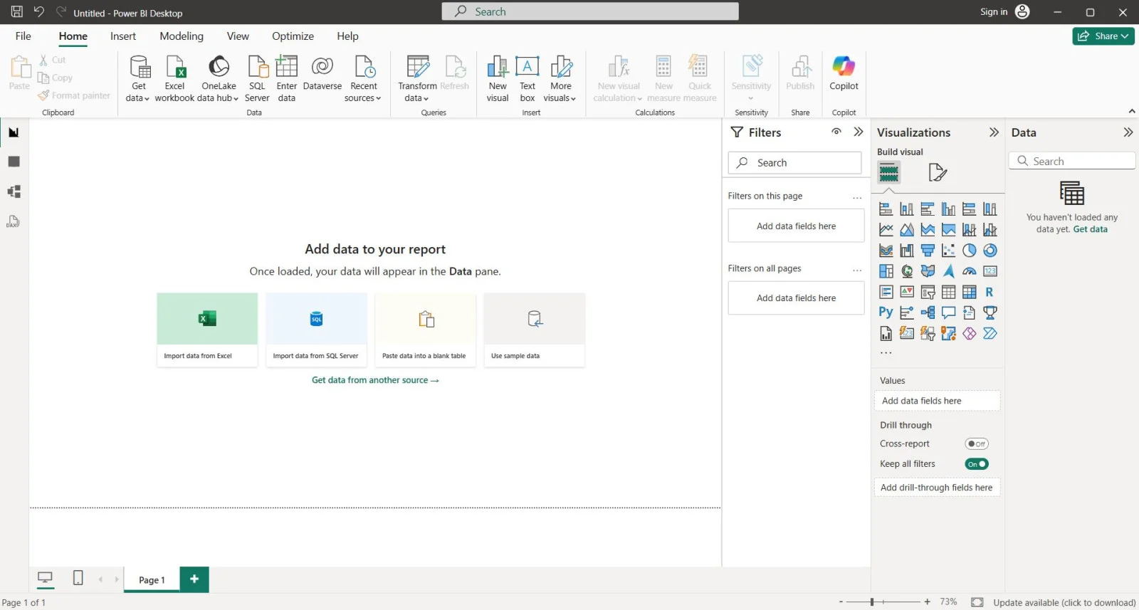
Power BI Desktop is a Windows application where you design and build your reports, dashboards, and data models from scratch. It's the core workspace where everything comes together- from connecting data sources to creating stunning visuals before publishing them to the web.
You can install Power BI Desktop using three methods: Microsoft Store (Recommended), standard installer, or the command line (using Command Prompt).
It can connect to a wide range of data sources, including files, databases, online services and more. You just have to choose the sources available under the Get Data menu.
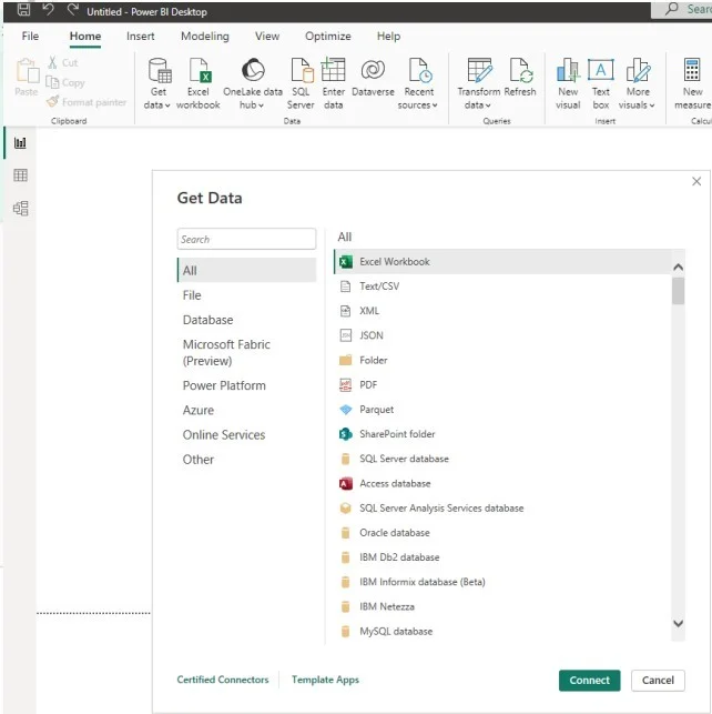
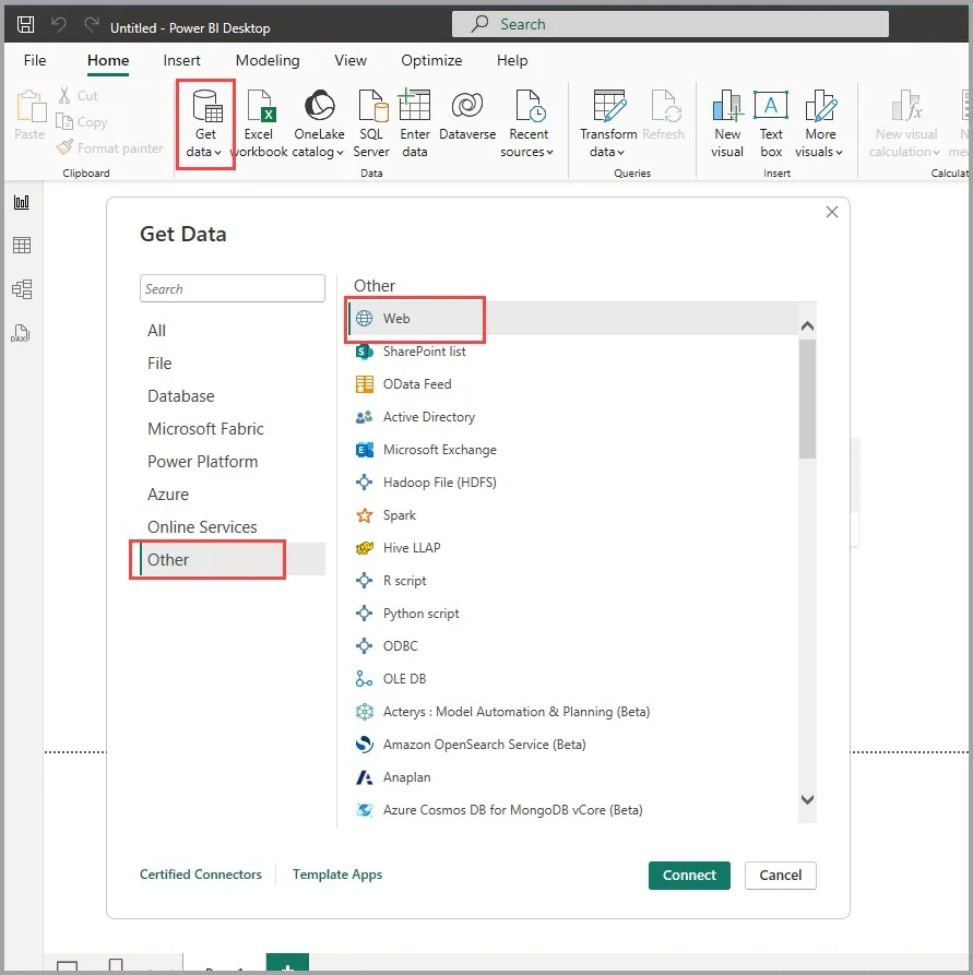
As you can see, there are multiple options for data sources to connect. Let's take an example, where we will integrate a Web resource.
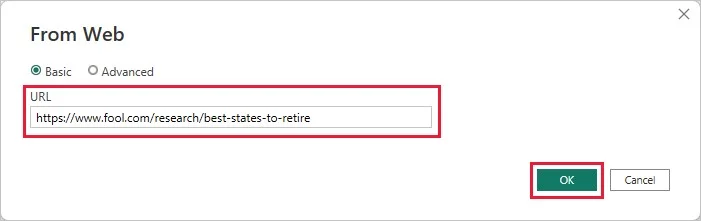
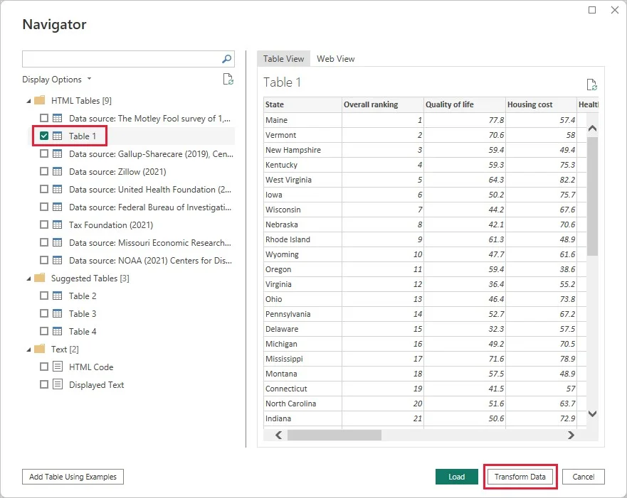
Data transformation is another essential process you should know. Power BI uses Power Query Editor, a built-in instrument, for this purpose. It can clean and transform any type of data available in this tool. To access the Power Query Editor, go to Home and select Transform data. You can also continue from the last step of the above section.
Some common types of data transformation using Power Query Editor are:
Double-click the name and change it to the new one.
Go to the Remove Rows option from Home and select the first option from the drop-down menu.
Just select all the rows containing null values, Right-Click, choose the Replace Values option, enter the new value and click on the Ok button.
Click on the first column, Left-Click, deselect the items you want to delete and click on the Ok button.
Select the column, Right-Click on its header, choose the Change Type option from the drop-down list and select the new data type.
Related Article: How to Use Power Query in Excel
DAX (Data Analysis Expressions) is a suite of different constants, functions and operators used in a formula. These formulas are used in performing basic calculations and solving data analysis problems as well as building new insights from available data. Data Analysis Expressions allows you to perform complex operations that are usually not possible with simple techniques. Here is an instance of a DAX formula:
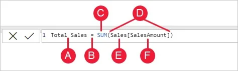
A: The measure name.
B: Operator for showing the result.
C: Function to perform addition.
D: Parenthesis () to contain arguments.
E: Reference of table.
F: Reference of column.
Related Article: DAX in Power BI: Formulas and Functions Explained
The next step is to understand how to create Power BI reports. This involves the following steps:
Data relationship is essential to show the correlation between two data tables or sources. It is then displayed through visuals for better understanding. Go to the Relationship View and define appropriate connections using common fields or keys. It will look like the image given below:
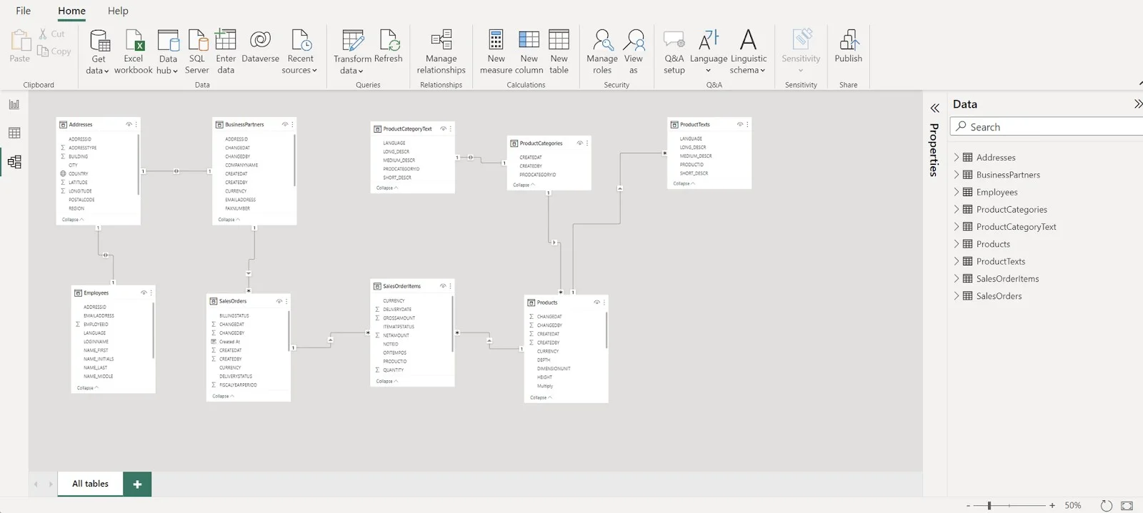
Image courtesy: CaseWhen
This business intelligence tool features a variety of visual techniques such as tables, maps, bar charts, line charts and more. You can find these in the Visualizations Pane available on the right side of the interface. Drag and drop the visualization to the canvas you want to add. Choose the appropriate one that suits the data and can convey insights effectively.
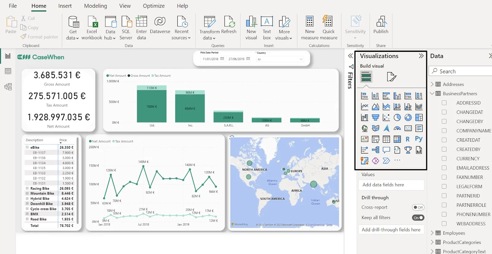
You can also customize the properties of the visuals to improve their clarity and overall appeal. Customization options include colors, titles, font styles, axes labels and legends. Just select and update them on the Visualizations pane.
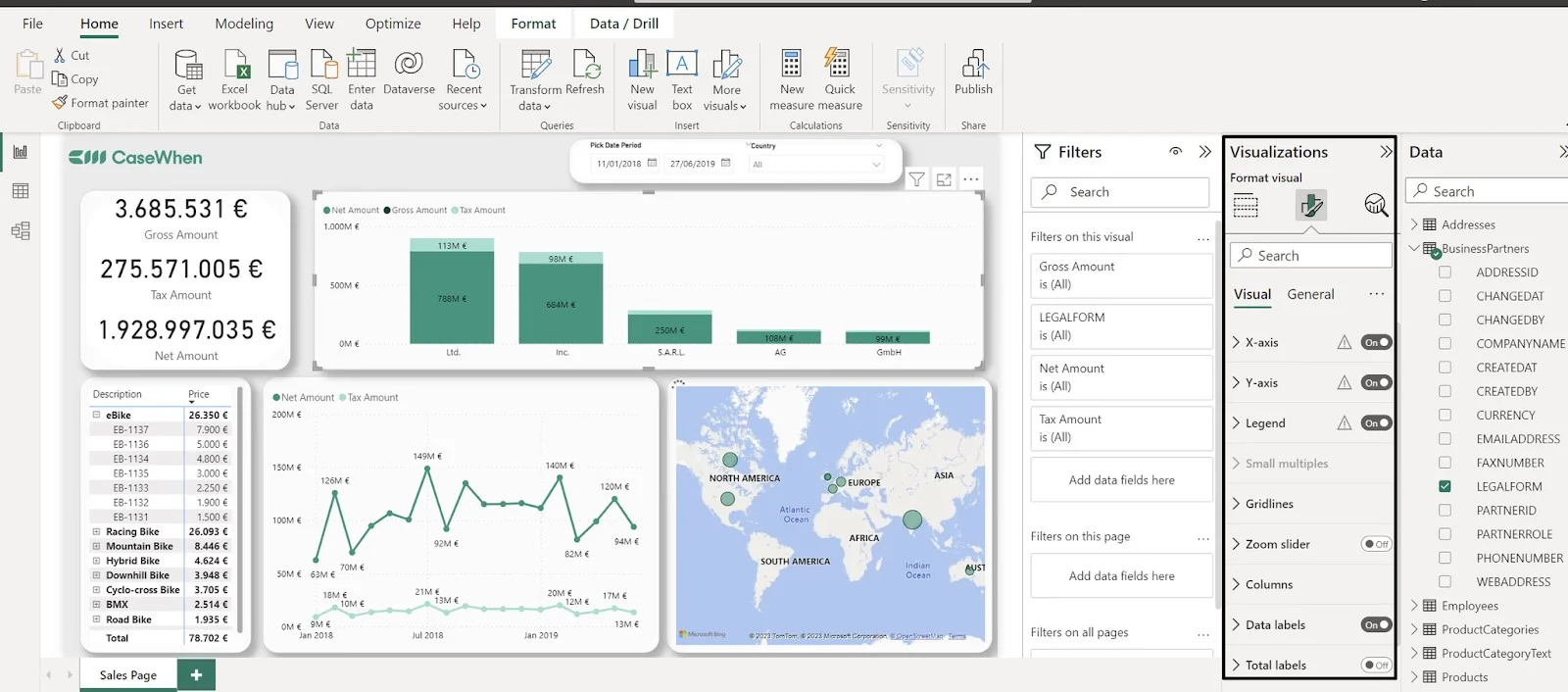
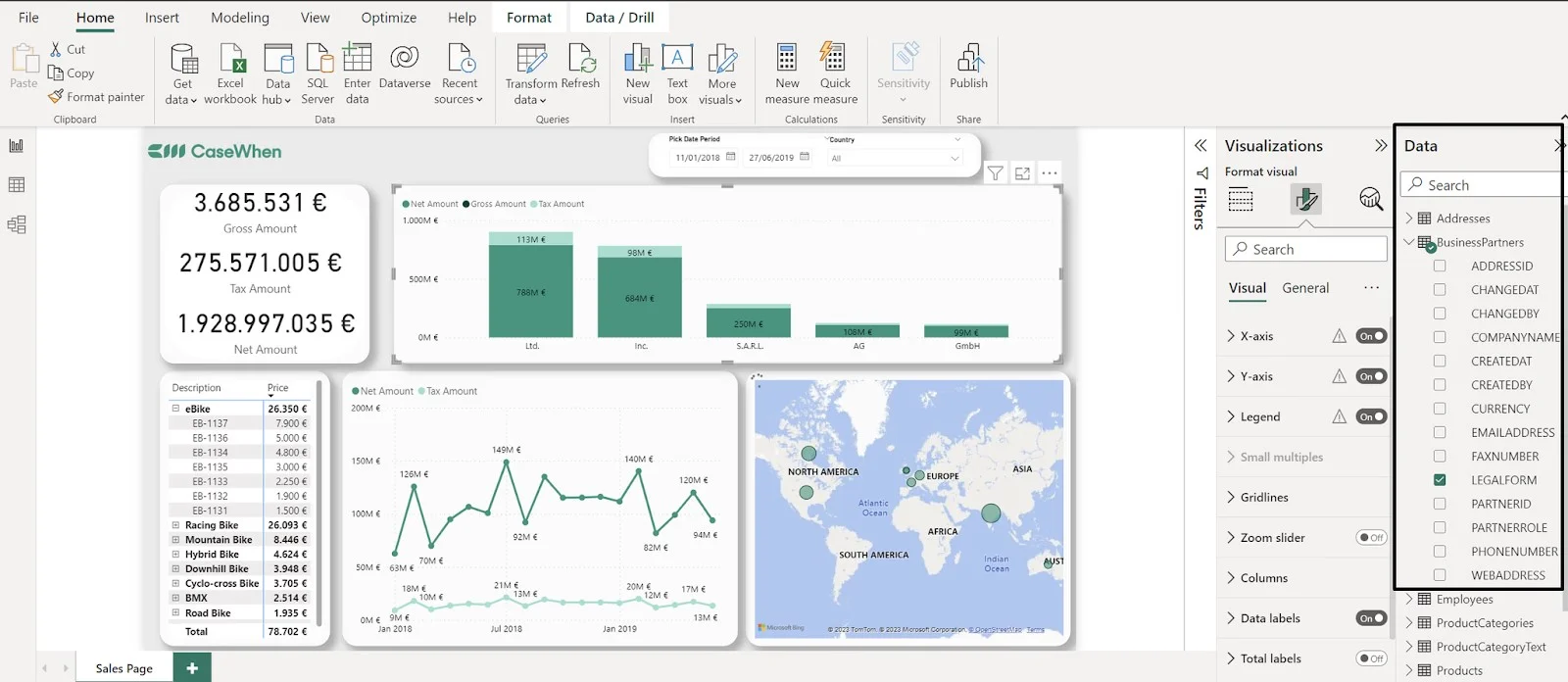
Next, use the Fields Pane to select fields for your data sources from the available list. You can add these fields to values, tooltips, axis, legend, etc. Try different combinations until you get the best one that can uncover better and more meaningful insights.
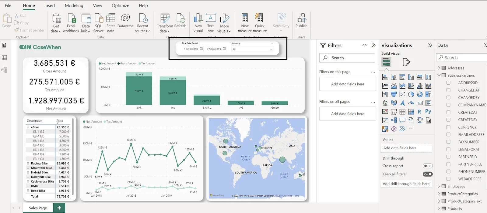
If your canvas includes some unwanted or irrelevant data, use filters and slicers to identify and remove it. Filters help to focus on a particular part of the data and exclude unwanted information. You can also create specific filters for particular visuals or pages. Slicers also provide the same functionality, but directly for the report canvas.
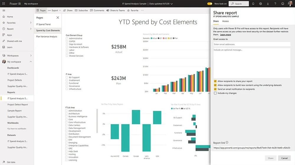
After creating a report, it is crucial to share it effectively with the team and stakeholders to ensure everyone is informed and can use the insights. While there are multiple ways to do it, using the Share option is the most preferred one.
This involves adding the email of the individuals to the section shown below.
Creating dashboards in Power BI involves importing and preparing your data, then building visuals like charts and tables to represent key insights.
Just knowing the basics of Power BI is not enough to create effective visualizations. You also have to consider the best practices. This section includes some of the best tips and tricks to use the full capacity of this BI tool.
Extensive use of visuals can lead to misinformation or complicated visualizations. Therefore, reports should only contain the necessary information with three to four visuals.
The main goal of creating a report is to convey the insights to the recipients. These recipients can be a team, stakeholder or external user. You have to make sure that your report is suitable and accessible for them.
Similar to the unwanted data, extra DAX formulas or queries can lead to inefficiency. It can increase the loading time of the server. Only use the necessary DAX formulas and queries to maintain the best loading speed possible.
Large datasets or a huge number of fields within them can be complicated to manage. This may reduce the efficiency of your dashboards. Therefore, it is important to organize information, fields and other elements in a structured form.
To provide a more interactive and guided experience for your report users, strategically employ bookmarks. These allow you to save specific views of your report, making it easier for users to navigate through different insights or tell a data story step-by-step.
There are several advanced techniques to enhance data visualization and analysis capabilities. Here is a list of some of the top techniques one should know about:
Data modeling refers to the process of establishing relationships between various data sources in Power BI. This helps in creating more complex dashboards and reports that include data from many sources.
DAX (Data Analysis Expressions) refers to a formula language that is used in Power BI for creating custom aggregations and calculations. One can create powerful calculations with DAX, which cannot be achieved with standard Excel formulas.
Power Query is a powerful and popular data transformation and cleansing tool. It enables users to connect easily with many data sources, transform & clean data and then consequently load it into Power BI.
Power BI offers many built-in visualizations. However, one can also create their own custom visuals with Power BI developer tools. This helps in creating unique visualizations tailored to a person's specific needs.
Power BI enables the integration of R scripts into dashboards and reports. R is an extremely powerful statistical programming language used for creating complex data models and visualizations.
Becoming a Power BI Developer requires regular practice and a strong understanding of data modeling, DAX, and visualization techniques. Gaining hands-on experience with real-world datasets and building interactive dashboards will help you develop the skills needed for this role.
Getting trained in Power BI opens up many different job opportunities for professionals.
This Power BI tutorial has explained various concepts and operations of this tool. Take it as your base camp and pursue a Power BI course or training program for your further learning. It will help you to gain the required skills to stand out in the crowd and grab the job of your dream. With this knowledge and training program, you will become a proficient expert in no time.
There are no strict prerequisites for learning Power BI, but having a basic understanding of data analysis and visualization can be helpful.
Power BI is used for creating interactive dashboards, visualizing business data, and sharing insights across organizations.
A. Power BI Desktop is free, while Power BI Pro and Premium are paid versions for collaboration and sharing.
Yes, you can learn Power BI on your own by using this Power BI tutorial.
The time it takes to learn Power BI depends on your existing skills and the amount of time you can dedicate to learning. With consistent effort, you can learn the basics of Power BI in a few weeks.
No, you don't need programming knowledge to learn Power BI. However, having some knowledge of data manipulation and analysis can be helpful.
You can get certified in Power BI by taking a certification exam offered by Microsoft. You can also prepare for the exam by taking online courses and practicing with sample data.