Data is everything for most companies, but only a few know how to manage it effectively and extract better outcomes. Fortunately, there are many tools and technologies available, and Power BI is one of them which help businesses visualize data and turn it into actionable insights. This data visualization and reporting tool offers many advanced features, making Power BI one of the best options for businesses requiring BI capabilities.
As per 6sense, around 51 thousand companies are using Microsoft Power BI as a data visualization tool in 2025 on a global level. The major number of companies are from the USA with around 19 thousand customers, standing at a staggering 49.94% total customer base.
In this blog, we will discuss what is Power BI, what is it used for, its architecture, components, Power BI advantages and disadvantages and more.
Power BI by Microsoft is a powerful and advanced data visualization tool used by business analysts and professionals to visualize data for better decision-making. The term BI stands for business intelligence, which indicates its usage for purposes around such tasks. It is designed to be used by business professionals who hold data knowledge. This tool comes with many advanced features, and the Power BI dashboard is one of them. It has the capability to visualize and report data in various styles, including charts, graphs, scatter plots, maps, and much more.
With its 'AI insights' functionality, artificial intelligence (AI) is employed to extract valuable insights within the users' data sets.
Power BI is not a single tool but a suite of interrelated applications designed for business intelligence. These include Power BI Desktop, Premium, Pro, Report Server, Embedded and Mobile. Some can be used for free, while some offer a pro and premium version through paid means. It also has different components as you can see in the table given below:
| Component | Purpose |
| Power BI Desktop | Build reports, models, and visuals |
| Power Query | Data extraction and transformation tool |
| Power Pivot | Data modeling and DAX calculation engine |
| Power BI Service | Online report sharing and collaboration |
| Power BI Mobile | Access dashboards on mobile devices |
| Power BI Gateway | Connects on-premise data to Power BI Service |
Explore igmGuru's Power BI training program to build your career in business analysts.
This platform was originally found by Thierry D'Hers and Amir Netz of the SQL Server Reporting Services Team at Microsoft. At first it was designed by Ron George in the summer of 2010. This project was named 'Project Crescent'. This project was initially accessible for the public download on July 11, 2011 tied together with SQL Server Codename Denali. Later named Power BI. It was then revealed by Microsoft in September 2013 as Power BI for Office 365.
First release of this application was based on the Microsoft Excel-based add-ins - Power Query, Q&A Visual, and Power Pivot. Eventually Microsoft also added multiple features like Question and Answers, enterprise level data connectivity and security options through Power BI Gateways. It was first unleashed to the general public on July 24, 2015.
Gartner.com, a software reviewing company established Microsoft as Leader in February 2019. In the '2019 Gartner Magic Quadrant for Analytics and Business Intelligence Platform' as a result of the abilities of this platform.
It is a group of tools which assist businesses analyze data, create reports and share insights. This platform has become so famous due to its features it provides to empower businesses with data-driven insights. It is equally useful for both freshers and beginners. This brings us to the question, what is Microsoft Power BI used for. Here are some of the best Power BI use cases.
It integrates well with software like Excel as well as other applications by Microsoft. This makes it workable with data after collection from different sources. This platform connects different data sources like Excel sheets, onsite data warehouses and cloud-based data storage. It then changes them into business insights. This platform can integrate with a website too. Users can easily integrate data from different sources including SQL, Excel and net-based sources like Azure and Salesforce.
It promotes collaboration between the different teams within an organization. This leads to better results and processes as everybody knows what is happening in the project at all times. This platform provides company-wide access to data visualization tools, data and insights to develop a data-driven work culture. It collaborates on workspaces and shared datasets. Users can share their dashboards and reports to display data in a way that is valuable to them.
One does not have to technically sound to make the most of this platform. It is equally useful to technical and non-technical people, whether they are beginners or already have experience in the field. Its instinctive interface lets its users visualize and analyze data. Businesses can track key performance indicators (KPIs) and metrics. Interacting with a particular visualization as a screen reader user is fairly accessible. As users can interact with the data as a table through keyboard shortcuts.
A business can be small in size, mid-sized or a large one, this platform has features that tend to all of them. Its capability to support humongous data sets makes it a scalable pick. It creates financial statements and balance sheets. This platform can analyze sales performance and profit. It integrates with a CRM system to analyze customer data and use insights for enhancing customer experience. This platform can analyze market trends and consumer behavior to explore opportunities.
Businesses benefit greatly with its ability to curate customized, visually appealing dashboards and reports. This makes the stakeholders and teams get a better idea about the data finding in a simpler manner. It can create dashboards and reports that present data sets in different ways using visuals. Users can turn their data into a vast range of different visuals. Visuals like pie charts, decomposition trees, gauge charts, KPIs, combo charts, bar and column charts, and ribbon charts among many different options.
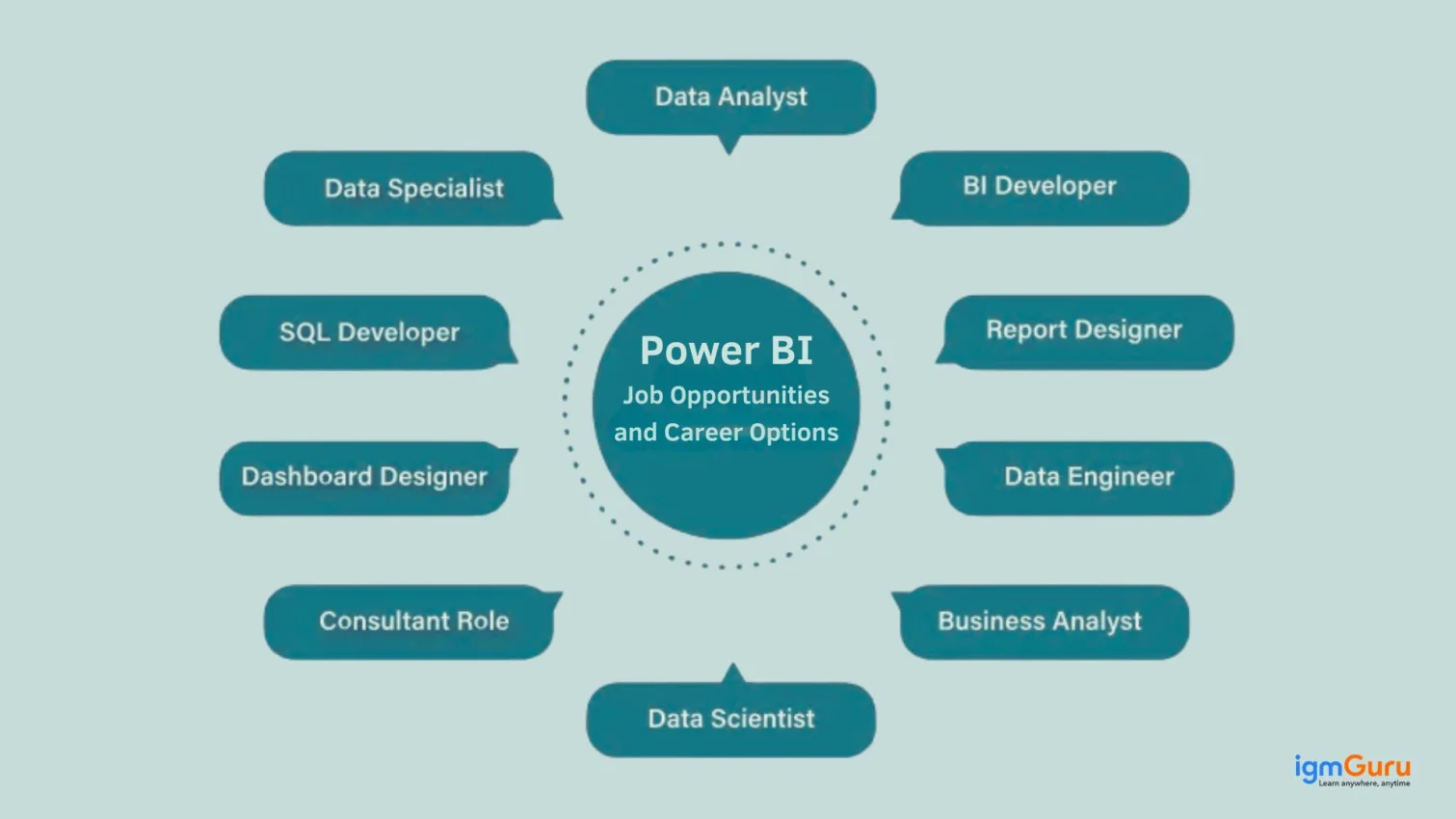
There is no single professional or team that benefits from and uses this platform. Its usage is widespread and here are some of the professionals who can utilize it
Microsoft continues to improve Power BI with new capabilities to make it smarter, faster and more collaborative. The recent updates of 2025 and 2026 have introduced various new features for commitment to integrating AI and better scalability. Here are some of the best features you should explore in 2026:
This new storage mode allows Power BI to connect directly to data stored in OneLake without the need for importing or querying external databases. It offers the speed of Import mode with the freshness of DirectQuery. Professionals use it for analyzing massive datasets efficiently.
Copilot uses AI to assist users in creating reports, writing DAX formulas, summarizing data and generating visuals through natural language prompts. This feature empowers both technical and non-technical users to build insights faster and with greater ease.
Visual calculations help to create custom calculations directly within a visual. You do not have to write a separate DAX measure when using this feature. This is best for quick ratio analysis, ranking or running totals.
The term dataset has now been renamed to Semantic Model to reflect a more accurate and standardized terminology across Microsoft Fabric. It includes support for enhanced governance, reuse and scaling across enterprise-level deployments.
Power BI now supports Git-based version control, which enables teams to collaborate on reports and data models more efficiently. Developers can track changes, manage branches and even integrate with CI/CD pipelines.
The latest updates introduce a more intuitive interface to test Row-Level Security (RLS) roles directly in Power BI Service. This makes it easier for developers to ensure data visibility is properly configured before publishing.
Report designers can now edit visual titles, labels and properties directly on the canvas by clicking elements within the visual. This reduces dependency on side panels and speeds up report customization.
The Power Bi architecture of this tool is developed on top of Azure. It involves four steps that covers up the whole process from creating reports to data visualization. Various technologies and processes work together to get the required results with extreme precision. Let's see those steps further.
It gathers data from various sources and imports it in many formats. These sources could be databases, Excel sheets, CSV files, etc. The collected data is transformed into a regular format during the integration step, stored and integrated into Business Intelligence tool.
The obtained data is not always entirely prepared for direct analysis. This is why it's necessary to review, reshape and make it ready to go. The platform offers user-friendly data transformation and modeling features to transform data for analysis. The Power Query Editor can be used to execute changes in column names, objects, data types along with getting rid of unwanted columns.
The reports are created with Power BI Desktop after the data is transformed and cleaned. A report contains different visual representations like tables, pie charts, graphs, etc to represent the data. Users can publish the report to Power BI Service once it's ready to make it accessible and shareable.
A dashboard refers to a visual interface which showcases data in one spot. It extracts and calls attention to important insights obtained from the reports. It gives an overall view of the report.
Explore this article: How to Learn Power BI
This section addresses the 7 crucial components. Let's take a look at these components which serve the usage of the platform.
There are various kinds of data available and various ways to understand them. The geospatial data is visualized using Power Map in 3D view. Take an example of a specific product being utilized by people located in different regions. This data is displayed through a geographic map representation with details highlighted by different shades or colours.
This reporting tool offers this impressive and free of cost component to users to build models, reports and advanced queries. They can also curate their own images and graphics to share with the team. One can elevate their skills in business intelligence with this primary element.
Handling data sets that are huge is just a complicated thing to do. However, Power Pivot can customize this data and make it a flexible area of Excel. KPIs, hierarchies, custom measures, and relationships can be created with just a few clicks. It also features the ability to build the data with drag-and-drop functionality.
Power BI Mobile Apps catering to three mobile operating systems include Android, iOS, and Windows. Such applications provide interactive views of reports and dashboards on the Power BI website. They can even be shared from your mobile app. Some reports may be highlighted where comments can be made and shared with peers.
Power Query is one of the most indispensable parts of this reporting platform and can be used by Excel or as part of Power BI Desktop. With Power Query, delete data source after data source, and then import data from a variety of different databases such as Oracle, SQL Server, or MySQL. You can also retrieve data from records like text files, CSV files, or Excel files. Read a step-by-step guide on how to export BI data to excel on our blog- Power Query.
This solution can be published on the Power BI website. You can create dashboards in this business interlligence tool for your reports and share them with others, and you can also create reports straight on Power BI on the web. Using this business interlligence on the web, users can perform slice-and-dice operations on data online through a web browser, without requiring any other tool.
Q&A Visual is about visualizing data in a more direct way. It really concentrates on presenting diagrams, charts, animation, graphs, etc., and not solely increasing columns and rows of data. It fills the gap between the data that is fed to Power BI and the visualization of that data. It is also integrated with AI-driven natural language query, which gives it an uperhand over other visualization tools.
Related Article- Power BI Roadmap for Beginners
This reporting and data visualization tool assists businesses and professionals in analyzing data and sharing insights. Here are some of the advantages as follows.
There are other benefits too.
To know more refer to - Power BI Benefits and Advantages
Like any other platform, it also comes with its own set of disadvantages involving limitations on performance, customization and cost. Let us take a look at some of the disadvantages discussed here.
Few users might find the customization options limited as compared to other tools on this platform. Whereas, advanced users might require third party tools or custom development on this Microsoft tool. It has many different visualization possibilities but only a few customization options.
Its large datasets can slow down performance and report rendering. The service might have limitations on the amount of data which can be stored. This platform might take longer to process data or to produce reports than other data analysis tools. Depending on the size of the data set and the difficulty of the study.
The tool is completely free for desktop, but the full abilities like sharing and collaboration features are a part of Pro version which is paid. This paid version is a subscription-based service. This platform's on-premises storage and processing can be very costly.
As we know that proper governance and security measures are important, especially in larger industries to make sure of data integrity. Companies need to consider the cost implications on this platform.
While this platform provides connectivity to a variety of data sources. Some specialized data sources or data types might not be supported. This might make it more tough to interpret and display some sorts of data.
Related Article- Best Power BI Dashboard Examples
Even some of the absolute best options could fail to meet a user's needs. Despite being one of the best platforms for business analytics, this reporting tool's features and benefits might not be what others are looking for. It's crucial to have some common Power BI alternatives in the list to make an effective decision and select the right tool for your workplace.
One of the ideal options for embedded analytics and BI, equipping professionals with personalized analytical experience. Its impressive features assists users with various tasks like data storytelling, action-based dashboards and automated analysis.
Tableau is one of the most relevant tools to elevate data into action-driven insights along with utmost security. Users can enjoy its single-sign-on and drag-and-drop data exploration features for their data.
This suite of tools and methodologies examines data through business proceedings. Users can obtain data-driven business insights, forecasts and more. It assists professionals to make empowered decisions with artificial intelligence.
Domo is a business management platform to extract data insights, automate traditional reporting methods, and assist in making informed decisions. It brings innumerable benefits to users with its data integration, analytics and BI capabilities.
This robust platform fabricates a space for users to traverse and interpret their data in significant ways. It transforms the approach to data insights, providing a dynamic touch to understand data. It comes with artificial intelligence, machine learning, augmented analytics and data integration capabilities.
Related Tutorial - Power BI Tutorial
As we all know Power BI, its roots were as an Excel add-in. But now it stands on its own. Individuals who are uninitiated to this tool may wonder why Microsoft offers two seemingly competitive data analysis applications. This means a little digging is due to clear differences between these two. Here is a comparison on Power BI vs Excel.
| Feature | Power BI | Excel |
| Purpose | Specialized tool for data visualization and business intelligence | General-purpose tool for calculations, data entry, analysis, and reporting |
| Visualizations | Interactive, attractive, drag-and-drop visuals (maps, KPIs, graphs, custom visuals, etc.) | Basic charts and graphs, not as visually dynamic |
| Ease of Use | User-friendly but may feel complex due to multiple tools and a bulky UI | Extremely familiar and simple for most office users |
| Data Handling | Handles large and varied datasets from multiple sources | Limited to ~1 million rows; not ideal for very large datasets |
| Data Connectivity | Connects to Excel, SQL Server, social media, Azure, Google Analytics, big data, etc. | Limited external connectivity, mostly used with local or cloud-stored files |
| Collaboration | Real-time collaboration via Business Intelligence Service | Requires cloud save (OneDrive, SharePoint) or manual sharing for collaboration |
| Customization | Highly customizable visuals, though requires some configuration | Flexible templates and formatting, good for simple reports |
| Complex Tables/Relationships | Struggles with complex table relationships; needs clean, well-structured data | Well-suited for tabular data; users can manually structure tables |
| Calculation Power | Uses DAX (powerful but challenging language for complex formulas) | Easy and fast to create formulas; supports complex calculations via built-in functions |
| Integration with Each Other | Can post and view Power BI data in Excel | Can be a source for Power BI data |
| Templates | Fewer built-in templates | Wide variety of built-in and downloadable templates |
| Flexibility | Less flexible for general business tasks outside BI | Highly versatile for different departments (accounting, HR, etc.) |
The licenses determine what features users can access to in Power BI Service. There are many kinds of licenses with major kinds being Desktop, Pro and Premium. The license one needs depends on how they will use the data, where it is stored and if it needs Premium features.
This license is free to install from Microsoft. It is good for analyzing data by oneself, and can connect to data from over 70 sources. One can export reports to Excel, PowerPoint, CSV and PDF. It can store up to 10 GB per user.
This license is a capacity based setup which is good for companies with huge datasets or storage needs. It can be allocated to different workspaces and users. This license can be scaled up or down as demands change. Premium can distribute content without the need for Pro licenses.
This is a per-user license that lets its users create, interact and read with content. This license can share content and collaborate with other Pro users. Pro interacts with dashboards and reports which others publish to the Service.
This article not only covers 'What Is Microsoft Power BI' but a brief history, its advantages and disadvantages and more. With more businesses depending on best data visualization tools, the demand for this platform rises, along with those who have skills in this area. The BI software market is expected to reach a revenue of $14.64 billion in the US alone.
Explore Our Other Related Articles:
FAQs For What is Power BI
This is a unified and scalable platform for self service and enterprise business intelligence (BI).
The salary in India ranges from INR 4.8 LPA to INR 11.4 LPA with the average salary around INR 7.5 LPA.
There are no requirements of programming as long as you are working on simple visualization tasks. Advanced visualization may require formula languages like DAX (Data Analysis Expressions) and M (Power Query M language) for better data manipulation and calculations.
Course Schedule
| Course Name | Batch Type | Details |
| BI Certification Courses | Every Weekday | View Details |
| BI Certification Courses | Every Weekend | View Details |