
Seaborn is an open source Python library for producing beautiful statistical graphs with a minimum of coding and effort. I have personally used Seaborn for visualizing datasets in the form of Bar charts, heat maps and line charts and it has made it easier for me to identify trends.
I also developed skills through the use of Seaborn, which allows me to select the proper graph to display the data how I want it, as well as customize the graph.
Learn about Seaborn in Python, the popular library that integrates deeply with Pandas data structures for data analysis to create attractive and informative statistical graphics.
Seaborn is a Python library that is used for creating statistical visualizations. It provides clean default styles and color palettes, which make plots more attractive and easier to read. It is built on top of Matplotlib and integrated with pandas data structures. Seaborn makes data visualization easier and more consistent.
For example:
|
Seaborn is a powerful Python library for creating attractive and informative data visualizations. It simplifies complex plots, improves design and helps users easily understand patterns, trends and relationships in data.
Seaborn provides aesthetically pleasing default styles and color palettes, making plots visually appealing without extra customization. It helps users create professional graphs quickly, even with minimal coding experience in visualization.
Seaborn is designed for statistical data visualization, offering built-in functions for distributions, relationships and categorical data. This makes analyzing patterns, trends and variations in datasets easier and more efficient.
Seaborn integrates seamlessly with pandas DataFrames, allowing users to directly use column names for plotting. This simplifies workflow, reduces coding complexity and improves productivity when working with structured datasets in Python.
Seaborn offers high level functions like scatterplot, lineplot and pairplot to visualize relationships. These automatically manage grouping, coloring and legends, saving time and reducing the need for manual configuration significantly.
Seaborn reduces the amount of code needed compared to Matplotlib while producing complex visualizations. It abstracts low-level details, which allows users to focus more on analyzing data instead of handling plotting mechanics
Seaborn is supported on Python 3.7+ and has very minimalistic dependencies. Installing Seaborn is not that complex. You can either install it with Python’s pip manager or you can do it with the help of conda package manager.
|
When you use pip, Seaborn and its required dependencies will be installed. If you want to access additional and optional features, you can also include optional dependencies in pip install.
|
You can also do it with conda:
|
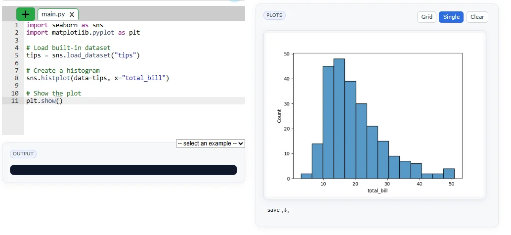
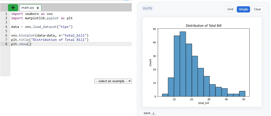
Seaborn provides built-in datasets that make it easy to practice and create visualizations.
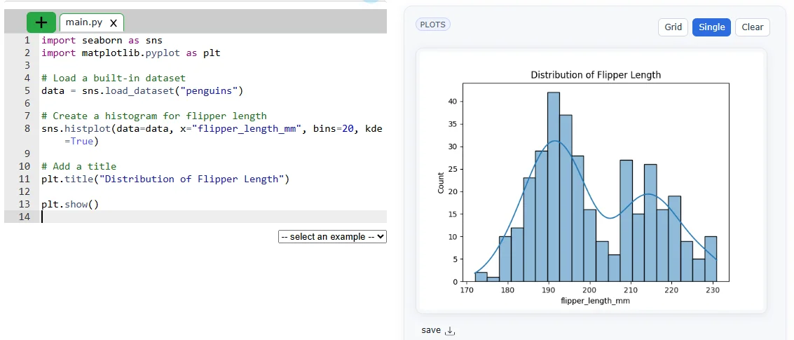
Example: the penguins dataset can be used to plot a histogram of flipper length, helping to understand data distribution only.
|
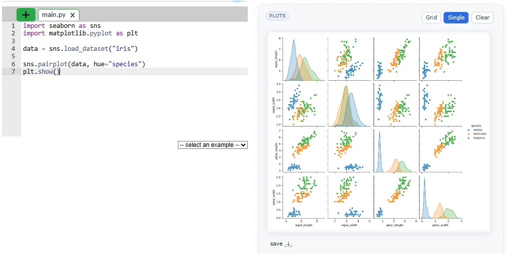
These plots are used when you have to visualize the relationship between variables. Those variables can be either completely numerical or a category like a group, class or division. Seaborn divides the plot into following categories:
Seaborn is mainly used in data analysis to visualize trends, patterns and relationships. Following are some of its real world applications:
Data analysis means understanding what your data is saying. Seaborn helps by creating simple graphs like histograms and bar charts to see patterns quickly. It makes it easy to check distributions, trends and comparisons without complex code.
|
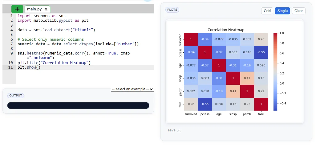
In data science, Seaborn is used before building models. It helps you understand relationships between variables, detect patterns and find important features. This makes your model more accurate and efficient.
|
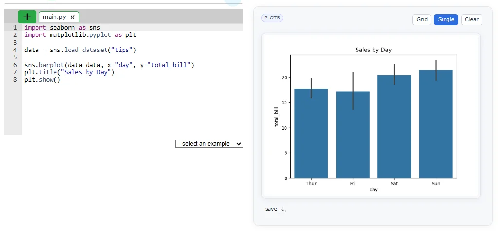
Businesses use Seaborn to study customer behavior and sales trends. It helps answer questions like which product sells more or when customers spend the most. These insights help companies make better decisions.
|
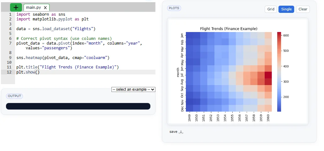
In finance, Seaborn helps analyze trends like stock prices or profit changes. It also shows relationships between different financial variables that help in taking better decisions and risk management.
|
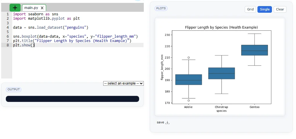
Healthcare professionals use Seaborn to visualize patient data and health trends. It helps in understanding patterns like disease spread or treatment results.
|
EDA is the first step in any data project. Seaborn helps you quickly explore data, find missing values and understand relationships. It gives a clear picture of your dataset before deeper analysis.
|
Seaborn and Matplotlib are two popular Python libraries for data visualization. Matplotlib offers full control and flexibility, while Seaborn provides a simpler, more attractive interface with built-in themes and statistical plots. Let me explain to you their brief differentiation:
| Parameters | Matplotlib | Seaborn |
|---|---|---|
| Level | Low-level library (more control, harder to learn) | High-level library (easy and user-friendly) |
| Ease of use | Requires more code and effort | Requires less code, simpler syntax |
| Customisation | Highly customizable (full control over plots) | Limited customization compared to Matplotlib |
| Purpose | General-purpose plotting | Statistical data visualization |
| Integration | Works with basic Python structures | Works best with Pandas DataFrames |
| Default Styles | Basic and plain styles | Attractive and modern default styles |
| Color Palettes | Limited, needs manual setup | Built-in beautiful color palettes |
| Statistical Features | No built-in statistical tools | Built-in statistical functions (like regression, distributions) |
In data visualization, even powerful libraries like Seaborn can produce misleading or ineffective results if not used thoughtfully. A strong understanding of data, plot selection and design principles is essential to create clear and meaningful visuals. By recognizing common mistakes, one can move beyond basic plotting and build professional, insightful visualizations that truly communicate the story behind the data.
Here are some common mistakes that I want you to avoid:
1. Not Understanding the Dataset: Jumping into plotting without checking data structure or values can lead to incorrect visuals.
2. Using the Wrong Plot Type: Choosing an unsuitable plot (like line instead of bar) can hide important insights.
3. Ignoring Missing Values: Unclean data can make your visualization misleading or incomplete.
4. Overcrowding the Plot: Too many elements (colors, categories) make graphs confusing and hard to read.
5. Not Adding Labels and Titles: Without proper titles and labels, the plot loses clarity and meaning.
6. Ignoring Color Choices: Poor color selection can reduce readability and confuse viewers.
7. Not Using Seaborn Themes: Skipping built-in styles like sns.set_theme, which will make plots look less attractive and professional.
In this blog, I have explained Seaborn, its features, installation, types of plots, customization and real-world applications, along with comparisons and common mistakes. It highlights how Seaborn simplifies data visualization and improves understanding of data. After reading this, readers should practice creating different plots, explore datasets and apply Seaborn in real projects to strengthen their data visualization skills.
Yes, Seaborn provides an API that allows users to create statistical visualizations easily using its functions.
Seaborn is basically a Python library that is used for data visualization.
Yes, using Seaborn is considered a valuable skill in data analysis and data science for creating effective visualizations.


Top Desktop Support Engineer Interview Questions and Answers
June 27th, 2026