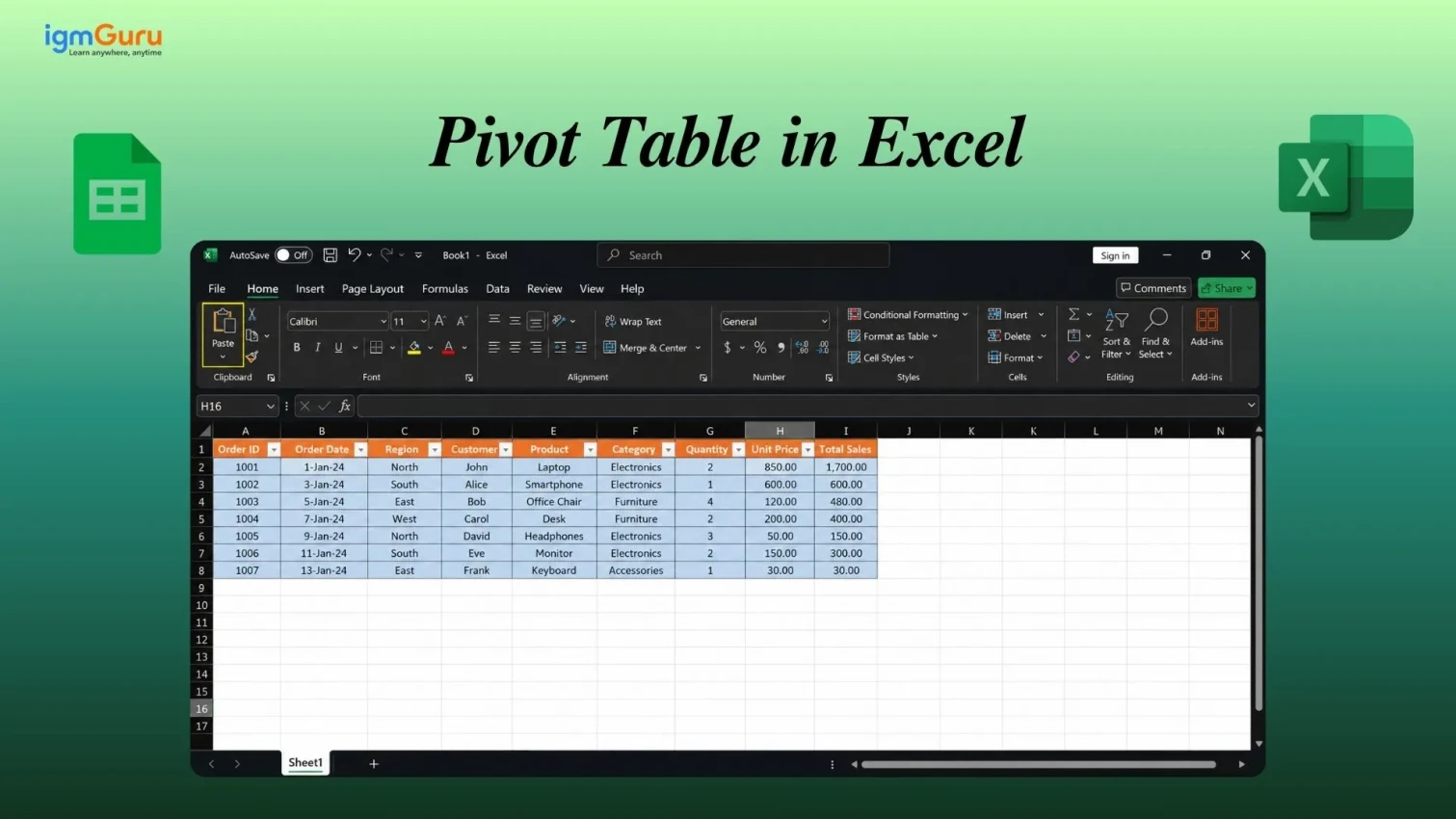
Pivot Tables in Excel provide users with a way to quickly summarize, organize, and analyze large amounts of data in one place. Users can create meaningful reports of the data in different categories, perform calculations such as totaling, averaging, counting and identifying trends very simply and quickly.
Due to their ability to simplify very complex data sets, they are used by many professionals in business, finance and data management. This simplifies the process of generating insights from their data without requiring complicated formulas or extensive technical skills.
In this guide, I will explain what are Pivot Tables, why they are valuable, how to create a PivotTable step-by-step, understand the different field areas, how to sort and filter data, how to refresh reports, how to read and interpret results, how to eliminate common mistakes and how to implement best practices when conducting data analysis using Pivot Tables.
A pivot table is a built-in Excel tool that summarizes a large dataset into a compact, readable report. The word "pivot" means to rotate or turn and that is exactly what it does. It takes your raw data and turns it into meaningful summaries by grouping, counting, summing and averaging values automatically.
Instead of writing formulas or manually sorting hundreds of rows, you simply drag and drop fields to reshape your data. Excel does the heavy lifting for you. That is why pivot tables are one of the most powerful features in Excel for data analysis.
One thing that surprises most beginners: a pivot table does not change your original data. It just reads the data and displays a summary. Your raw data stays safe no matter what you do inside the pivot table.
NOTE: Pivot tables work in all modern versions of Excel, including Excel 2016, 2019, 2021, Microsoft 365 and Excel for Mac.
Also Read: Excel Formulas Cheat Sheet
Let’s say you have a dataset with 500 rows of sales records and your boss wants to know, “Which region had the highest sales in Quarter 1?” With no pivot table available to you, you would be required to filter, sort and write SUMIF formulas by hand. This takes time and has a very high chance of being incorrect. However, if you used a pivot table, it would take you less than 30 seconds to find out the answer.
Below are a few reasons why pivot tables should be learned today:
Whether you work in sales, finance, marketing, HR, or operations, pivot tables save you hours of manual work every single week.
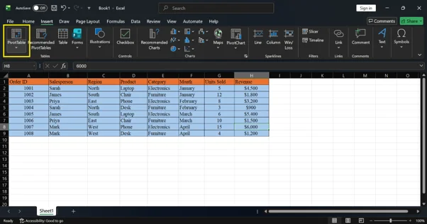
Alright, your data is ready. Now, let us actually build the pivot table. This part feels intimidating the first time, but I promise it is simpler than it looks. Just follow each step in order and do not skip ahead. Creating a pivot table in Excel takes less than a minute. Follow these steps:
| Order ID | Salesperson | Region | Product | Category | Month | Units Sold | Revenue |
| 1001 | Sarah | North | Laptop | Electronics | January | 5 | $4,500 |
| 1002 | James | South | Chair | Furniture | January | 12 | $1,800 |
| 1003 | Priya | East | Phone | Electronics | February | 8 | $3,200 |
| 1004 | Sarah | North | Desk | Furniture | February | 3 | $900 |
| 1005 | James | South | Laptop | Electronics | March | 6 | $5,400 |
| 1006 | Priya | East | Chair | Furniture | March | 10 | $1,500 |
| 1007 | Mark | West | Phone | Electronics | April | 15 | $6,000 |
| 1008 | Mark | West | Desk | Furniture | April | 4 | $1,200 |
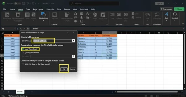
Excel will open a new worksheet with a blank pivot table on the left and the PivotTable Fields pane on the right. This is where you will build your report.
Pro Tip: Format your data as an Excel Table before you create a pivot table. Go to Insert > Table. When you add new rows later, the pivot table will include them automatically after a refresh.
Now you are looking at a blank pivot table and a pane on the right with a list of fields. Nothing has happened yet and that is completely normal. This is where most beginners get confused and close Excel out of frustration. Do not do that. This section will explain exactly what you are looking at.
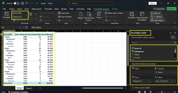
The PivotTable Fields pane has two sections. The top section lists all your column headers, also called fields. The bottom section has four areas where you drag those fields to build your report.
| Area | What It Does | Example |
| Filters | Adds a top-level filter to the whole pivot table. You can filter the entire report by one value at a time. | Filter by Month = January |
| Columns | Displays unique values as column headers across the top of the table. | Show each Region as a column |
| Rows | Displays unique values as row labels down the left side of the table. | Show each Salesperson as a row |
| Values | Calculates the numbers. Usually a sum, count, or average. | Sum of Revenue |
Now that you understand the four areas, let us put them to use. We are going to build a simple but genuinely useful report together. By the end of this section, you will have a working pivot table that shows real results. Follow each step exactly as written.
Let us build a simple report that shows total revenue by salesperson. This is one of the most common pivot table use cases and the perfect place to start.
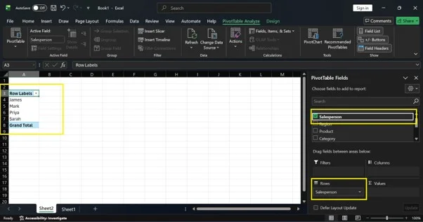
In the PivotTable Fields pane, find the Salesperson field and drag it into the Rows area. You will see the names Sarah, James, Priya and Mark appear as row labels in the pivot table on the left side of the sheet.
Now drag the Revenue field into the Values area. Excel will automatically calculate the sum of revenue for each salesperson. Your pivot table now shows total revenue per person.
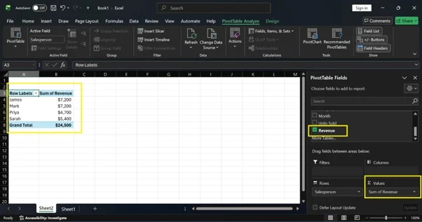
Your completed pivot table will look like this:
| Row Labels | Sum of Revenue |
| James | $7,200 |
| Mark | $7,200 |
| Priya | $4,700 |
| Sarah | $5,400 |
| Grand Total | $24,500 |
You can now see at a glance who generated the most revenue. The Grand Total row at the bottom shows the overall number across all salespeople. You have just built your first working pivot table in Excel.
Related Article: How to Compare Two Columns in Excel?
Adding a Second Dimension to Your Pivot Table
One field in Rows and one in Values is a great start. But pivot tables get really interesting when you add a second layer of detail. This is where you start to see connections in your data that a simple filter or formula would never show you.
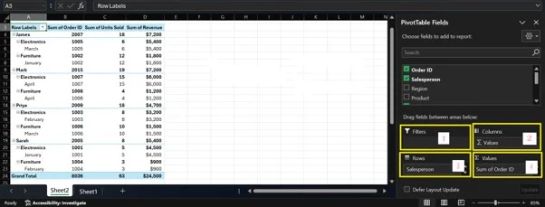
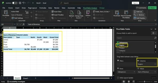
Pivot tables become really powerful when you add a second dimension to the report. Let us say you want to see revenue broken down by salesperson and by region at the same time.
Drag the Region field from the field list into the Columns area. Your pivot table will now show each region as a separate column. Each salesperson appears as a row. The cells at the intersections show how much revenue each person generated in each region.
You can also drag Category into the Rows area, below Salesperson. This creates a nested view where you see each salesperson's total, plus a breakdown by product category directly underneath.
Pro Tip: Do not overcrowd your pivot table. Adding too many fields makes it hard to read. Start simple with one or two fields. Add more only when you need them.
Examples are the fastest way to learn pivot tables. So instead of just describing what pivot tables can do, we are going to build four of them together, step by step, right inside your Excel file. Open the sample dataset we set up earlier and follow along.
I have split these into two groups. The beginner examples use simple one or two field setups. The advanced examples add an extra layer of detail that gives you deeper insights from the same data.
These two examples use just one or two fields. They are straightforward, fast to build, and immediately useful. If you are brand new to pivot tables, start here.
What this tells you: Which salesperson brought in the most money overall.
Why this is useful: If you manage a team, this report shows you at a glance who is performing and who might need support. You can build this in under 60 seconds.
How to build it:
That is it. Your pivot table is ready.
What your pivot table will look like:
| Row Labels | Sum of Revenue |
| James | $7,200 |
| Mark | $7,200 |
| Priya | $4,700 |
| Sarah | $5,400 |
| Grand Total | $24,500 |
How to read it: Each row shows one salesperson and their total revenue across all months and products. The Grand Total at the bottom is the combined revenue for the whole team. James and Mark are tied at the top. Priya is the lowest. That is a conversation starter right there.
Try this next: Click the dropdown arrow next to Row Labels and sort by Largest to Smallest. Now your top performer appears at the very top of the list automatically.
What this tells you: Which product sold the most units across all regions and salespeople?
Why this is useful: If you manage inventory or run a small business, this report tells you which products are moving fast and which are sitting still. It helps you make smarter stocking and purchasing decisions.
How to build it:
Done.
What your pivot table will look like:
| Row Labels | Sum of Units Sold |
| Chair | 22 |
| Desk | 7 |
| Laptop | 11 |
| Phone | 23 |
| Grand Total | 63 |
How to read it: Phone and Chair are your top selling products by volume. Desk is far behind the others with only 7 units. If you were managing this inventory, you would want to make sure you have enough Phones and Chairs in stock and might reconsider how much shelf space you give to Desks.
Try this next: Right-click any number in the Sum of Units Sold column, select Sort, and choose Largest to Smallest. Your best-selling product will jump to the top of the list instantly.
These two examples add a second dimension to your report. They show you how data points relate to each other, not just what the totals are. Once you can build these, you are thinking like an analyst.
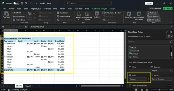
What this tells you: How much each salesperson earned in each region, side by side in one table.
Why this is useful: This report answers a much deeper question than just "who sold the most." It shows you where each person is strong and where they have gaps. Maybe James dominates in the South but has zero presence in the North. That is something you would never see from a simple total.
How to build it:
What your pivot table will look like:
| Row Labels | East | North | South | West | Grand Total |
| James | $7,200 | $7,200 | |||
| Mark | $7,200 | $7,200 | |||
| Priya | $4,700 | $4,700 | |||
| Sarah | $5,400 | $5,400 | |||
| Grand Total | $4,700 | $5,400 | $7,200 | $7,200 | $24,500 |
How to read it: The blank cells tell you that no sales happened at that intersection. Each salesperson in this dataset only covers one region. In a larger real-world dataset, you would see multiple values across the columns, and that is where this report gets very powerful. You can immediately spot which region is underperforming and which salesperson covers it.
Try this next: Drag Month into the Filters area at the top. Now use the dropdown that appears above your pivot table to filter the whole report by a single month. You can instantly see how the revenue breakdown changed from January to April.
What this tells you: How much each product category earned each month, and what percentage of the total each number represents.
Why this is useful: This is the kind of report a business owner or manager actually uses to make decisions. It shows you not just the raw numbers but the share of the pie each category holds. You can see whether Electronics is growing month over month or whether Furniture is slowly catching up.
How to build it:
What your pivot table will look like:
| Row Labels | Jan Revenue | Feb Revenue | Mar Revenue | Apr Revenue | Grand Total | % of Grand Total |
| Electronics | $4,500 | $3,200 | $5,400 | $6,000 | $19,100 | 77.96% |
| Furniture | $1,800 | $900 | $1,500 | $1,200 | $5,400 | 22.04% |
| Grand Total | $6,300 | $4,100 | $6,900 | $7,200 | $24,500 | 100% |
How to read it: Electronics makes up almost 78% of total revenue while Furniture accounts for just over 22%. You can also see the month by month trend. April was the strongest month overall at $7,200. This tells you that Electronics is carrying the business and that April was a particularly good month, likely because of Mark's strong Phone sales in the West region.
Try this next: Right-click any date or month label in the Columns area and select Group. Choose Quarters if you have a full year of data. Your pivot table will instantly collapse the months into Q1, Q2, Q3, and Q4, giving you a quarterly performance view with one click.
PRO TIP: Once you have built all four of these, try mixing and matching fields on your own. That is when pivot tables really start to feel like a superpower.
Building the pivot table is only half the job. The other half is controlling what it shows you. This is where you go from just having a summary to actually finding answers. Sorting, filtering and changing value types are the three things you will use constantly once you start working with pivot tables regularly.
You can sort a pivot table just like a regular Excel table. Click the dropdown arrow next to a row or column label and choose Sort A to Z or Sort Z to A for text fields. To sort by a numeric value, right-click any number in the pivot table, select Sort and choose Largest to Smallest or Smallest to Largest.
You have three ways to filter your pivot table data:
By default, Excel shows the Sum of numeric fields. But you can change this at any time. Click on any value cell in your pivot table and go to Value Field Settings. You can switch from Sum to Count, Average, Max, Min, Product, or Standard Deviation.
You can also show values as a percentage of the total, a percentage of a row, or a running total. This is useful when you want to compare each item's share against the whole.
Here is something that trips up almost every new pivot table user. You update your data, look at your pivot table, and nothing changes. You start to wonder if something is broken. It is not. Pivot tables just do not update on their own. Here is how to fix that.
A pivot table does not update automatically when your source data changes. You need to refresh it manually. Here is how:
If you add new rows to your dataset and the pivot table does not pick them up after a refresh, your data range probably does not include the new rows. The easiest fix is to format your source data as an Excel Table before you create the pivot table. Excel Tables expand automatically, so new rows are always included.
Pro Tip: Use the keyboard shortcut Alt + F5 to refresh the active pivot table instantly without clicking through the ribbon.
You have built the pivot table and the numbers are showing up. Now what? A lot of people stop here and just stare at the table without knowing what to look for. This section tells you exactly how to read what Excel is showing you and where to focus your attention.
Once you build a pivot table, you need to know how to read it correctly.
Start by looking for the highest and lowest values. They show you where performance is strongest and where it is weakest. Then look for patterns across rows or columns. A value that stands out from the others usually signals something worth investigating.
If a cell is blank, it means there is no data for that combination. For example, if Priya made no sales in the West region, that cell will be empty. You can replace blanks with a zero by right-clicking the pivot table, selecting PivotTable Options, and typing 0 in the field labeled "For empty cells show."
Even people who have been using Excel for years make these mistakes. The good news is that once you know what to look for, they are all easy to avoid. Go through this list before you build your next pivot table.
Blank rows break the pivot table data range. Excel may not include all your data in the summary. Delete any blank rows and columns before you create a pivot table.
Every column in your dataset needs a unique header in the first row. If any header is blank, the pivot table will ignore that column entirely.
If Excel treats your Revenue column as text instead of numbers, the Sum will show as zero or will default to Count. Select the column, look for the green triangle warning in the top-left corner of the cell, and convert the values to numbers.
If your dates are stored as text, for example typed as "Jan 2024" rather than entered as a real date, Excel cannot group them by month or year. Use proper date formatting so Excel recognizes them correctly.
Pivot tables do not live-update. Always refresh after you add, edit, or delete data in the source table.
A pivot table with five fields in Rows and three in Columns becomes nearly impossible to read. Build it gradually. Keep it focused on answering one specific question at a time.
Now that you know how to build and read pivot tables, let us talk about how to build them well. These are the habits that separate someone who just gets by with pivot tables from someone who uses them confidently and efficiently every day.
These habits will make your pivot tables cleaner, faster, and much more useful over time.
Pivot tables in Excel are not as complicated as they look at first. Once you understand the four field areas and the basic workflow, you can build powerful data reports in just a few minutes. You do not need complex formulas. You do not need to be an Excel expert. You just need to know what question you want to answer, and then drag the right fields into the right areas.
Start with the sample dataset in this guide. Build each of the five example reports step by step. Once you feel comfortable, bring in your own data and apply the same process. You will quickly see how much time a pivot table saves compared to doing the same analysis manually.
The more you use pivot tables, the more natural they become. They are one of those Excel skills that pays for itself every single time you open a spreadsheet with real data in it.
Read This Article: Excel Interview Questions and Answers
Yes, you can use the Excel Data Model to combine data from multiple tables or sheets. When the dialog box appears during pivot table creation, check the box that says "Add this data to the Data Model." Then use Power Pivot to create relationships between your tables.
In the PivotTable Fields pane, drag the field out of whichever area it is in, or simply uncheck the checkbox next to the field name at the top of the pane. The field disappears from the pivot table immediately.
No, pivot table values are calculated automatically from your source data. You cannot type directly into a value cell. To change a number, edit the source data and then refresh the pivot table.
This usually happens when your numeric column contains at least one cell formatted as text or one blank cell. Excel defaults to Count when it detects non-numeric values in the column. Fix the source data, refresh, and then change the value field setting back to Sum.
Add your date field to the Rows area. Right-click any date in the pivot table and select Group. In the dialog box, choose Months and also choose Years if you have data across multiple years. Click OK and Excel will group all dates by month automatically.
Yes, excel Online supports pivot tables with most of the same features as the desktop version. Google Sheets has its own pivot table feature that works similarly. The steps differ slightly, but the core concept is the same across both platforms.