Data visualization tools are fueling the data science industry these days. They give a complete view into the enterprise data to extract important insights for business intelligence. Tableau is also one such tool that has 12.33% of the market share and the second best ranking due to its interactive dashboards. Do you want to learn how to create a Tableau dashboard?
You have come to the right spot as this article includes different ways to create a Tableau dashboard. It also entails the types and benefits along with the purpose of creating these dashboards. Gaining this knowledge will be especially beneficial for data experts. The data experts with Tableau skills are in great demand and get impressive salaries of up to $107,105 per annum.
Let's start by understanding 'What is a Tableau dashboard'. There are hundreds of operations, trends and many more elements that keep a business running. Data experts are responsible for monitoring all the elements and making decisions accordingly for business intelligence. This is not an easy task and its complications keep rising with the business size. This is where they need dashboards.
Dashboard collects and visualizes all the information in a single precise manner. Let us take an instance of a sales dashboard. It comprises the historical sales data, key performance indicators (KPIs), growth rate, customer feedback and operational indicators in a single view. Managers or executives use it to understand the circumstances and make informed decisions accordingly.
Explore other Business Intelligence Certification Courses by igmGuru for a more refined career advancement.
It is also important to understand the benefits of creating a Tableau dashboard before actually doing it. Enterprises can get many advantages by using these in their daily data-based tasks. We have already highlighted what it consists of in the above sections. It also gives some additional benefits -
All size companies can use this dashboard. It has the ability to comprise gigabytes of raw data daily on a single screen. This screen view benefits companies in creating value and making better decisions. It also gives access to each key metric that can transform raw data into valuable insights.
A dashboard in Tableau has access to different data sources that give a detailed report of the working of a company. Data experts use them to create a detailed analytical report. This data analysis task is straightforward as it can monitor key performance metrics and make sense of historical events.
It gives the ability to view anomalies, forecast sales and historical data to managers or executives. They can come up with the best business strategies by using all this information. They can also dive deeper into past data or filter out risky parameters from this data.
This gives an unbiased picture of the performance of a company. It includes all the data from the maximum growth percentages to the failures in marketing campaigns. It is really a good accountability. This Accountability is very important to keep enterprises away from major losses or bankruptcy.
These dashboards give a dynamic experience from the experts. This lets them understand the different factors of an enterprise. They can filter or isolate a single metric, view different map or time series line plots and even use external tools for generating anomaly alarms.
Explore top Tableau Certifications for a clear career path.
There are many Tableau dashboard examples a company can use. This is only possible as they are highly customizable. This means experts can add different filters, features, functions and more to build a dashboard of their own. All of these fall into a category named iDashboards which are of three types including -
One should understand some basic considerations before jumping on how to create an interactive dashboard in Tableau. There are a few rules for that. These rules will make them able to build an effective dashboard that fulfills the demands and goals of their audience. These are -
1. Understand the audience and their requirements.
2. Use relevant, relative and pure data to achieve the goals.
3. Choose the best visualizations and techniques to represent the data.
4. Use a reliable dashboard that caters to all requirements for reducing complications and time.
5. Do not add too many plots to the dashboard and make it as simple as possible.
6. Ask the audience for feedback and work on it to make a better design.
Related Article - Power BI vs Tableau
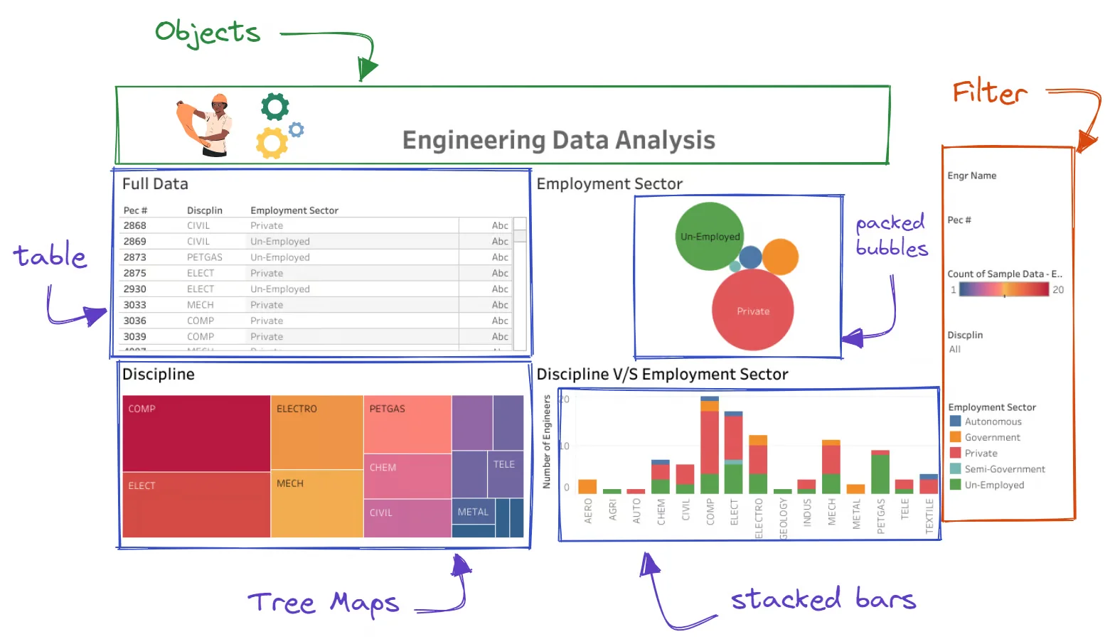
Now we can explore how to create a Tableau dashboard. These dashboards typically consist of three elements including objects, visualization and filters. One can add many types of components in them as shown below -
Now let us move to steps -
Step 1. Start by opening a new dashboard window. It can be opened from the Dashboard option on the menu bar or the Dashboard icon highlighted in the bottom bar.
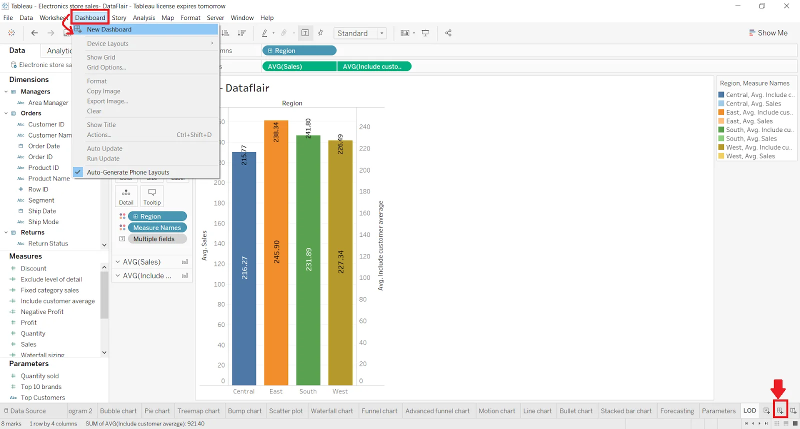
Step 2. Choose the New Dashboard in this section. It will open a new window namely Dashboard 1. It can be changed by double clicking on the name if you want to.
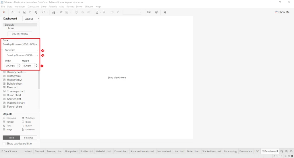
Step 3. There will be many tabs and options for dashboarding on this window. Check the left side to see the Dashboard Pane. It shows the size, number of sheets, objects and more.
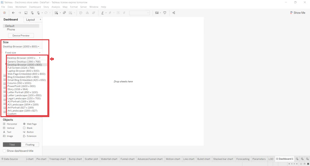
Step 4. Explore all the options in this tab and make changes according to requirements. You can set the size of the dashboard by applying custom dimensions like height and width. It also has a list of default sizes. You can select one from them too.
Step 5. Just next to the Dashboard Pane is a Layout pane. It includes the options to improve appearance and layout. Here you will find different settings like size, border, background, position and paddings.
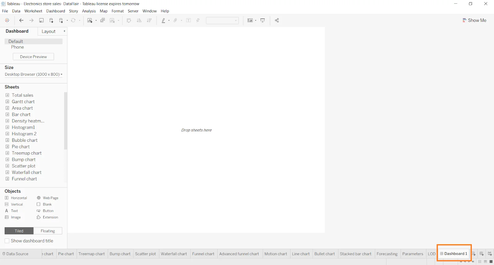
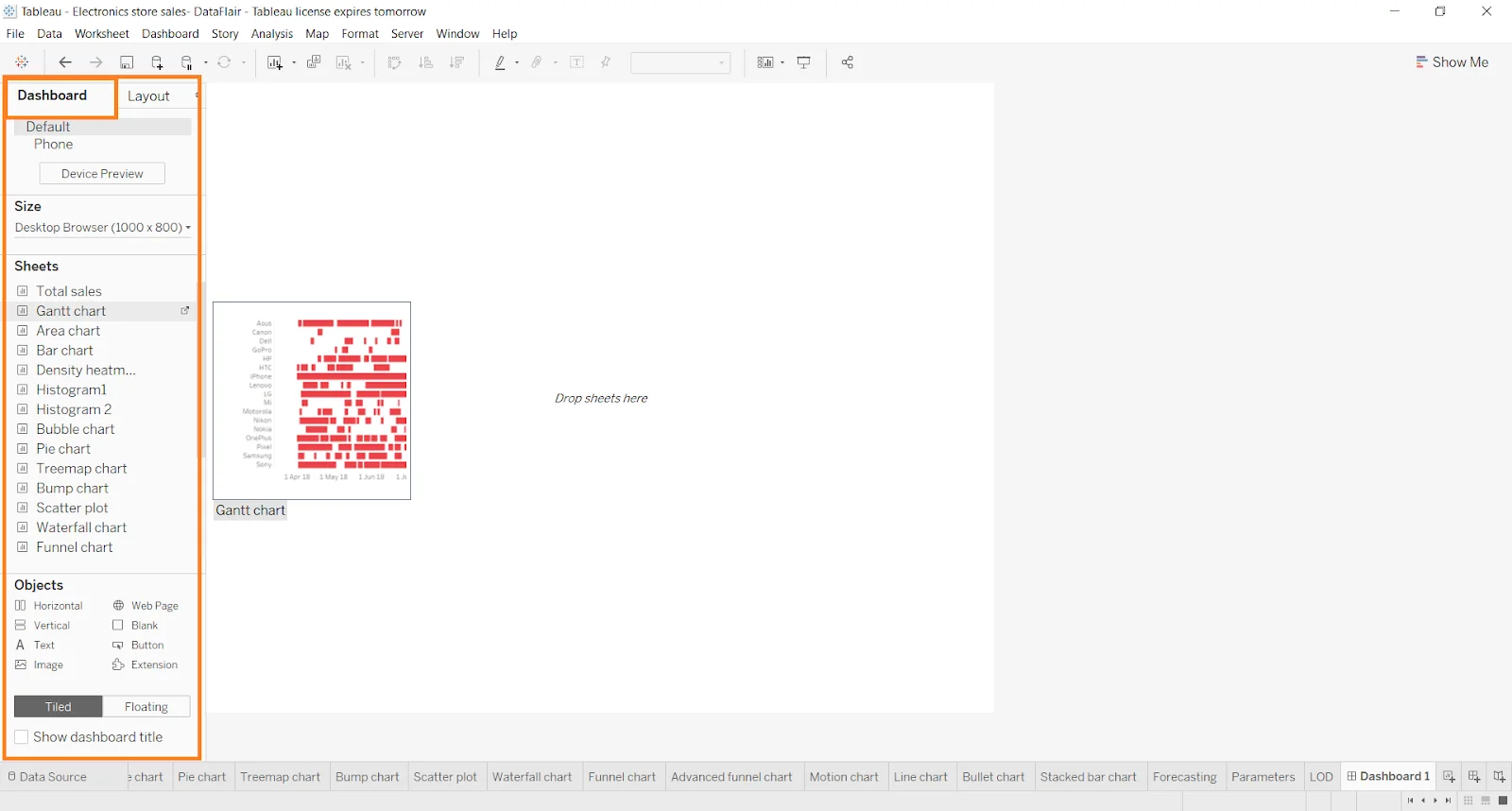
Step 6. Now let us add a sheet on the dashboard. Just drag and drop the sheet you want to include from the Dashboard Tab. You can change the shape or size of the visual, chart and graph in this sheet. Just click on the graph and select the small downward arrow shown at the right. You can add as many sheets as you want.
Step 7. You have already built a simple dashboard. Let us make it more interactive. Add some other objects to make it more interactive and dynamic. Navigate the Objects Section and add the required objects like text box, web page, button, extension and more.
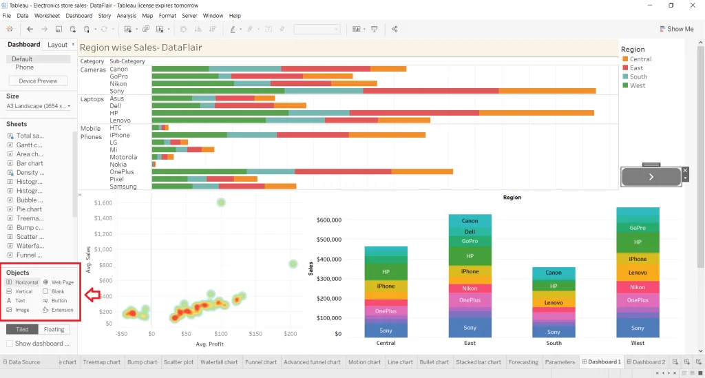
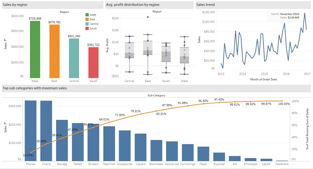
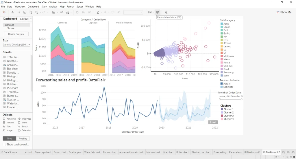
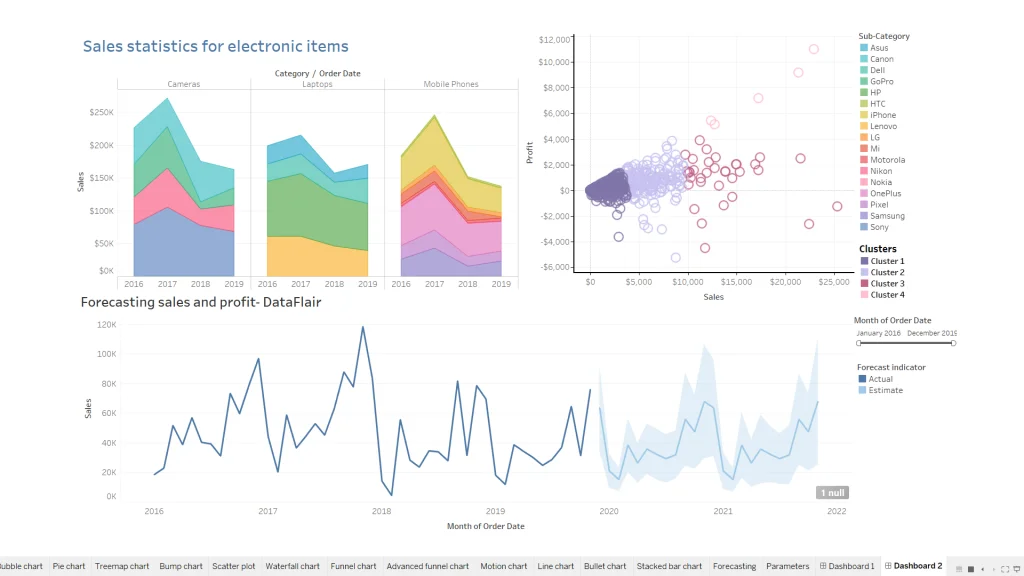
Step 8. Let us move to finalize our dashboards now. We will take three visualizations in the current dashboard as shown below. It shows the sales and profits forecast. We will also include a list of legends to show the names and details of sub categories in the right pane.
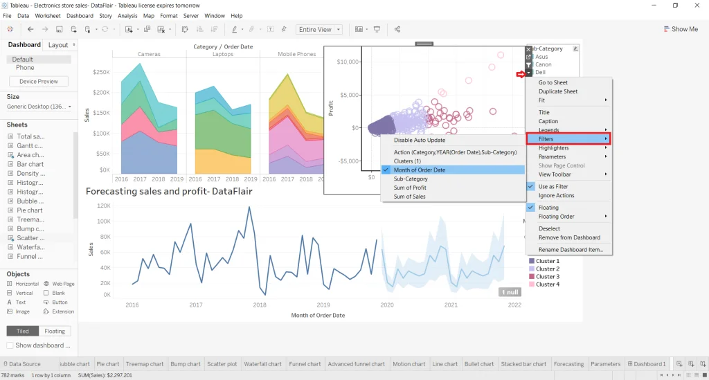
Step 9. Now add filters by clicking on a visual. We are adding a month filter on the scatter plot that shows sales values for different clusters. Click on the icon shown in the image below and select the Filters option. Now choose the Months of Order Date option. There will be many options for fields.
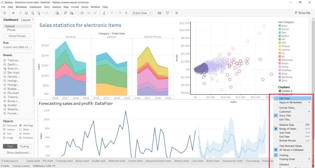
Step 10. This will give a slider filter to choose different months to see data. Drag and drop this filter wherever you want. You can also change the filter setting by clicking the right button on it.
Step 11. Click on the option available at the top as shown below or just press F7. This will show the dashboard in presentation mode. This will give a complete view of how the dashboard will be presented to the audience. Just monitor it and make changes in the filters if required to bring out the best visualization.
Related Article - Tableau Tutorial
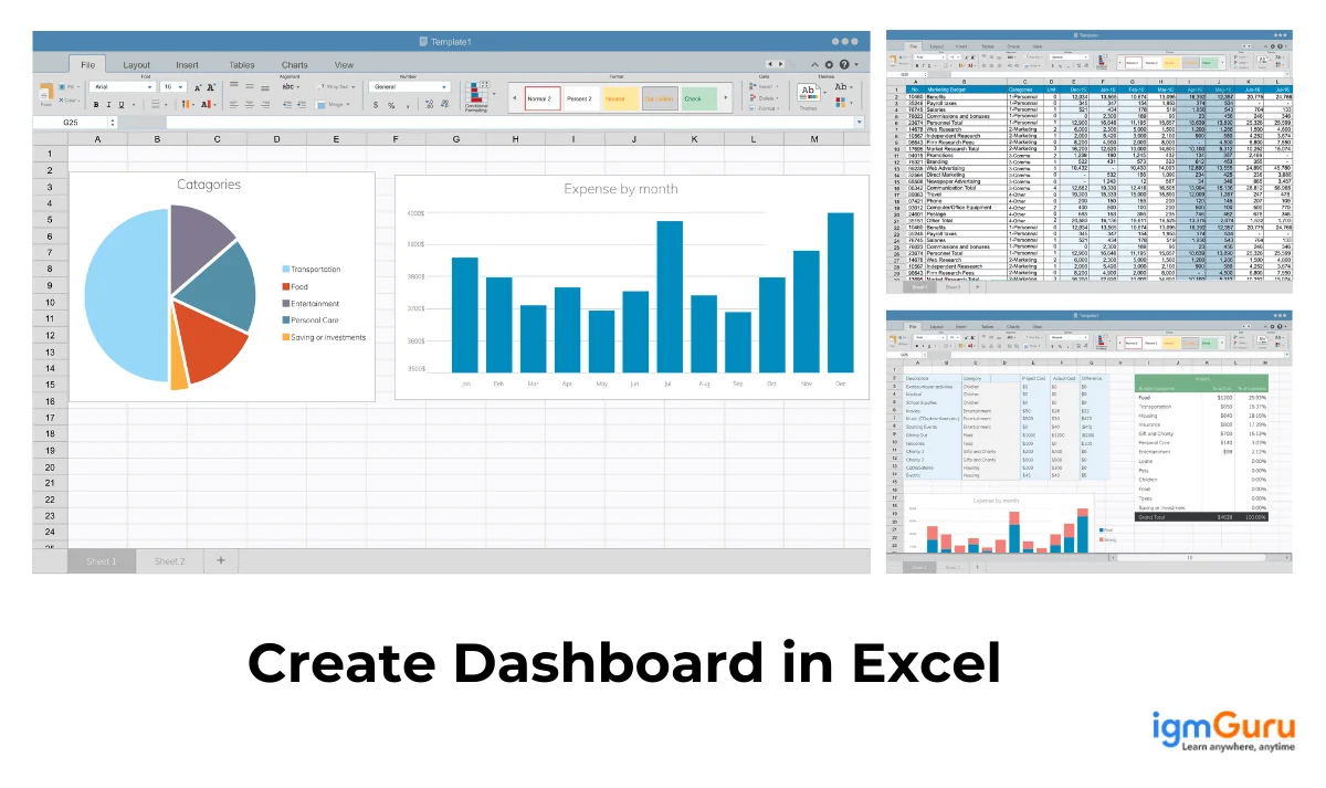
Excel sheets are amongst the most ubiquitous forms of data indexing in the IT industry. Everyone who uses Windows may have worked with Excel spreadsheets. This popularity is due to its wide number of data related applications. Let us explore how to create a Tableau dashboard from Excel -
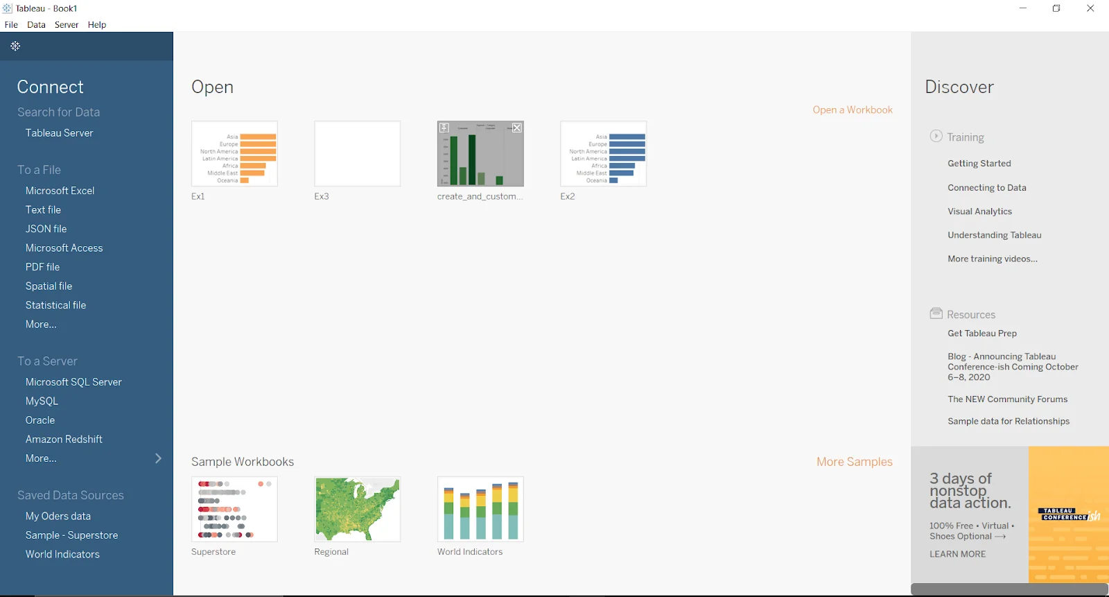
Step 1. Start by opening the Tableau application in your system.
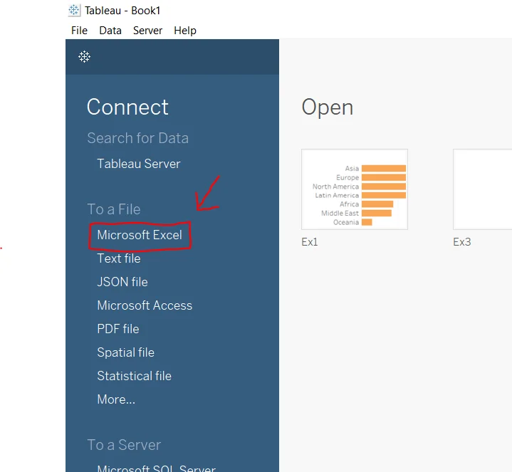
Step 2. Now select Microsoft Excel in the To a file under the Connect section.
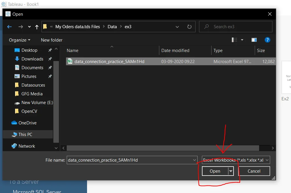
Step 3. You will see a file selector after clicking on this option. Here you can select or change location as you want to.
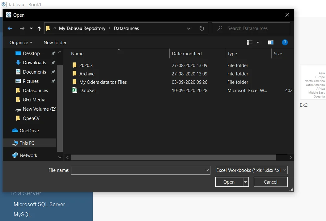
Step 4. Choose an Excel file and click on the Open button.
Step 5. This will open a new screen on the system as shown below.
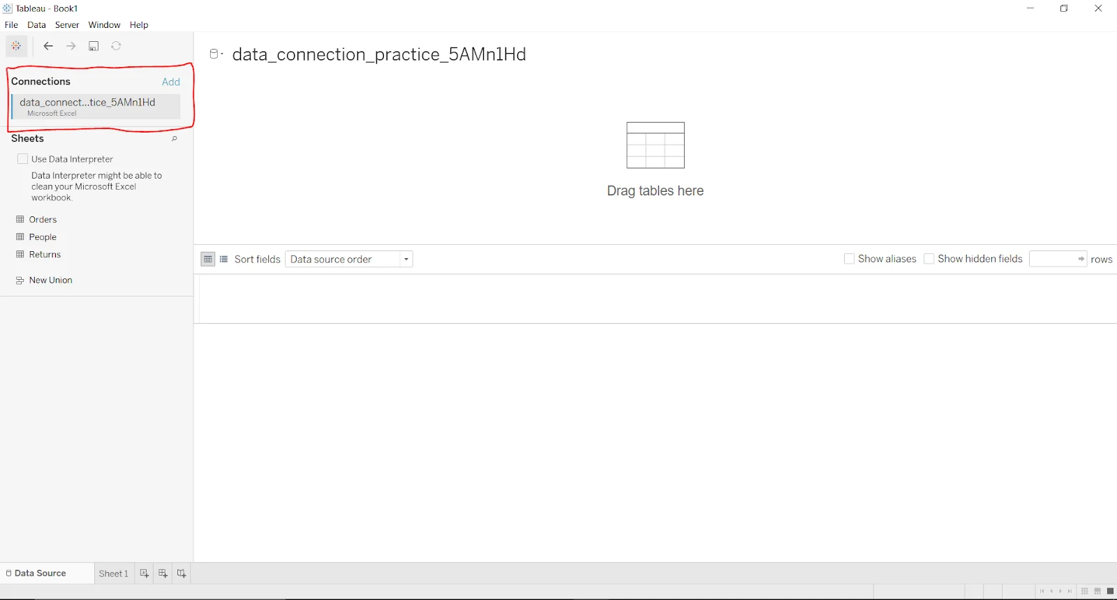
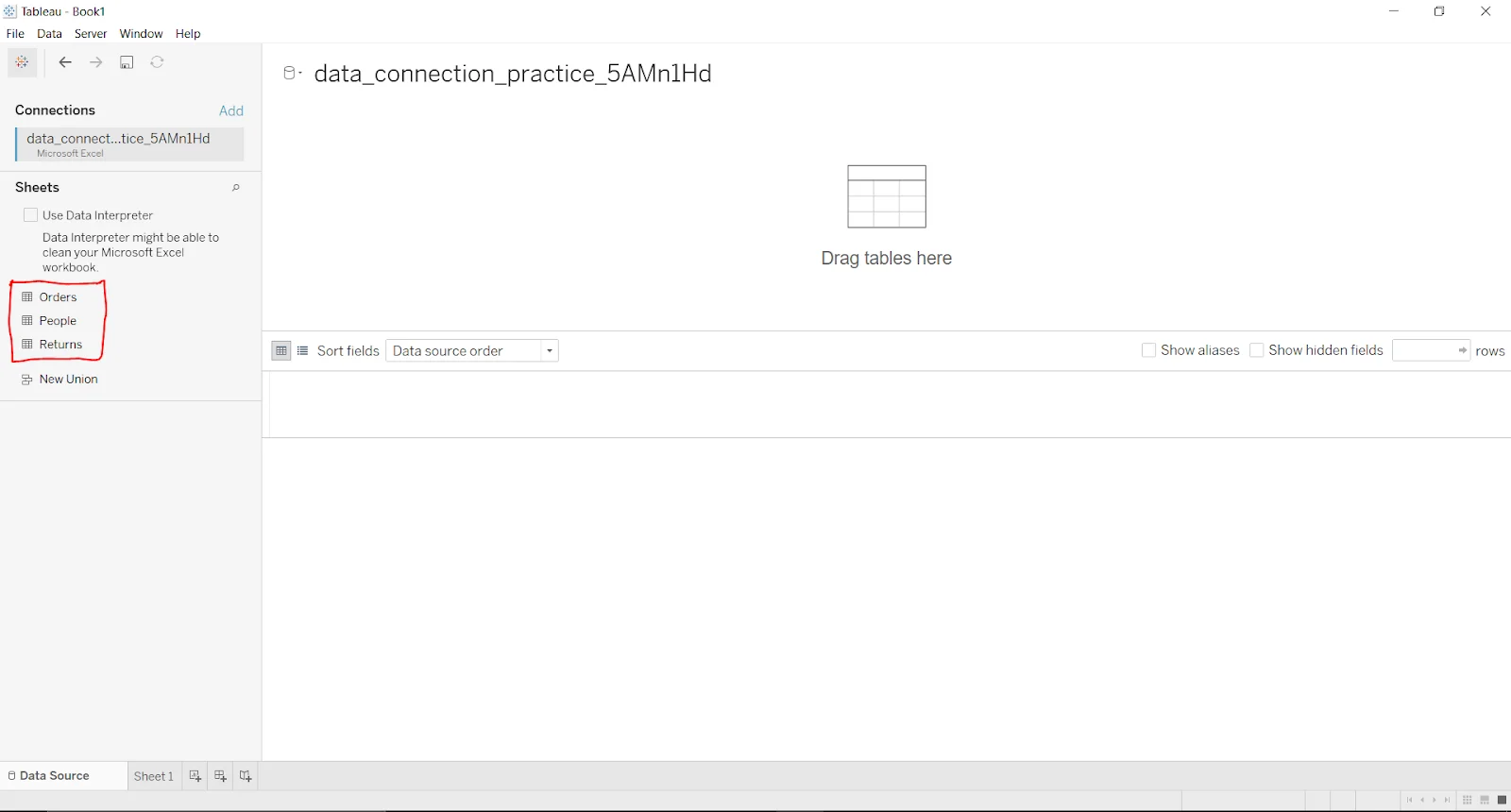
Step 6. Now you have the Excel file with all the sheets it includes.
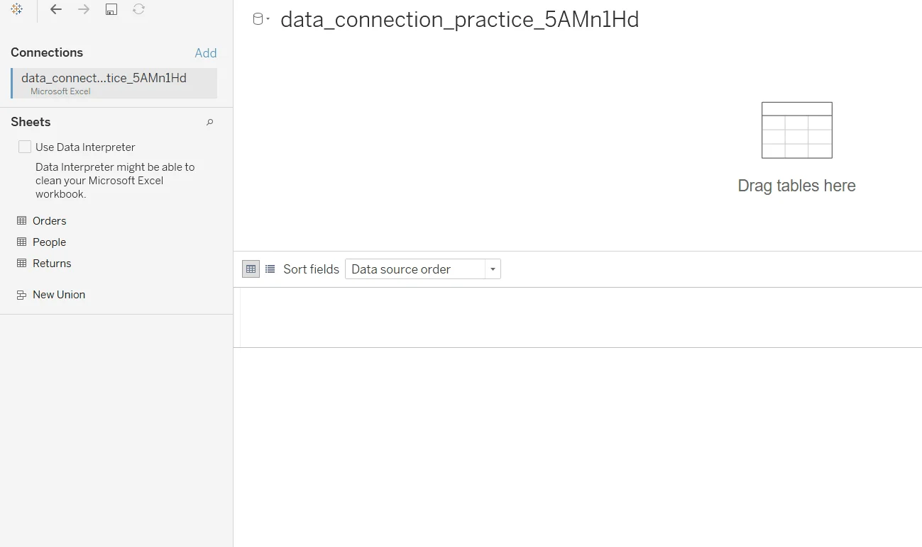
Step 7. Just drag the sheet to the top section to view its information.
This article has explained how to create a Tableau dashboard from scratch. It has explained this process in detail, from adding visuals, filters and objects to visualizing the dashboard in an effective way. This knowledge is apt for individuals who want to build a dashboard on this platform. It also gives a good start to beginners in this field.
Creating a dashboard on this platform is a straightforward process. Just drag and drop the data into worksheets, use its panels to give dimensions, apply filters and add objects. Completing these tasks will create a dashboard. The effectiveness and interactivity will depend on your creativity.
KPI dashboards give a visualization of key performance indicators with interactive graphs and charts. Data experts use it for data analysis and business intelligence tasks. Key performance indicators are basically performance measures and specific strategies.
There are many types of filters available on this platform. All these filters are categorized among six sections including -
Course Schedule
| Course Name | Batch Type | Details |
| Tableau Training | Every Weekday | View Details |
| Tableau Training | Every Weekend | View Details |