Many businesses have begun capitalizing on the gigantic quantities of data they are collecting. But this can only be possible with the use of modern data visualization tools. Such tools give non-tech users within a company a complete understanding of the data and its insights.
Fortune Business Insights values the data visualization global market at USD 8.85 billion in 2019. This value is estimated to soar to USD 19.20 billion by the year 2027 at a CAGR of 10.2%. Growing internet use, advancements in Machine Learning, more cloud computing technologies and many other factors drive this market growth.
Let's understand the top data visualization tools that will shine in 2026.
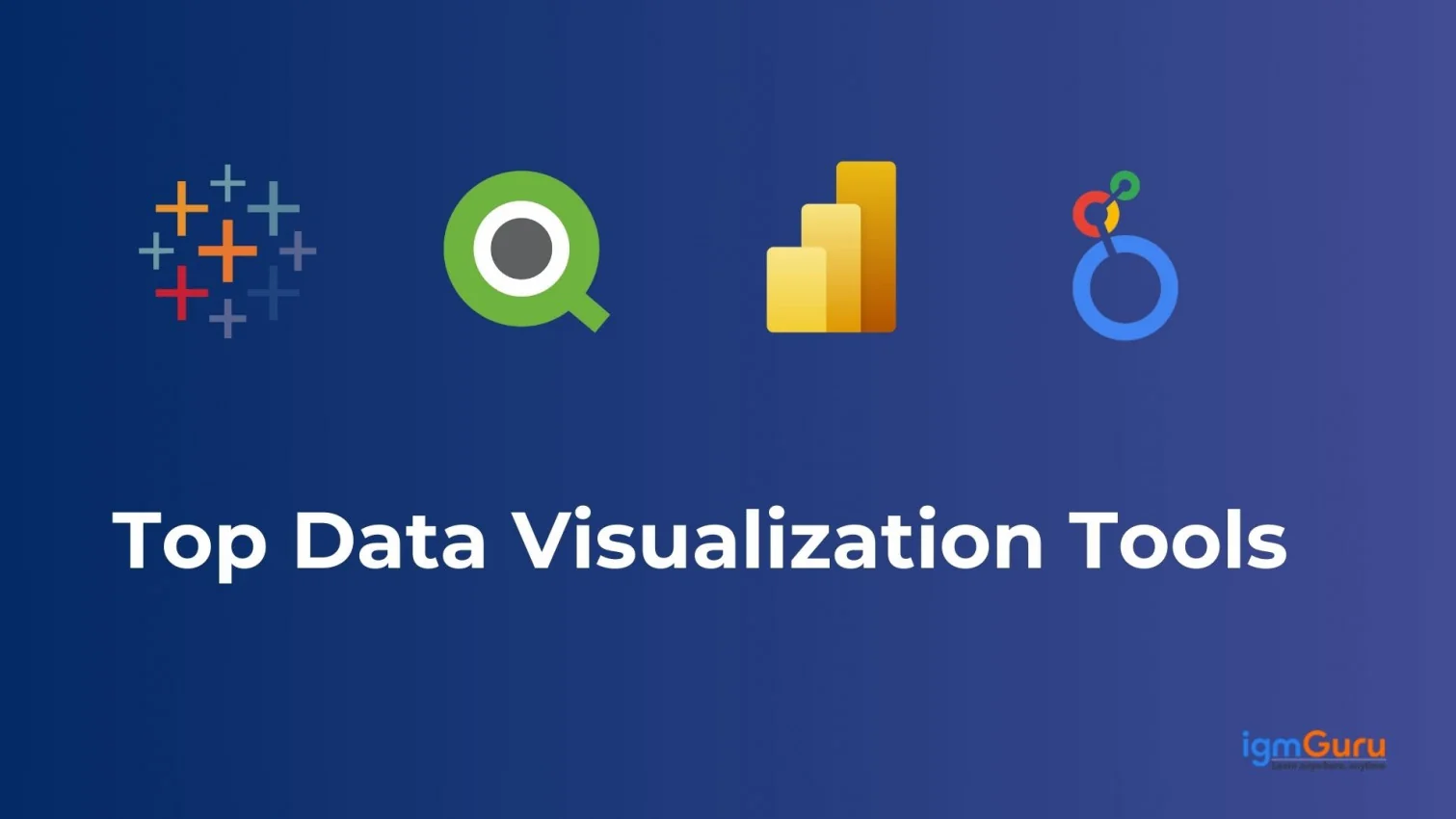
Tableau, QlikView, Power BI, Zoho Analytics, and Looker are some of the best Data visualization tools companies are using to visualize their data. These tools are different forms of software for visualizing data. Each tool's features and capabilities vary. At the basic level, however, they input a dataset to visually manipulate it. Many of them also come with built-in templates for generating basic visualizations.
Here is a table explaining each data visualization tool in a clear and concise way.
| Tool | Rating (Out of 5) | Use Cases | Best For | Price |
| Tableau | 4.5 | Interactive dashboards, enterprise BI, advanced visualization | Enterprises and analysts needing fast, self-service insights | Creator: $75/user/month, Explorer: $42, Viewer: $15 (tableau.com) |
| QlikView | 4.0 | On-premise BI, associative engine, deep analytics | Organizations with in-house BI teams and complex data models | From $200/month (cloud) |
| Power BI | 4.7 | Self-service BI, Microsoft ecosystem, dashboards & sharing | Businesses of all sizes using Microsoft tools | Free, Pro: $14/user/month, Premium: $24/user/month (microsoft.com) |
| Looker | 4.2 | Cloud BI, LookML modeling, embedded analytics | Companies needing modern data modeling & embedding | Custom (contact sales) |
| SAP Analytics Cloud | 4.1 | Cloud BI, predictive analytics, planning | SAP users focusing on planning and enterprise integration | Custom pricing |
| Zoho Analytics | 4.0 | Affordable BI, automation, visual reports | Small and mid-sized businesses | Tiered pricing available |
| Domo | 4.0 | Cloud BI, real-time dashboards, team collaboration | Large teams with multiple data sources | Custom enterprise pricing |
| Yellowfin | 3.9 | BI with data storytelling and collaboration | Organizations needing embedded analytics + narratives | Custom pricing |
| Infogram | 3.8 | Infographics, data storytelling, marketing visuals | Marketers and non-technical users | Free tier + paid plans |
| Grafana | 4.3 | Real-time metrics, monitoring dashboards | DevOps and IT teams monitoring infrastructure | Free (open source); paid enterprise tiers |
| RAWGraphs | 3.7 | Custom, open-source visualizations | Designers and data journalists | Free/open-source |
| Datawrapper | 4.1 | Quick charts & maps for online publishing | Journalists and media organizations | Free tier; paid for branding |
| Jupyter | 4.2 | Code-based visualizations, notebooks for Python/R | Data scientists and developers | Free/open-source |
| Dundas BI | 3.9 | Embedded analytics and reporting | ISVs and enterprises needing customizable BI | Custom pricing |
| Plotly (Dash) | 4.2 | Interactive charts and dashboards | Developers & analysts integrating visuals in apps | Free (open-source); enterprise available |
| Google Charts | 3.8 | Web-embedded JS charts | Developers needing quick visuals for websites | Free |
| ChartBlocks | 3.5 | Simple online chart builder | Non-technical users | Free tier + paid plans |
| FusionCharts | 4.0 | JavaScript charts, enterprise-grade visualizations | Web developers and enterprises | From $497/license |
| Sisense | 4.1 | Full-stack analytics and data modeling | Enterprises with big data and embedding needs | Custom enterprise pricing |
| D3.js | 4.3 | Custom visualizations using JavaScript | Developers needing full visual design control | Free/open-source |
Note- Prices shown are list/starting points (US$) and may vary by region/currency/offer.
There are endless data visualization tools out there. Data usage is changing from all sides and that calls for the need to have amazing tools by one's side. Each tool brings its own set of features and benefits to help the company using it. Here are the best data visualization tools to know about and learn in 2026.
Tableau is among the most powerful and popular tools for visualizing data. There are two main reasons for this claim. One is that it is easy to use and the second is that it is super powerful. It can be connected to different data sources for creating all sorts of maps and charts. Many big companies globally use Tableau, which Salesforce owns.
This tool has different versions - desktop, web-based and server. It also has some customer relationship management (CRM) software. Tableau efficiently creates visualizations from gigantic datasets that are constantly evolving. Artificial intelligence, big data and machine learning applications use these visualization tools. It also integrates well with advanced databases like Teradata, MySQL, SAP, Hadoop, and Amazon AWS.
The benefits of Tableau are quite long. Some of the main reasons behind its preference are-
Just like any other tool, Tableau has its cons -
Explore igmGuru's Tableau training program to become a Data Visualization expert.
QlikView is a major player in the data visualization market. It provides bang-on solutions to thousands of clients in hundreds of countries. Its data visualization tool enables customized and accelerated visualizations. It also incorporates many different solid features like enterprise reporting, business intelligence capabilities and analytics.
It integrates data from many different sources like spreadsheets, databases and much more. A single platform lets users access and analyze data spread throughout the company. It also comes with many advanced analytics features like data mining, statistical analysis and predictive analytics.
There are many benefits of QlikView for any business that uses it.
Here are some drawbacks of QlikView -
Explore igmGuru's QlikView Developer Training program to learn more about QlikView.
Power BI is Microsoft's easily usable data visualization tool. It is available for both on-premise installation as well as deployment on the cloud infrastructure. Power BI is a complete tool that supports many backend databases. This list includes Salesforce, Teradata, Oracle, PostgreSQL, GitHub, Google Analytics, Azure, Adobe Analytics, Excel and SQL Server.
It is an enterprise-level tool for creating stunning visualizations and delivering real-time insights. This tool has a transformative role in every industry and company it enters. It empowers the user by streamlining workflows, propelling the projects to greater heights and optimizing the decisions.
A offers a good amount of benefits to anyone who uses it. These are some must-know pros of Power BI -
Let's look at some cons of Power BI -
Related Article - Power BI Tutorial
Looker is a great open-source data visualization tool that gives detailed data and analyzes important insights. Its real-time data dashboards add more detailed analysis so that companies can instantly make decisions. It also has links with Snowflake, BigQuery, Redshift, and 50+ SQL dialects. This lets it connect easily to different databases.
It is a part of the Google Cloud Platform (GCP). Being a part of such a huge platform reflects the benefits it offers. It has its own dependency language called LookML, which is built around SQL. Thus, professionals with SQL knowledge find it easy to get started with Looker.
It has a long list of benefits. Some of the main pros of Looker are discussed below.
Some of the key disadvantages of Looker are as follows -
Go through igmGuru's Looker Training program to learn Looker with industry experts.
SAP Analytics Cloud has the ability to perform intelligent data analysis for reviewing data and developing visuals for forecasting business consequences. It has some of the most updated modeling tools for delivering insights about any data mistakes. This tool categorizes different data metrics and dimensions with these modeling tools.
It suggests intelligent transformations to the data. This is counted as a top one on the list of the most used tools for data structure visualization. Customer satisfaction is achieved through natural language and artificial intelligence technology for any business questions about data visualization.
This cloud-vase analytics tool is great for data visualization. Some of the top benefits of SAP Analytics Cloud are -
Here are a few drawbacks of SAP Analytics Cloud -
Explore igmGuru's SAP SAC Analytics Cloud Training program to start your career as a data analyst.
Zoho Analytics, one of the best data analytics and business intelligence tools, creates eye-catching data visualizations based on the given data in no time. Zoho Analytics files can be exported in any format, like Excel, Spreadsheet, PDF, etc.
Going for this tool will give a number of benefits to its users. Take a look at some of these mentioned below.
Zoho Analytics has its drawbacks despite its many advantages. Let's take a look.
Domo has different data visualization tools to give a stable platform for data analysis. This creates practical data visualizations for people to understand the data conclusions with ease.
Users must know at least some points out of the long benefits list of Domo which are mentioned below.
Yellowfin is very well known in every part of the world. Its automation product is perfect for people who have to make decisions in less time. It solves analytical challenges and shows businesses what, why, and how it happens.
There are some amazing aids to get from this tool. Here are some of the best ones to find reasons to select this software over other options.
Let's go through some of its cons to understand the tool better.
Infogram does not require its users to have design skills to create striking infographics and charts in less time. It gives many design templates, icons, pictures, maps and charts options to customers.
Some cons of Infogram are mentioned below.
Grafana takes no money from its users to analyze and track data. It's a loved tool by developers and data enthusiasts for its flexibility and its ability to blend with other tools. It has tools to change time series database data into clear visualizations and graphs.
This tool also has some limitations-
The other name for this tool is RawGraphs, which works with data like TSV or CSV files. It gives a link to connect data visualization and spreadsheets. It has different layouts of all kinds, from traditional to modern.
This tool gives a myriad of awesome plus points to users who make the most out of it. Here are some plus points to get an idea -
Now, let's look at a few pointers to highlight the cons of RAW.
DataWrapper is not only free but also well-known in the market. It is known for its deep-rooted ability to present graphical statistics on big data. Users can create maps and charts that they can insert into reports.
There is an endless list of bonuses for this tool and here are some of those -
A few limitations of Data Wrapper are -
Using JupyteR, users can share and create documents that have visualizations, live code, narrative text, and equations with this web application. It is a good one for interactive computing and statistical modeling. It gives hassle-free cleansing and transformation of data.
There are enough reasons to go after JupyteR to enjoy many benefits like the ones mentioned down below -
Here are some disadvantages of the tool.
Dunbas Bi tool makes and shows animated dashboards and scorecards. Users can set up this platform however they want for data analysis in a flexible and open way.
Here are some limitations of this tool-
Plotly gives complete integration with programming languages, which centers around analytics like MATLAB, R, and Python to create complicated visualizations. This tool supports easy cloud deployment and installation.
These are some of the best benefits to convince oneself to get Plotly -
Here are some disadvantages of the tool
Google Charts is a free API and JavaScript-based charting library. It offers simple, engaging charts and enhances web applications with its engaging charting capability. It enables software development teams to envision their website data in the form of area charts, line charts, histograms, pie charts, pictographs and so on.
The criticism against Google data privacy policies raises concerns for users to utilize a Google product.
Shortage of advanced capabilities and features.
This tool's customization options still remain somewhat limited in comparison with other libraries.
ChartBlocks is a robust no-code and cloud-based tool, curated for visualizing data. It visualizes data through a wide range of chart types. It has pre-made templates with a variety of colours, grids, sizes and fonts which can be easily edited. It prevents the requirement for coding or graphic design experience by enabling users to transform spreadsheet data into shareable graphics with ease.
FusionCharts is a web-based data visualization software, bringing a large number of benefits to all sizes of businesses. It utilizes the JavaScript programming language to transform real-time data into comprehensive graphs for organizations. It offers about 2,000 region-specific data maps and over 50 statistical charts or other chart types.
Sisense is a data analytics and BI platform that provides assistance to companies in analyzing and visualizing data from distinct sources into workflows, dashboards, apps, reports, etc. This platform emphasizes businesses that require analytics capabilities but lack adept professionals.
D3 stands for Data-Driven Documents, and D3.js is a JavaScript library that helps you work with documents based on data. It's a solid choice for creating data visualizations. With D3, developers can build dynamic and interactive visual displays right in the browser using HTML, CSS, and SVG. Basically, data visualization is all about showing filtered data as images and graphics.
Effectively conveying information is highly regarded for the growth of a company. There are many different data visualization tools and techniques that play their unwavering role in turning complicated data into concise and actionable insights. But this long list of available tools can also lead to confusion. It all comes down to choosing the right data visualization tools and techniques for your needs. Here are certain pointers to keep in mind-
There is no dearth of amazing tools and techniques for visualizing data. Since there are many different types of data, the tools and techniques apt for visualizing it are also different. Understanding the kind of data one has at hand will directly influence which tool and technique is used.
1. Data Type - Data is often segregated as categorical or numerical. The first one includes customer segments or product categories, which are best represented through pie charts or bar charts. Numerical data includes sales figures or stock measurements. This is best represented through scatter plots or line charts.
2. Data Relationships - Network diagrams or scatter plots are best for showing the relationships between variables.
3. Data Volume - Gigantic datasets must be handled with advanced techniques like interactive visualizations or heatmaps.
Visualizations are supposed to effectively communicate the findings. This can only be done by following best practices, which also ultimately sway which tools and techniques are used. Some key best practices to always stick to are -
1. Simplicity - The visual should be clutter-free and without any unnecessary decorations to avoid any distractions.
2. Consistency - The complete visualization should maintain a consistent style, color theme and look.
3. Accessibility - The entire intended audience should be able to access and understand the visuals. This includes tech people, non-tech people and even those with any disability.
4. Clarity - Clear visuals mean better understandability with clear axes, labels and legends.
5. Interactivity - The interactive elements should be used carefully for engaging the audience thoughtfully.
6. Narrate a Story - Every visualization should have a strong narrative to it. Optimum insights and relevant context help in fulfilling this best practice.
Picking the right techniques and tools is highly dependent on what one finds to be useful over a period of time. This means that one has to learn through experimentation and analysis. See what works best as per the data and intended audience.
Many different job titles and roles today require the individual to have knowledge of the best data visualization tools. Different factors affect which tools and techniques one picks for visualizing their data. All aspirants and learners should have good knowledge about these 20 best ones.
Data visualisation tools are basically software that visualize information in different ways. One can find data patterns, extract valuable insights and make beneficial decisions with these visuals.
Such tools are very important as they are best for identifying data patterns and exploring complicated relationships. Business forecasting and making decisions use these findings.
Many industries like healthcare, retail, hospitality and finance use these tools. These also act as primary tools for data engineers, data analysts, business analysts and other job titles.
Mastering these tools is a simple process. Anyone can master these tools with different methods like joining online courses, tutorials or training. Regularly using them will automatically lead to a high level of experience.
Course Schedule
| Course Name | Batch Type | Details |
| Data Science and BI Courses | Every Weekday | View Details |
| Data Science and BI Courses | Every Weekend | View Details |