CSS is one of the core technologies used in frontend web development. It controls how websites look and behave across different devices. CSS plays a key role in building modern user experiences from layout design to responsive interfaces.
As a result of this, many companies include CSS topics in frontend developer interviews. Candidates are mostly asked questions related to selectors, layout systems, Flexbox, Grid, animations and responsive design.
In this guide, I have compiled the most commonly asked CSS interview questions and answers for beginners, intermediate developers and experienced professionals. These questions will help you revise important concepts and prepare confidently for frontend development interviews. Let’s begin.
These basic CSS interview questions help beginners understand the fundamental concepts of CSS that are commonly asked in frontend developer interviews.
CSS is known as Cascading Style Sheets. It is a stylesheet language used to control the appearance of web pages created using HTML. It helps developers design layouts, colors, fonts, spacing, and responsiveness. It does not style each element manually. CSS separates design from structure by making websites faster and easier to maintain. Modern web development relies on CSS for creating visually attractive and mobile-friendly user interfaces.
CSS is used to improve both the design and performance of websites. It allows developers to style multiple pages using a single file.
Main purposes of CSS:
The latest version of CSS is CSS3. It introduced modern styling features like animations, flexbox, gradients, shadows and responsive layouts. It is not like earlier versions. CSS3 is modular, which means features are released as independent modules instead of one large update. Most modern browsers fully support CSS3. This makes it the foundation of modern UI design and responsive web development practices.
CSS syntax defines how styles are applied to HTML elements using selectors and declarations.
A CSS rule contains:
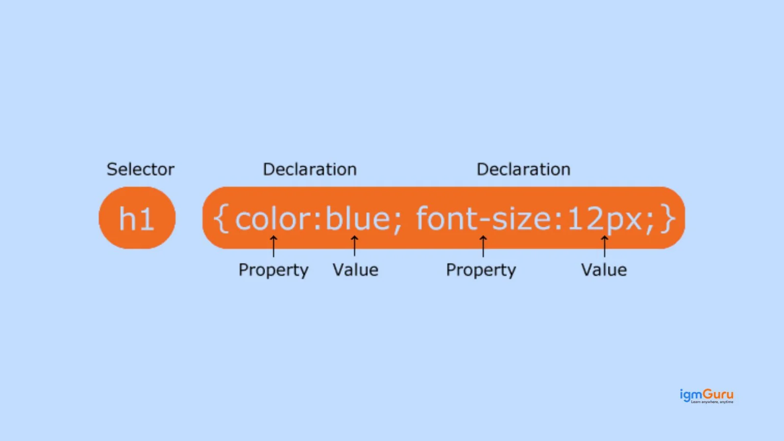
For instance:
|
Understanding CSS syntax is fundamental because every styling rule follows this structure.
There are three ways to apply CSS in a webpage:
1. Inline CSS
Applied directly inside an HTML tag.
2. Internal CSS
Written inside the <style> tag within the HTML file.
3. External CSS
Stored in a separate .css file and linked to HTML.
CSS selectors are patterns used to target HTML elements so styles can be applied to them. They help developers control exactly which elements should receive specific styling rules. Common selectors include:
Selectors are important for writing clean, optimized CSS and are commonly tested in frontend interviews.
Both class and ID selectors style HTML elements, but they serve different purposes.
| Class Selector | ID Selector |
| Used multiple times | Used once per page |
| Written as .class | Written as #id |
| Lower specificity | Higher specificity |
| Reusable styling | Unique element styling |
A CSS rule set is a complete styling instruction applied to selected elements. It combines a selector with one or more declarations.
Structure:
For instance:
|
Rule sets allow developers to maintain structured and readable CSS code across large websites.
CSS frameworks are pre-written libraries that help developers build responsive websites faster using ready-made styles and components. Some popular CSS frameworks:
They reduce development time, ensure responsive layouts, and maintain consistent design systems, which is why many companies expect candidates to understand them during frontend interviews.
CSS provides several benefits in modern web development:
Read Also: Python Tutorial for Beginners
These CSS interview questions focus on core concepts like the box model, specificity, positioning, and display properties that every frontend developer should understand.
The CSS Box Model explains how every HTML element is displayed as a rectangular box. It consists of four parts: content, padding, border, and margin. The content holds text or images. Padding adds space inside the border. The border surrounds the padding. Margin creates space outside the element. Understanding the CSS box model is essential for layout design and spacing in web development.
The difference between margin and padding in CSS is about spacing location. Margin creates space outside an element, separating it from other elements. Padding creates space inside the element, between the content and its border. Margin does not affect the background color, but padding does. This question checks your understanding of layout spacing and is very common in frontend developer interviews.
CSS specificity determines which style rule is applied when multiple rules target the same element. It works on priority. Inline styles have the highest specificity, followed by ID selectors, class selectors, and element selectors. If specificity is equal, the last declared rule is applied. Understanding CSS specificity rules helps avoid styling conflicts and is important for debugging CSS issues.
In CSS, display behavior defines how elements appear on a webpage. Block elements take full width and start on a new line, like <div>. Inline elements take only necessary width and stay in the same line, like <span> . Inline-block elements combine both behaviors. They stay inline but allow width and height adjustments. This concept is essential in CSS layout design.
The display property in CSS controls how an element is rendered on a webpage. It defines whether an element behaves as block, inline, inline-block, flex, grid, or none. For example, display: flex enables flexible layouts, while display: grid creates two-dimensional layouts. This property is widely used in modern responsive web design and frequently asked in CSS interview questions.
Both properties hide elements, but they work differently. When you use display: none, the element is completely removed from the layout and does not take space. When you use visibility: hidden, the element becomes invisible but still occupies space. This difference is important in UI design and performance optimization in CSS-based web applications.
The position property in CSS defines how an element is placed in a webpage layout. It works with properties like top, bottom, left, and right. The main positioning types are static, relative, absolute, fixed, and sticky. CSS positioning is crucial for creating structured layouts, dropdown menus, headers, and overlays in modern frontend development.
CSS positioning types control how elements move on a page. Static is the default position. A relative moves an element based on its normal position. Absolute positions it relative to the nearest positioned parent. Fixed attaches it to the viewport and stays during scrolling. Sticky behaves like a relative until a scroll point, then sticks like fixed. These are essential for responsive layouts.
The z-index property controls the stacking order of positioned elements. Elements with higher z-index values appear in front of lower ones. It only works on elements with position values other than static. This property is commonly used for modals, dropdowns, overlays, and layered UI components. Many interviewers ask about z-index issues in CSS layout problems.
The overflow property in CSS controls what happens when content exceeds the size of its container. It has four main values: visible, hidden, scroll, and auto. For example, overflow: hidden hides extra content, while overflow: scroll adds scrollbars. This property is important in responsive web design and content management in dynamic web applications.
The following questions cover important CSS layout techniques and responsive design concepts such as Flexbox, Grid, media queries, and viewport units.
Responsive web design is an approach where a website automatically adjusts its layout according to screen size and device type. It ensures proper display on mobile phones, tablets, and desktops. It uses flexible grids, media queries, and responsive images. Responsive web design improves user experience, reduces bounce rate, and is essential for modern frontend development and mobile-first website design.
Media queries in CSS are used to apply different styles based on device width, height, resolution, or orientation. They are a key part of responsive web design. For example, developers use breakpoints like 768px or 1024px to adjust layouts for tablets and desktops. Media queries help create mobile-friendly websites and are commonly asked in responsive design interview questions.
Flexbox, also known as Flexible Box Layout, is a CSS layout model used to design responsive and flexible user interfaces. It allows elements inside a container to align, distribute space, and adjust automatically. Flexbox works mainly in one direction, either row or column. It simplifies alignment problems and is widely used in modern frontend development and UI layout design.
In Flexbox layout, the main axis is the primary direction in which flex items are arranged. It depends on the flex-direction property. If flex-direction is row, the main axis is horizontal. If it is a column, the main axis is vertical. The cross axis runs perpendicular to the main axis. Properties like justify-content control the main axis, while align-items control the cross axis.
Flexbox and CSS Grid are both layout systems, but they work differently. Flexbox is one-dimensional, meaning it handles layout in a single row or column. CSS Grid is two-dimensional, allowing control over both rows and columns at the same time. Flexbox is ideal for smaller components, while Grid is better for full page layouts. This difference is frequently asked in frontend interviews.
CSS Grid is a powerful two-dimensional layout system used to create complex web page designs. It allows developers to define rows and columns using properties like grid-template-rows and grid-template-columns. Unlike older layout methods, Grid provides better control and cleaner code. It is widely used in modern responsive web design and enterprise-level frontend applications.
Centering a div in CSS can be done in multiple ways depending on the layout. For horizontal centering, margin: auto works when width is defined. For both horizontal and vertical centering, developers commonly use Flexbox with justify-content: center and align-items: center. CSS Grid can also center elements using place-items: center. This is one of the most searched CSS interview questions online.
Viewport units are responsive length units in CSS. The vh unit represents 1 percent of the viewport height, and vw represents 1 percent of the viewport width. For example, 100vh covers the full screen height. These units are commonly used in full-screen sections, hero banners, and responsive layouts. Understanding viewport units is important in modern responsive CSS design.
The width property defines the fixed width of an element. The max-width property sets the maximum limit an element can grow to. In responsive web design, max-width is preferred because it allows elements to shrink on smaller screens while preventing overflow on larger screens. This helps maintain flexible and mobile-friendly layouts in modern CSS development.
The box-sizing property controls how width and height are calculated in CSS. By default, content-box includes only content size, and padding and borders are added outside. With border-box, padding and border are included inside the defined width and height. Most developers use box-sizing: border-box for easier layout control and predictable responsive design.
Read Also: Python Interview Questions And Answers
These advanced CSS interview questions explore deeper topics like pseudo-classes, animations, transforms, CSS variables, and preprocessors used in modern web development.
Pseudo-classes in CSS define the special state of an element. They are used to style elements based on user interaction or position in the document. Common examples include :hover, :focus, :active, and :nth-child(). Pseudo-classes are widely used in interactive UI design and form styling. This is a common advanced CSS interview question for frontend developer roles.
Pseudo-elements in CSS are used to style specific parts of an element. They are written using double colon syntax like ::before, ::after, ::first-letter, and ::first-line. Unlike pseudo-classes, pseudo-elements create virtual elements inside the selected element. They are commonly used for adding decorative content, icons, or styling text without modifying HTML structure.
Both ::before and ::after are CSS pseudo-elements used to insert content before or after an element’s content. The ::before element appears at the beginning, while ::after appears at the end. They require the content property to work. Developers use them for adding icons, decorative elements, or styling effects. This difference is often asked in advanced CSS interviews.
CSS variables, also called custom properties, allow developers to store reusable values inside a stylesheet. They are defined using --variable-name and accessed using the var() function. For example, colors and font sizes can be stored once and reused. CSS variables improve maintainability, theme switching, and scalable design systems in modern frontend development.
CSS preprocessors such as Sass and Less extend normal CSS with advanced features like variables, nesting, mixins, and functions. They make large projects easier to manage. The preprocessor code is compiled into standard CSS before being used in browsers. Many companies use Sass in real-world projects, so this question is common in experienced frontend developer interviews.
The opacity property in CSS controls the transparency level of an element. It accepts values between 0 and 1, where 0 means fully transparent and 1 means fully visible. For example, opacity: 0.5 makes an element semi-transparent. Opacity affects the entire element, including text and child elements. It is commonly used in overlays, hover effects, and UI animations.
Opacity controls transparency, while visibility controls whether an element is visible or hidden. When opacity is set to 0, the element becomes transparent but still remains clickable and occupies space. When visibility is set to hidden, the element is invisible but still takes layout space. This difference is important in UI behavior and interactive CSS design.
CSS animations allow elements to gradually change from one style to another using keyframes. Developers define animation stages using @keyframes and apply them with properties like animation-name and animation-duration. CSS3 introduced animation features, making it possible to create smooth transitions without JavaScript. Animations improve user experience and are common in modern web interfaces.
CSS transition is used for simple style changes between two states, usually triggered by events like hover. It defines start and end states. CSS animation, on the other hand, can have multiple stages defined with keyframes. Transitions are easier for small effects, while animations are suitable for complex sequences. This difference is frequently asked in advanced CSS interview questions.
The transform property in CSS is used to apply visual transformations like rotate, scale, translate, and skew to elements. It changes the appearance without affecting the document flow. For example, transform: rotate(45deg) rotates an element. Transform is widely used in animations, hover effects, and interactive UI design, making it an important topic in frontend interviews.
These practical CSS interview questions focus on real-world problems developers often face while working with layouts, performance, and debugging styles.
If CSS is not applying, common reasons include incorrect selectors, higher specificity overriding your styles, or CSS file not linked properly. Sometimes browser cache causes old styles to load. Also check for syntax errors like missing semicolons. Using browser developer tools helps inspect applied styles. Understanding CSS specificity and cascading rules is key to solving this issue.
The z-index property only works on elements with position set to relative, absolute, fixed, or sticky. If the position is static, z-index will not apply. Another common issue is stacking context, where parent elements affect layering. To fix z-index problems, check positioning, stacking context, and ensure the element has a higher value than overlapping elements.
Debugging CSS issues usually starts with browser developer tools like Chrome DevTools. Inspect the element to see which styles are applied or overridden. Check specificity conflicts and inherited styles. Look for layout issues using box model visualization. Clearing browser cache can also help. Effective CSS debugging is an important practical skill in frontend development interviews.
Improving CSS performance helps websites load faster and rank better in search engines. Best practices include removing unused CSS, minimizing file size, and combining multiple CSS files. Use CSS minification and avoid deeply nested selectors. Prefer efficient layout systems like Flexbox and Grid. Optimized CSS improves rendering speed and overall frontend performance.
Mobile-first design is a responsive web design strategy where developers design for small screens first, then expand for larger screens using media queries. It ensures better performance, cleaner layouts, and improved user experience on mobile devices. Since most traffic comes from smartphones, mobile-first design is widely used in modern frontend development.
You can create a responsive website using pure CSS without Bootstrap or other frameworks. Use flexible grids, percentage widths, and max-width instead of fixed sizes. Apply media queries to adjust layouts for different screen sizes. Use viewport units like vh and vw. Flexbox and CSS Grid help create adaptive layouts without external libraries.
Accessibility in CSS means designing websites that are usable for people with disabilities. It includes proper color contrast, readable font sizes, visible focus states, and avoiding hidden interactive elements. Use relative units like rem for scalable text. Good CSS accessibility improves user experience and is increasingly important in modern frontend interviews.
Reset CSS removes all default browser styling to create a consistent base. Normalize CSS keeps useful default styles but corrects browser inconsistencies. Reset provides a blank starting point, while Normalize maintains better usability. Many modern projects prefer Normalize because it preserves helpful defaults while ensuring cross-browser compatibility.
Unused CSS increases file size and slows page loading. You can remove unused styles manually or use tools like browser coverage reports. CSS purging tools in build systems help eliminate unused classes. Writing modular CSS and avoiding overly generic selectors also helps. Reducing unused CSS improves performance and search engine optimization.
Browser rendering affects how CSS is applied and displayed on a webpage. The browser parses HTML, builds the DOM, applies CSS to create the CSSOM, and then renders the layout. Heavy CSS files can block rendering and delay page load. Understanding the critical rendering path helps developers optimize CSS for faster performance and better user experience.
The following trending CSS interview questions highlight modern tools, frameworks, and new CSS features that are frequently discussed in frontend interviews today.
CSS3 is the latest evolution of CSS. It introduced advanced features like animations, transitions, flexbox, grid layout, gradients, and media queries. Earlier CSS versions focused mainly on basic styling. CSS3 is modular, meaning features are developed in separate modules. Modern responsive web design relies heavily on CSS3 features for interactive and dynamic user interfaces.
CSS Modules are a styling approach where class names are locally scoped to a specific component. This prevents global naming conflicts in large projects. They are commonly used in React and modern frontend frameworks. Instead of global styles, each component has its own CSS file. CSS Modules improve maintainability, scalability, and structured frontend architecture.
Tailwind CSS is a utility-first CSS framework used to build custom designs directly in HTML using predefined classes. Instead of writing custom CSS, developers use utility classes like flex, mt-4, or text-center. It speeds up development and ensures responsive design. Tailwind is widely used in modern frontend development and frequently appears in frontend interview questions.
The Bootstrap grid system is a responsive layout system based on 12 columns. It uses containers, rows, and columns to structure content. Developers can define column sizes for different screen sizes using classes like col-md-6 or col-lg-4. The Bootstrap grid system simplifies responsive web design and is commonly asked in CSS framework interview questions.
The calc() function in CSS allows dynamic calculation of values using mathematical expressions. It supports addition, subtraction, multiplication, and division. For example, width: calc(100% - 50px) adjusts layout based on available space. The calc() function is useful in responsive layouts and flexible designs. It reduces the need for JavaScript for simple layout calculations.
The difference between rem and em units in CSS relates to how font sizes are calculated. The em unit is relative to the font size of its parent element. The rem unit is relative to the root element’s font size, usually the html tag. Using rem ensures consistent scaling across the website. This question is common in responsive typography interviews.
In CSS, absolute units like px, cm, and in have fixed sizes. Relative units like %, em, rem, vh, and vw adjust based on screen size or parent elements. Modern responsive web design prefers relative units because they adapt to different devices. Understanding this difference is important for building mobile-friendly and scalable layouts.
The object-fit property in CSS controls how images or videos fit inside a container. Common values include cover, contain, fill, and none. For example, object-fit: cover ensures the image fills the container without distortion. It is widely used in responsive image design and modern UI development.
A sticky footer layout ensures the footer stays at the bottom of the page, even when content is short. It does not overlap content. Developers often use Flexbox or Grid to create a sticky footer. This layout improves user experience and is common in modern responsive web applications.
The future of CSS includes features like container queries, subgrid, improved logical properties, and better performance optimization. Modern CSS focuses on responsive design, accessibility, and scalable UI systems. Utility-first frameworks and component-based styling are also growing trends. Staying updated with modern CSS trends is important for frontend developer interviews and real-world projects.
CSS is a fundamental skill for anyone who is preparing for frontend developer interviews. When you understand concepts like the box model, selectors, Flexbox, Grid and responsive design, it helps you in solving real-world UI problems. The guide has covered the commonly asked basic CSS concepts to advanced and practical interview scenarios. Practicing these questions will help you in strengthening your fundamentals and so you can perform confidently in technical interviews.
The most common CSS interview topics are selectors, box model, Flexbox, Grid layout, responsive design, CSS specificity, positioning, animations and performance optimization.
Yes, CSS is beginner-friendly because it focuses on styling rather than programming logic. Yet, mastering layout systems like Flexbox, Grid, and responsive design requires practice.
Yes, most front-end developer interviews include CSS questions because layout design, responsiveness and UI styling are essential parts of modern web development.
Explore Our Trending Articles-