Anyone working on Windows will surely have come across Excel in their experience. It is really a good tool for data consolidation, metrics tracking, and decision-making. These are indeed great functions, but do you know how to use them? It requires creating an interactive dashboard in Excel. These dashboards can collect and visualize all data in an interactive way.
The tool has been upgraded many times with stronger features since it was first introduced in 1985. Now, companies of different sizes are using this tool in their data-related tasks. It is among the top 5 data analytical tools with a market share of 8.06%. This means adding a new skill to your can open a variety of opportunities for you.
A dashboard in Excel gives a compact visual representation of information. These are specially designed to be interactive, easy to understand and concise. Experts can easily extract useful insights from this representation. These contain many elements like raw numbers, characters, tables, and different types of charts.
Dashboards in Excel are so flexible that they can be customized according to different requirements. One can filter, explore and break down its information for better decision making.
A dashboard in Excel is used for many applications. It represents a consolidated and visual overview of data from different sources in a single plane. Experts use this view to detect trends, oversee performance and make informed decisions. They do not have to explore humongous datasets while using these dashboards. Listed below are some of the benefits of these dashboards -
Explore our comprehensive guide on top data visualization tools.
Excel has many dashboards and templates to choose from. Each of them caters to different requirements. It is important to select the best one. Understanding their types can be very beneficial to choose the suitable one. The following are some of the most popular types of dashboards in Excel-
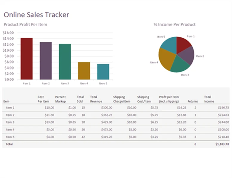
An online sales tracker is a type of KPI dashboard in Excel. The recent COVID-19 pandemic has closed many offline and small businesses. Many of them have started online businesses to recover from their losses. This is where they need a platform to manage their sales, spending, and overall performance.
The online sales tracker dashboard is one of the best options in this instance. It lets businesses track metrics of their performance, sales, and profits. A very simplistic visual of business yet is robust. It is also the best template to start working on these dashboards for beginners.
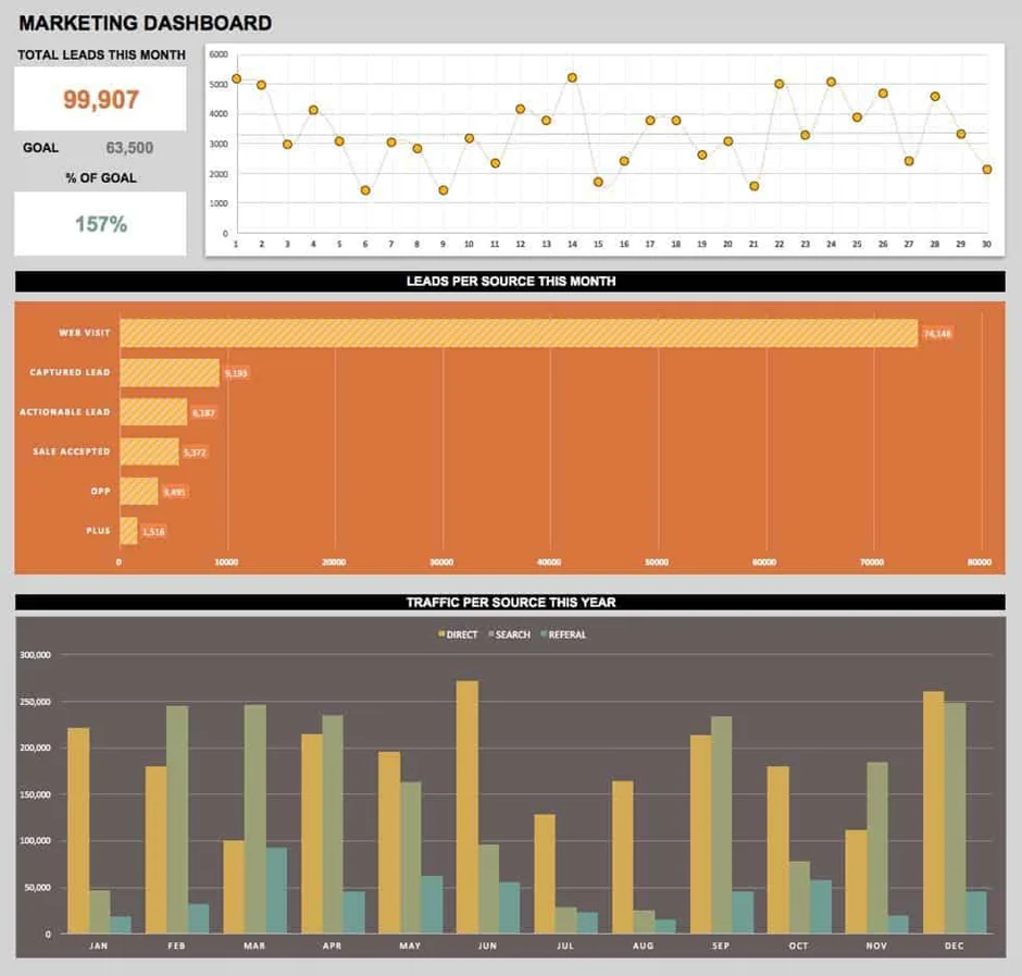
The marketing team drives sales on services and products for each level of companies from small startups to big enterprises. They require a lot of research to understand their customers, business nature and the overall trends. Marketing analytics is a simple as well as a robust dashboard. It is best for monitoring all the leads and their process.
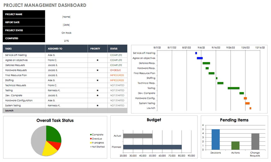
Project management is considered as a complicated job to perform. It involves a lot of stages and processes. This requires complete planning and evaluation of each element of a project. This is where project management templates come as handy dashboards.
It monitors all the tasks, timelines and budgets by using different visualizations. It uses Gantt charts, budget, overall task status and pending items into visualization. This streamlines the project and schedules all tasks without overdoing the budget.
Related Article- How to Create a Dashboard in Power BI
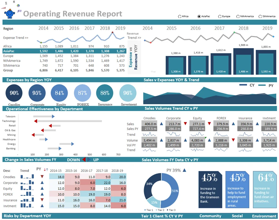
The operational revenue template is another example of these dashboards. It shows the complete revenue of a company generated by its primary business activities. It is an advanced version of the previous dashboard. This contains expenses and revenue of a business from an operational perspective. It also includes sparkline visualizations.
Read Also - Top Data Analysis Tools
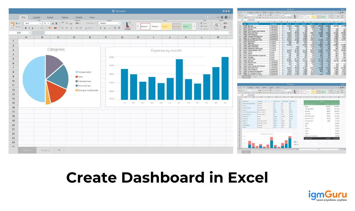
Let's come to the main point of discussion - how to create an interactive dashboard in Excel. Creating a dashboard in Excel involves many steps, including organizing data, using pivot tables, creating pivot charts and adding interactive elements. Follow the steps listed below to build a dashboard in Excel -
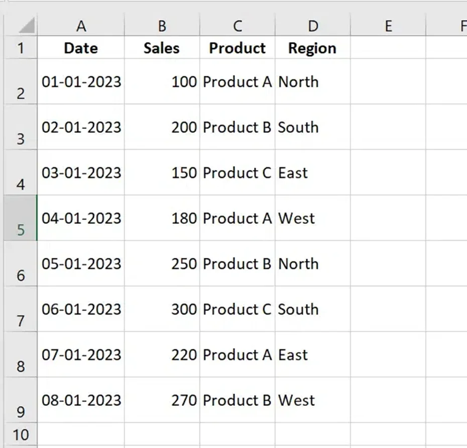
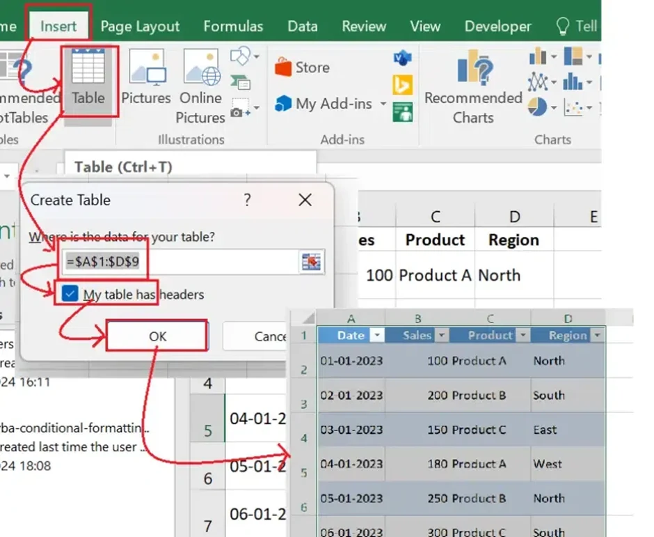
Clean and organized data is the foundation of dashboards. These dashboards are meaningless and can not give important insights without structured data. Data is structured with the following steps -
Now it is time to plan a layout for the dashboard. This involves selecting different elements like KPIs, Charts and interactive filters. KPIs highlight all key metrics, including total sales, growth percentages, and average revenue. Charts visualize trends using different visuals like bar, line or pie. Filters like slicers or dropdowns give dynamic features.
Also Explore: Microsoft Excel MCQs
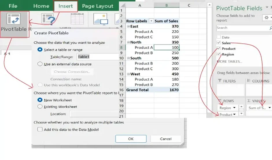
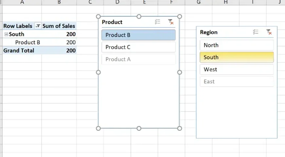
PivotTables work as the backbone for most dashboards. They can summarize and analyze humongous data sets quickly. Creating a pivot table involves selecting table > clicking on insert PivotTable, choosing a space in the worksheet, and dragging filters to the PivotTable.
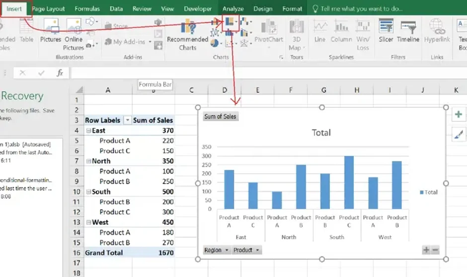
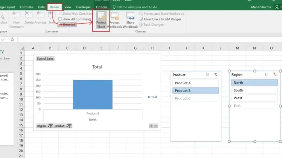
Now add charts to transform raw data into visual insights. This lets users easily track trends and patterns to make informed decisions. Select the PivotTable and click on the Insert Chart option. There are many options available to select from like Column, Line, Pie and more.
Also Read: Top Excel Interview Questions and Answers to Prepare for your next Excel Interview
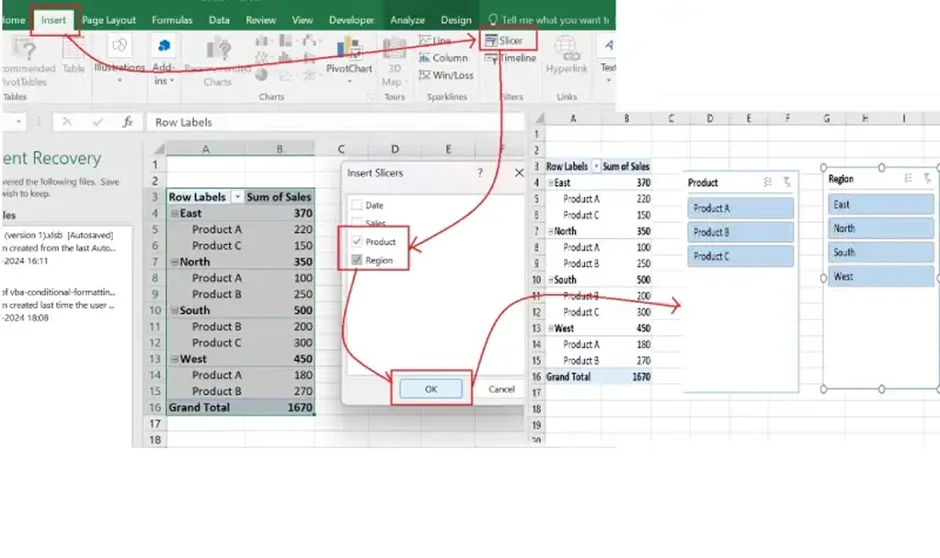
Use of interactive filters creates user-friendly dashboards. Viewers can focus on specific data points once they implement filters in dashboards. This involves selecting PivotTable > choosing the Insert Slicer option > selecting fields to filter > resizing slicers on the dashboard > and positioning them.
Also Explore: How to remove spaces in Excel?
The simplicity of dashboards depends on its presentation and design. More appealing designs are often easy to understand. Use the following tips to create an interactive template -
It is important to test the functionality before sharing the dashboards with the team. Just check that each chart and KPIs update dynamically with filters. Check all the formulas added in the workflow. There is an option, namely Protect Sheet, in the Review section. It can set passwords to prevent fortuitous edits.
Creating an Excel dashboard is not only about adding charts and KPIs. The real goal is to present information in a way that helps users make decisions quickly. Over the years, I have found that simple and focused dashboards often perform much better than dashboards packed with dozens of charts and metrics. The following best practices can help you create dashboards that are both professional and easy to use.
One of the most common mistakes I see is trying to display every available metric on a single screen. In most cases, decision-makers only need a few critical KPIs. Concentrate on the metrics that directly support business objectives and remove unnecessary visualizations that may distract users.
When building dashboards, I prefer placing the most important KPIs at the top, followed by charts and supporting details. Users should be able to understand the overall performance within a few seconds without scrolling through multiple sections.
Consistency improves readability. Use the same color palette, font styles, chart formatting, and number formats throughout the dashboard. A consistent design not only looks professional but also helps users interpret information more quickly.
Different charts serve different purposes. Line charts work well for trends, bar charts are effective for comparisons, and pie charts should be used sparingly. In my experience, selecting the correct chart type has a bigger impact on usability than adding more visual elements.
Features such as slicers, timelines, and filters allow users to explore data without modifying the underlying workbook. Interactive dashboards provide greater flexibility and help users analyze specific regions, products, departments, or time periods more efficiently.
Even the best-designed dashboard becomes unreliable if the underlying data is inaccurate. Before creating visualizations, verify formulas, remove duplicate records, and ensure that data sources are updated correctly. Accurate data is the foundation of meaningful insights.
Before distributing a dashboard to stakeholders, test all filters, charts, PivotTables, and formulas. I always recommend reviewing the dashboard from the perspective of an end user to ensure that every element works as expected and that the information is easy to understand.
Following these best practices will help you create dashboards that are visually appealing, easy to maintain, and capable of delivering actionable insights for better decision-making.
Mastering how to create dashboards in Excel can open up a world of possibilities. Experts with this skill can efficiently organize and visualize data to make informed decisions. We have explained all the steps to create an interactive dashboard in this article. This knowledge is enough to get started with this tool.
Excel is an excellent choice for creating dashboards. It gives robust tools like charts, slicers, PivotTables and conditional formatting for data analysis and visualization.
There are many templates available for creating dashboards in Excel. Each of them focuses on delivering different functionalities. This article has explained some of them in detail.
The KPI dashboards involve the sales, spending, finance, and customer services of a business. This gives a complete overview on the status of business alongside strategies to improve it.