Data conversations often start with collecting data or analysing it, and only later do people mention visualizing it. Yet, after working closely with data over the years, I've seen that visualization is not just a "final step." It's the step that actually unlocks meaning and drives better decision-making. Good visualizations turn raw numbers into clear insights, revealing patterns and trends that might otherwise stay hidden.
The demand for visualization has been growing rapidly across industries. The global data visualization market was valued at USD 8.855 billion in 2019 and is expected to reach USD 19.20 billion by 2027- clear proof of its increasing importance. As organizations adopt data-driven decision-making, visualization tools and skills are becoming essential.
In this guide, you will understand what data is visualization, its importance, benefits, types, best tools, and real-life use cases.
Data visualization is a practice for representing data and information through graphs, charts, maps, and other visual tools. It is easy to understand the outcome, trends or patterns with these representations or visualizations. The findings are also more accessible to non-technical users for greater usage. Let's understand its importance.
Get a comprehensive guide on how to become a Data Analyst for a bright career.

It is quite not that convenient to obtain information from a data table and this is where visualization comes in handy. Here are some more points to prove the importance of data visualization.
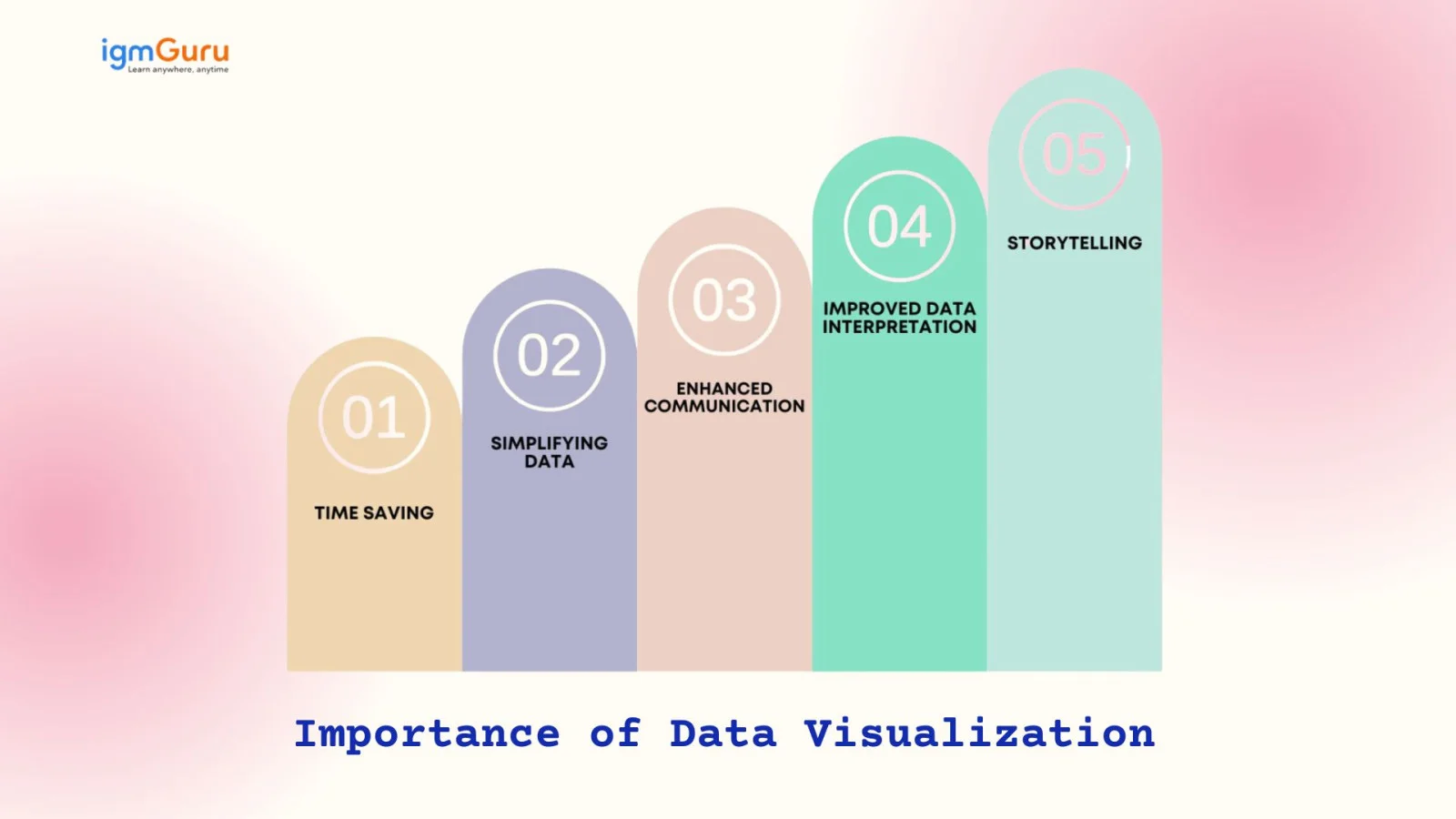
Data visualization helps users instantly understand complex information through charts and graphs. Instead of going through lengthy spreadsheets, decision-makers can spot trends and outliers quickly, saving time and improving efficiency.
Raw data can be overwhelming, especially in large volumes. Visualization transforms this data into easy-to-understand visuals, making complex relationships clearer. It helps non-technical users comprehend insights without needing great analytical skills or technical expertise.
Visuals speak louder than numbers. Data visualization turns intricate datasets into visual stories that are easier to share and explain. It bridges the communication gap between technical teams and stakeholders, ensuring everyone interprets data with the same understanding.
With well-designed visuals, patterns, correlations, and anomalies become more apparent. This clarity leads to faster and more accurate decision-making. Data visualization helps users interpret information in a way that supports meaningful insights rather than raw statistics.
Data visualization transforms data into a compelling narrative. By combining visuals with context it helps tell a story that drives engagement and action. This storytelling aspect makes data more relatable, memorable, and impactful for audiences of all levels.
For example, if a data analyst has to create a visual report for company executives detailing the profits of various products, then the data story can start with the profits and losses of multiple products and move on to recommendations on how to tackle the losses.
The visualization process presents data in a comprehensive manner, playing an important role in the growth of organizations. Dashboards provide visibility to data by tracking and visualizing it through different techniques, such as those mentioned below.
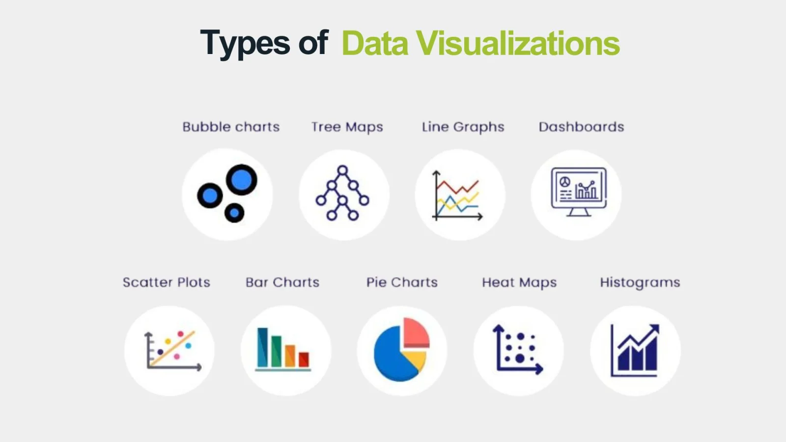
This graph displays data through a bar chart where the bars touch each other. It helps to see how many numbers fall into each range, making it easier to spot any outliers in the dataset.
A table consists of columns and rows for making a comparison between things, providing a big picture and neat information.
These maps are great for showing how people behave based on their location. They can represent spots on a map or even different areas of a webpage.
These charts show sections that make up a whole. They're an easy way to display data and see how each part compares to the others.
It comes in handy for showing changes in data over time. Line charts connect data points with lines, while area charts stack those points on top of each other and use colors to show different variables.
These maps are a cool way to show hierarchical data using nested rectangles. They help you compare the sizes of different categories based on their area.
This helps you see the relationship between two variables and is often used in regression analysis. Just keep in mind, they might get mixed up with bubble charts, which add a third variable through the size of the bubbles.
After understanding types, it's time to explore why it truly matters- the benefits. These advantages show just how powerful data visualization can be for both learners and businesses. Once you grasp them, you will see why it's worth investing time to master this skill and its top tools.
It discovers the otherwise lost hidden trends in data. Laying out the entire data in a visually comfortable manner makes data trends easily observable. Not only data scientists and analysts but even non-tech professionals can make out these trends.
Top management and stakeholders are highly interested in using this practice for meaningfully interpreting data. A lot of time is saved because data analysis happens faster and a bigger picture can be visualized in less time. This leads to the identification of patterns, gaining insights and discovery of trends to stay ahead of the competitors.
Different techniques and tools related to this practice effectively communicate the results of data analysis to a large team. Many employees can visualize data simultaneously for developing common plans and goals. Visual analytics measures goals and related progress to improve team motivation.
Data visualization highlights customer needs and behavior through clear visuals. Sales and marketing teams can quickly spot service gaps and respond with targeted strategies to reduce inefficiencies and improve customer satisfaction.
While visualization of any kind of data offers powerful insights, it isn't without its drawbacks. Certain limitations can affect accuracy, interpretation, and decision-making if not handled carefully. Let's discuss them below-
A platform could be prone to cyberattacks or other threats, compromising the security of data. It's a great concern as the possibility of utilizing a data set that is not compliant with privacy regulations is also there.
A user requires training on the tools which is being utilized to prevent creating the incorrect visual type. A complicated visualization appears to be disarranged, making it tough to gather insights.
This is a real issue. We need to check visualizations and the data behind them to make sure they aren't skewed in any way. If we skip this step, it can hurt the trustworthiness of the analysis. For instance, if a data set doesn't include important groups in a population, the resulting visualization could be misleading.
People may mean well when using a visualization tool, but they can still come away with the wrong ideas from the detailed visuals.
Organizations are witnessing significant improvements in their operations through the implementation of these practices. Here are some of the best practices for visualizing data.
Learning data visualization is incomplete without learning about the top data visualization tools. Data analysts and scientists use different tools for different work and data sets. Each of these tools serves distinct purposes and communicates the findings in a more refined and easier way. Let's take a look at the top visualization tools -
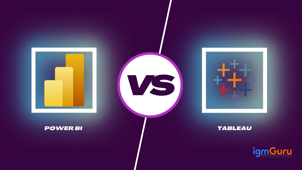
Tableau is an extremely popular business intelligence tool on a global level. It has a straightforward drag-and-drop functionality that makes it highly accessible for everyone. People can show their findings about the business's data through interactive visualizations.
Power BI is a Microsoft solution for business intelligence and visualizing data. It is very famous for self-service analytics, predictive analytics, reporting and other tasks. This Power BI tutorial has all the necessary information to begin learning and using this tool.
Looker is a modern data exploration and business intelligence platform, now part of Google Cloud. It enables users to create dynamic dashboards, generate in-depth reports, and connect to various data sources seamlessly. Looker's modeling layer (LookML) allows teams to define business logic centrally, ensuring consistency across the organization.
Qlik Sense is a powerful, self-service and analytics tool. It features an associative data engine that allows users to explore information freely, without being limited to predefined queries. With AI-driven insights, strong data integration capabilities, and a user-friendly interface, Qlik Sense supports both beginners and advanced analysts.
Grafana is an open-source platform designed for monitoring, observability, and visualization. It's widely used for creating interactive and real-time dashboards, especially with time-series data from sources like Prometheus and InfluxDB. Grafana's plugin ecosystem and flexible query options make it a favorite for DevOps teams and IT professionals.
Google Data Studio, recently rebranded as Looker Studio, is a free tool for creating shareable dashboards and detailed reports. It integrates seamlessly with other Google services like Analytics, BigQuery, and Sheets. With a drag-and-drop interface and customizable templates, it empowers businesses to visualize data without needing technical expertise.
Choosing the right chart matters more than most people realize. Over the years, I've seen many insights get lost just because the wrong visual format was used. The goal is not to make visuals "look good," but to make them easy to understand. Your chart must match the kind of question you are trying to answer.
A simple rule I follow:
Think about your audience first, the question second, and the chart last. This avoids guesswork and makes your visualizations meaningful, not confusing.
People often treat data analysis and visualization as the same thing, but they serve different purposes. Based on my experience, analysis answers "what is happening and why," while visualization answers "how do we communicate those findings clearly?" Let's explore the difference through a table.
| Point of Difference | Data Analysis | Data Visualization |
| Purpose | Understand datasets, find insights, answer questions | Present insights in visual form for clarity and communication |
| Focus | What is happening and why | How to communicate findings clearly |
| Output | Reports, statistical insights, predictive results | Charts, graphs, dashboards, visual stories |
| Users | Analysts, data scientists, technical professionals | Analysts + non-technical stakeholders |
| Skills Required | Statistics, math, query languages, modeling | Design thinking, storytelling, chart selection |
| Time Consumption | Can be time-intensive due to cleaning and computation | Usually faster once data is analyzed |
| Decision Making | Supports deeper decision-making | Makes insights accessible to wider audience |
| Data Handling | Works with raw, structured, and unstructured data | Works with processed, meaningful data |
| Main Goal | Extract hidden patterns and relationships | Simplify and communicate insights visually |
This section covers 5 real-life data visualization examples that demonstrate its utility across various fields.
Data visualization has played a pivotal role during COVID-19 by keeping a check on the fatal virus. Real-time data regarding the infection rates were being presented by health professionals through engaging dashboards,
Here are some key features -
Data visualization is the way for financial analysts to get insights into stock market trends and make empowered investment choices. These visualization tools provide a detailed view of market indices, stock performance and much more through visualization.
Here are some key features -
Environmental scientists use data visuals to show how climate change is impacting our planet and to push for sustainable habits. For example, NASA's Climate Change portal offers interactive visuals that let you see changes in global temperatures, carbon dioxide levels, and ice melt.
Here are some key features -
Schools are using a visualization tool to keep an eye on how students are doing. Tools like Edmodo and Google Classroom let teachers create dashboards that show grades, attendance, and engagement levels.
Here are some key features -
City planners and traffic officials are using data visualization to improve traffic flow and cut down on congestion. Apps like Waze and Google Maps give drivers and planners up-to-the-minute traffic data.
Here are some key features -
Effective visualization brings out a human's natural tendency to recognize and work with patterns. This article not only covers an answer to 'what is data visualization' but also dives into its benefits, types and tools. Every single tool has a different use and leans on different types to convey the findings from the organizational data.
Visualizing data is an art that takes a good amount of knowledge and skills. One must know what questions to ask, pick the right tool at all times and know what must be highlighted. It takes practice to actually become a pro and once a person reaches the apex, there is no turning back.
It analyzes complicated data, extracts highly valuable insights, identifies trends, and presents them all in a visually appealing manner.
The key goals of visualizing data are exploring, monitoring and explaining.
Bar charts are amongst the best types because they swiftly compare data across different categories to highlight differences and show everything at a glance.
Explore Our Trending Articles:
Course Schedule
| Course Name | Batch Type | Details |
| Business Intelligence Courses | Every Weekday | View Details |
| Business Intelligence Courses | Every Weekend | View Details |