Microsoft Power BI is a powerhouse in the world of data analytics and business intelligence, and for good reason. It's a go-to tool for turning complex data into clear, actionable insights.
But what happens when it's not the perfect fit? Maybe you're hitting performance limits with massive datasets, finding the customization options too rigid, or discovering that the costs are climbing as your team grows. If you're looking for more flexibility, different features, or a better pricing model, you're in the right place.
This guide explores the best Power BI alternatives on the market. Whether you're a data analyst wanting to expand your toolkit or a business owner seeking the ideal solution for your team, we'll help you find the perfect alternative for your next project. Let's get started.
Power BI is one of the most popular data visualization tools by Microsoft. It mainly helps businesses/professionals turn huge amounts of data into easy-to-understand charts, graphs, and reports. Whether an individual is working with spreadsheets, databases, or cloud services, Power BI makes it easier to pull that information together and spot patterns, trends, or insights. It's especially famous with businesses as it permits teams to create interactive dashboards. These dashboards update on time, making decision-making faster and more informed. Plus, as it is a part of the Microsoft terrain, it plays really well with tools like Excel, Azure, and Teams.
Explore igmGuru's Power BI training program to build your career in BA.
It is a powerful tool in the world of data analytics. It offers a vast variety of features for data visualization, reporting, and sharing insights across teams. It's especially famous among businesses that depend on Microsoft products, thanks to its flawless unification with tools like Excel, Azure, and SQL Server. But like any other platform, it isn't without its drawbacks. As it works great for many use cases, there are still some limitations that can become frustrating. The data needs to grow more complex. From performance issues with large datasets to limited customization options and pricing concerns. It might not be the perfect fit for every company.
Let us take a closer look at some of the key limitations of Power BI as a data analysis platform.
It might struggle with very large datasets, especially in its free or Pro versions. Performance may be slower and users may require an upgrade to Power BI Premium to manage larger volumes efficiently.
As it supports row-level security (RLS), setting it up and handling it across many datasets and user groups can get complicated and time-consuming.
This platform offers a good variety of visuals, but fully customizing reports or developing unique visual styles can be limiting without going deeper into DAX or using third-party tools.
Basic reports are easier to make, but after moving into more advanced analytics. Like using DAX functions or custom visuals, there's a notable learning curve.
Even though Power BI supports data through streaming datasets. It is not as strong or flawless as some other platforms, which are built especially for real-time analytics.
It works best when used in parallel with other Microsoft products. If one's business uses different tools or platforms, unification may be tougher or require extra workarounds.
Exporting reports to PDF or PowerPoint is possible, but sometimes it lacks flexibility. Also, sharing reports with users outside the company or without a Pro license can be an obstacle.
Through Power BI Pro, data refresh is limited to 8 times per day (48 times for Premium). This can be an obstacle if one needs constant updates.
This platform is affordable firstly, but as the company grows and one requires more advanced features or higher capacity, the costs can quickly add up, especially with Power BI Premium.
Read Also- Power BI vs. Tableau: Which is Better BI Tool for 2026?
Here is the quick overview for a better understanding.
| Tool Name | Best For | Pricing Model | Key Strength | Learning Curve |
| Salesforce Tableau | Enterprise Visualizations | $15 USD/Per User/Month | Powerful & beautiful interactive visuals | Medium |
| Qlik Sense | Associative Data Exploration | $200 per Month | Uncovering hidden insights via its Associative Engine | Medium |
| Looker Studio | Startups & Google Users | Free | Easy integration with Google products (Analytics, Sheets) | Easy |
| Sisense | Embedded Analytics | Custom (Annual) | Strong API for embedding analytics into apps | Medium to Hard |
| IBM Cognos Analytics | Scalable Enterprise Reporting | $10.60 Per User/Month | AI-driven insights & robust corporate reporting | Hard |
| SAP BusinessObjects | Large Enterprises using SAP | Custom | Deep integration with SAP ERP systems | Hard |
| Zoho Analytics | Small to Medium Businesses | $21.56 per Month (Free tier available) | Affordability & integration with the Zoho suite | Easy to Medium |
| Domo | Cloud-native BI & Collaboration | Custom (Usage-based) | Strong real-time data & collaboration features | Medium |
| Google Charts | Developers & Web Integration | Free | Customizable, interactive charts for websites | Easy (for devs) |
Power BI has earned its place as a popular choice for business intelligence and data visualization, especially for teams already using Microsoft products. It offers solid reporting tools, interactive dashboards, and a wide range of data connectors. But it's not a one-size-fits-all solution. Depending on your specific needs, whether it's more flexibility, better scalability, easier collaboration, or just a different pricing model, Power BI might not check all the boxes.
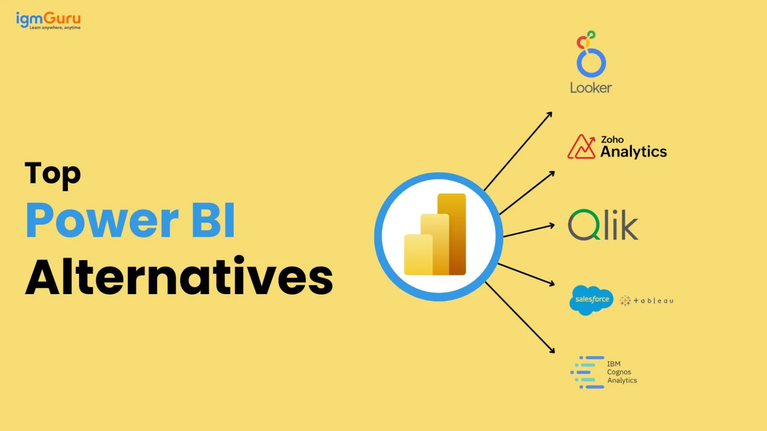
Luckily, there are several great alternatives out there that cater to different use cases and preferences. In this guide, we'll explore some of the top Power BI alternatives that offer unique features, strengths, and advantages that might be a better fit for your business.
Salesforce Tableau is best for Powerful visual analytics and enterprise-level data insights.

Tableau, which is now a part of Salesforce, is one of the strongest and most widely recognized business intelligence platforms in the market. It's known for its rich, interactive visualizations and its capability to connect to virtually any data source. What sets Tableau apart is its drag-and-drop interface, which makes complicated data analysis more accessible, even for non-technical users. At the same time, it offers deep abilities for data analysts and developers through calculated fields, advanced dashboards, and scripting support.
Qlik Sense is best for Associative data exploration.

It uses an in-memory engine that lets users explore data from any angle without being restricted to a predefined path. It's strong in self-service BI and is amazing for uncovering hidden insights through its associative model.
Looker, acquired by Google, is also the top choice for many businesses. It is a free and cloud-based reporting tool that allows users to make reporting quick and easy.

Google's free tool is a solid option for basic dashboards and reporting, especially for teams already using Google products like BigQuery, Sheets, and Analytics. It's easy to use, but more limited in power and customization.
Sisense is best for embedding analytics into products.

Sisense lets one embed interactive dashboards and analytics into apps, websites, or platforms. It's well known for managing complicated data from multiple sources and is developer-friendly with strong APIs.
IBM is best for Scalable enterprise reporting and AI-driven insights.

IBM Cognos Analytics is a long-standing player in the business intelligence space, designed primarily for large companies with complicated data reporting needs. It combines traditional BI capabilities, like pixel-perfect reporting and dashboarding. Through modern features like AI-assisted data discovery, natural language queries, and automated insights.
Read Also- Microsoft Fabric vs Power BI: Which One Should You Choose?
SAP is a Traditional enterprise reporting and integration with SAP systems.

SAP BusinessObjects BI Suite is a complete business intelligence platform tailored for large enterprises. Basically, those already using SAP's ERP or other systems. It has its specialty in producing highly structured, formatted reports and is known for its strong abilities in scheduled reporting, compliance reporting, and enterprise-level distribution.
Zoho analytics is best for small to medium sized businesses looking for affordability.

It gives good functionality for the price. Involving AI made insights, drag and drop dashboards and a huge variety of integrations. It is perfect for smaller teams that need solid BI features without breaking the bank.
Domo is for not going out and doing Cloud native BI with strong collaboration features.

It offers a user-friendly, cloud-first platform with a strong focus on business operations and collaboration. It's especially useful for companies looking to connect different departments and make data more accessible.
Google Charts is the best choice for users looking to create customizable, interactive charts for the web.

Google Charts is a free data visualization tool that permits users, primarily developers, to embed interactive charts and dashboards directly in websites and applications. It supports a huge variety of chart types, including bar charts, pie charts, geo maps, and more, all built using HTML5 and SVG for cross-browser compatibility.
Choosing the right data visualization tool isn't only about picking the most popular software. It's about finding a solution that matches your data needs, business goals, technical expertise, and future scalability. Before choosing the one, consider the following:
Power BI is a strong choice for many businesses, especially for those who have already invested in the Microsoft ecosystem. But it's not the only option, and definitely not always the best fit for every team or use case. Whether it is looking for more advanced visualizations, better capabilities, easier integration with the existing tools, or a more developer-friendly platform, there's an alternative out there that can meet your needs.
From enterprise-grade solutions like Tableau and IBM Cognos to lightweight, flexible tools like Metabase and Google Charts, the BI landscape is full of strong tools customized for different goals. The key is understanding what matters most for your organization, whether that's ease of use, scalability, cost, or customization and choosing a platform that aligns with that vision.
At the end of the day, the best BI tool is the one that helps you make smarter, faster decisions with much confidence.
Ans. It allows you to explore different features, integrations and pricing models that may better suit your requirements.
Ans. Choosing the right alternative includes considering various requirements, including budget, data sources, analysis, operations, and features.
Ans. Metabase and Apache Superset are open-source and free alternatives.
Ans. Tableau and Qlik Sense are the most popular and best alternatives for large enterprises.
Course Schedule
| Course Name | Batch Type | Details |
| Data Science and BI Courses | Every Weekday | View Details |
| Data Science and BI Courses | Every Weekend | View Details |