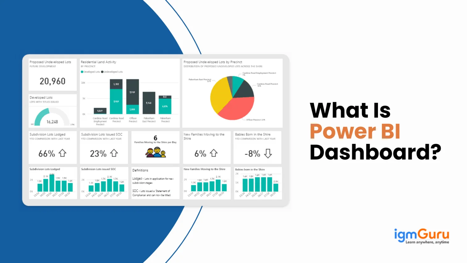
A Power BI Dashboard is a visual reporting tool of Power BI that helps businesses or professionals track data, performance, and key insights in one place. It combines charts, graphs, and real-time reports on interactive dashboards and reports to make it easier to understand trends, monitor progress, and make smarter decisions quickly without dealing with complex spreadsheets or raw data.
In this article, I will explain what a Power BI Dashboard is, how to create a dashboard, and more.

A Power BI dashboard refers to a single-page and interactive canvas. It showcases key insights and metrics from multiple data sources. It offers a unified view of data via visualizations such as graphs, maps and charts. This allows the users to monitor the business's performance at a single glance.
Dashboards are highly interactive and are easily customizable. These help in highlighting important data points. This enables real-time decision-making, along with comprehensive analysis within a consolidated interface.
Related Article - Power BI Tutorial for Beginners
Here are some of the reasons to choose a Power BI dashboard:
A Power BI Dashboard comes with a wide range of features that help businesses analyze data and make better decisions. Here are some useful features of the Power BI Dashboard.
One of the most important features of Power BI Dashboard is its ability to bring data together from different platforms. If you have data stored in the cloud, Excel, SQL Server, Azure, PDFs, or any other online applications, Power BI can combine everything into a single dashboard.
Power BI uses tiles to display important information in a clean and organized way. Each tile represents a chart, graph, KPI, or report section that updates automatically whenever the source data changes. Users can click on a tile to explore the detailed report behind it, making the dashboard interactive instead of just static visuals.
Every business has different reporting needs, and Power BI offers enough flexibility to match them. Users can design dashboards from scratch, arrange visuals based on priorities, and add widgets or reports as needed. Businesses can also use ready-made dashboard templates to save time and quickly start analyzing data.
Power BI supports a wide range of visualizations such as bar charts, pie charts, line graphs, ribbon charts, scatter plots, and waterfall charts. These visuals help turn raw data into meaningful insights that are easier to understand and present.
Dashboards can be shared with team members and stakeholders through Power BI services. This allows teams to collaborate, track performance, and make decisions using the same data in real time.
Power BI works well with many business applications and devices. It can integrate with other software platforms and can be accessed on Windows, iOS, and web-based systems, making reporting more accessible from anywhere.
Reports in Power BI refer to multi-page documents. These present data via various visualizations, like graphs, charts, maps and tables. Each report has the potential to contain several visual elements and pages. Each can offer comprehensive analysis and detailed insights into data from unique and distinct perspectives.
Reports enable users to drill down into certain necessary data points, uncover deeper insights and interact with the visualizations. All this helps in making more informed decision-making and gaining a thorough understanding of key business metrics.
Creating a dashboard in Power BI is not as hard as you think. It involves connecting your data source, transforming the data, and then using charts, tables, and visuals to build an interactive report. Once your report is ready, you can publish it and pin important visuals to a dashboard for better insights and monitoring. You can check out this article to build your own dashboard from scratch.
Power BI dashboards render many advantages for individuals and businesses. Here is a list containing some key advantages of the Power BI dashboard.
Dashboards facilitate users to interact with data via multiple visual elements. These include graphs, maps and charts. This interactivity aids in exploring data from multiple angles and getting deeper insights.
Power BI dashboards offer real-time data updates. This ensures that users get access to the latest information for on-time decision-making. This is imperative to monitor key metrics and respond swiftly to changes.
These can be shared easily with stakeholders and colleagues. It fosters collaboration since team members can interact with and view the same data. This leads to more informed decisions.
These consolidate data from various sources into a unified view. This centralized approach aids in offering a comprehensive outlook of business performance. Hence, eliminates the need to move to and from between different reports and tools.
Power BI dashboards are accessible through mobile devices. Hence, it allows users to seamlessly stay connected to their insights and data on the go. This high-level mobility enables decision-makers to access critical information anywhere, anytime.
Here is the comparison between Power BI Dashboard and Report -
| Feature | Power BI Dashboards | Power BI Reports |
| Definition | A high-level, single-page view that combines visuals from multiple datasets or reports. | A detailed, multi-page document built from a single dataset with deeper analysis. |
| Purpose | To provide a snapshot overview for quick insights and decision-making. | To explore, analyze, and drill down into data extensively. |
| Pages | Limited to one page (single canvas). | Can contain multiple pages for in-depth data exploration. |
| Data Sources | Can pull visuals from various datasets and reports. | All visuals come from a single dataset. |
| Interactivity | Limited interactivity (mainly for viewing, pinning, and linking). | Highly interactive with slicers, drill-throughs, and filters. |
| Customization | Less customizable in terms of layout and design. | Greater control over visual placement, formatting, and layout. |
| Alerts and KPIs | Can set data alerts for KPIs and specific thresholds. | Alerts cannot be set directly in reports. |
| Sharing & Accessibility | Ideal for executives and decision-makers needing quick insights; can be pinned and shared easily. | Used more by analysts or teams requiring comprehensive data views. |
| Usage Scenario | Used to monitor performance metrics, KPIs, and business health at a glance. | Used for storytelling with data, in-depth presentations, and operational reporting. |
| Platform Requirement | Requires Power BI Service (not available in Power BI Desktop). | Created in Power BI Desktop and then published to the Service. |
Here are some of the real-time Power BI dashboard examples that I have created.

Purpose: Track sales KPIs like revenue, profit margins, top-selling products, regional performance, etc.
Key Features:

Purpose: Help CFOs understand company financials at a glance.
Key Features:

Purpose: Optimize logistics, inventory, and supplier performance.
Key Features:
Undoubtedly, Power BI is the most powerful tool and is being used for many reasons. Whereas a Power BI dashboard is a dynamic tool that visually represents data, offering insights at a glance. It helps businesses track key metrics, monitor trends, and make informed decisions based on the data.
A dashboard is one page with pinned visuals from multiple reports, while a report can have multiple pages and detailed exploration.
They help decision-makers quickly track KPIs, spot trends, and monitor performance in real time.
Yes, you can easily share dashboards with teammates through the Power BI service, as long as they have the right access permissions.