Tableau has quickly become one of the top tools for data visualization, helping businesses turn raw data into clear, actionable insights. No matter if you're just getting started or already have some experience under your belt, brushing up on commonly asked Tableau interview questions can give you a solid edge. In today's data-driven world, knowing how to present data in a smart and visually appealing way is a skill in high demand.
This guide is designed for professionals of all levels to walk you through some of the most frequently asked questions in Tableau interviews - along with simple explanations and tips to help you answer them confidently. Whether you're aiming for your first job in data analytics or looking to level up, preparing these questions will bring you one step closer to your dream role. Let's dive in and get you interview-ready.
This blog post is a complete overview of the most commonly asked Tableau interview questions and answers. We have structured these questions based on the experience and expertise required for different job roles. It starts by discussing the basic concepts before progressing to developing and advanced ones. Exploring this blog will not only improve the knowledge of individuals but also boost their confidence.
Understanding of the basic concepts is equally paramount for each level of candidates. Interviewers always test the fundamental knowledge of candidates in the interviews. Sharpen your fundamental knowledge with these basic Tableau interview questions.
Tableau is a robust tool for visualizing data with intuitive dashboards and insightful reports. It is the most potent tool of the business intelligence industry. This tool converts raw information into a simple format that is easy to understand for each employee of an organization. All this information is shown to them in the form of intuitive reports and graphs on dashboards.
Different types of data stores can be connected with this visualization tool, including text files, SQL Server, MySQL, Oracle, Excel spreadsheets and web data connectors.
This tool has different types of charts, including pie charts, line charts, bar charts, maps, scatter plots, treemaps, heat maps, etc. Each of them has its unique characteristics and is suitable for visualizing different information.
This tool gives the following advantages -
This data visualization tool is different from Power BI in different aspects like -
| Basis | Tableau | Power BI |
| Provider | It was introduced as an independent company, but it is now a product of Salesforce. | It is a component of Microsoft. |
| Ease of use | This platform has a complicated learning curve due to intricate customization features. | This platform is user-friendly due to the absence of customization features. |
| Data connectivity | This tool can be integrated with a variety of data stores like online services, cloud platforms and databases. | This tool can be integrated with different data stores like SQL, Excel and Azure. |
| Visualization | It can visualize almost every type of data, whether it is simple or complex. | It is a good visualization tool but lacks when we have to visualize complicated data structures and analytics. |
| Collaboration | This tool can share reports with the help of additional tools. Access to this information can be controlled. | It can easily share dashboards and reports to any co-workers or clients. |
To know in detail, explore our guide, Power BI vs. Tableau.
A fresher is the first job position for an individual. They have to make sure of getting a good experience out of it. It is important to start with a top company to improve its portfolio. Here are the top Tableau interview questions for freshers that will assist them to join one of the best companies.
Different factors make measures and dimensions different, including -
| Factors | Measures | Dimension |
| Nature | These are quantitative and numerical data fields that represent quantities, values and amounts. | These are qualitative and categorical data fields that represent categories, attributes and labels. |
| Usage | These are used to perform mathematical and logical operations like sum, average, multiplication, etc. | These are used to group and segment data, build hierarchies and create visualizations. |
| Examples | Sales, profit, quantity, etc. | Region, product name, category, etc. |
Page shelf is a customizable feature for breaking views into different pages. It is customized according to different factors. It shows an alternative view of each page after performing this feature. This method analyzes the way the page is affecting the other data.
A story is a list that includes a series of dashboards and worksheets. It shows all the information that is stored in these dashboards and worksheets in an arranged manner. Individuals can easily find data relations and valuable insights for decision-making from these representations. The story is published on the web for the audience.
The following practices are useful for improving the performance of this platform -
There are two connection types available in this platform including -
Read Also - Tableau Certifications Guide - Certification Levels and How to Pass
One may want to be promoted to a senior post after getting a sort of experience as a fresher. It requires some advanced knowledge of this platform to get senior jobs roles. Here are some commonly asked Tableau interview questions for intermediates that will assist them in their career improvement.
Query fusion is an ability of this platform. It combines more than one query into a single query to reduce the number of queries. This fusion gives better performance by minimizing the requirement of data space, load and network traffic. The system automatically fuses queries whenever it is possible.
Creating dashboards is the final step of data visualization. There are different methods to build a dashboard, which are as follows -
Data blending is a technique to combine different data sources on a single plane. Here individuals can easily analyze and visualize data from different databases. It is the advanced approach of integrating data stores. Let's take two data sources in which one shows the annual sales of the company and the other the profit and loss of that company.
Working on these data banks will not be possible by using simple joins. This problem can be resolved by data blending, where all the information of the sales will be blended with profit and losses in a proper manner. The result of this data will be stored in a single sheet and will be analyzed or visualized using simple joins.
Worksheet is a basic building block of performing data visualization. It has drag and drop fields that construct graphs, charts and tables. It has a feature of customization by which individuals can include filters, charts and manipulate the formatting inside the sheet. They can design unique visualizations with this feature. It is also possible to create computed fields, data blending and reference lines on a worksheet.
Sets, parameters and groups are the elements that arrange data in a well manner to make it understandable. Set is a collection of different values that are manually selected or blended together depending on a condition. It is dynamic and created across multiple dimensions.
Groups are collections of values that are blended together within a single dimension to create a higher category. These categories are static and appear in the same dimension window as the original values. Parameters are user defined inputs that interact with data and modify visualization. It is used for filtering, calculations, conditional formatting, etc.
Read Also - Tableau Tutorial- A Guide For Beginners
Professionals often go for higher posts after getting a certain experience for their career improvement. Here are some of the most asked Tableau interview questions for experienced professionals. These questions will train them to achieve their dream job in the best companies.
Multi-tenancy is handled with different methods including Row Level Security (RLS) for data restrictions, building projects and permissions for each tenant and deploying a combination of workbook and data sources for each tenant.
Hyper file is a well optimized data engine format of this platform. It stores extracts for faster data inputting and querying, manages huge data stores and optimizes for parallel processing. TDE is the older format in comparison to other data engines that do not have these features. It is almost replaced by hyper files.
We can integrate Tableau dashboard with web page or application to build dynamic and interactive web pages. The content is included in the web application by embedding options and APIs. Here are the steps to build a dynamic website on this tool -
Dashboard is optimized for building better visualizations. There are different strategies that can boost the performance of a dashboard like -
Follow these steps to plot geographical data -
You may also read- Top Power BI Alternatives For Businesses
Tableau developer is one of the well-paid jobs in this field. They earn up to $140,369 per year in the USA and INR 12,00,000 in India. The following are some Tableau developer interview questions that will assist you to become a developer in this field.
LOD expressions solves the parallel period comparison problem by the following steps -
(SUM([Sales]) - [Previous Year Sales]) / [Previous Year Sales] |
{FIXED [Customer ID], DATETRUNC('month', [Date Comparison]): SUM([Sales])} |
DATEADD('year', -1, [Order Date]) |
DATEADD function adds an increment to date and returns a new date. The increment is decided by the data part and interval together. This function can perform several date calculations and operations like building rolling averages, calculating future dates, etc. Let's take an instance of creating a calculated field. The syntax of this function will be as follows -
| DATEADD (interval, number, date) |
Top and bottom five values of a view are displayed by a multistep process. The following are the steps of this process -
RANK(SUM[measure], 'asc') <= [Parameter] OR RANK(SUM[measure], 'dsc') <= [Parameter] |
Group can be created in a calculated field by choosing the calculated field > input the name of field in the dialog box > enter the calculation and click on ok. The calculation given below is an instance of this case -
IF [Container]='Jumbo Box' then 'Big Containers' ELSEIF [Container]='Jumbo Drum' then 'Big Containers' ELSEIF [Container]='Large Box' then 'Big Containers' ELSEIF [Container]='Medium Box' then 'Midsize Containers' ELSEIF [Container]='Wrap Bag' then 'Midsize Containers' ELSEIF [Container]='Small Box' then 'Little Containers' ELSEIF [Container]='Small Pack' then 'Little Containers' END |
Views can be embedded by Tableau server and online on web pages, applications, blogs and portals. Embedding a view into a web page includes clicking on the share button from the top of the view > copy and paste embed code on the web page. This view can only be seen by creating an account on the server.
It requires in-depth knowledge and wide experience to improve career and salary aspects. Here are some Tableau advanced interview questions that are commonly asked in top job role interviews. These questions are apt for the individuals to be positioned at senior posts.
These three are elements of this platform that performs different operations. FIXED is used for calculating the expression for a particular dimension level but view level dimensions are not included. INCLUDE integrates dimensions with view level of detail. EXCLUDE detach dimensions from the view level of detail.
Assume Referential Integrity is a feature to increase query performance for joins when data includes referential integrity. This feature is enabled from the data menu. It will add a joined table in the query if data has referential integrity.
Histogram is the best chart for showing how data points are distributed in a single variable. It displays the counts and frequency of data points inside predetermined bins or intervals. This representation is viewed for observing
outliers, patterns and distributional shape from central tendencies. Histogram charts are especially beneficial for understanding the distribution of numerical and continuous data.
Workbook is the highest level of a container that presents in this framework. It is also referred to as a document that accommodates several dashboards, tales and spreadsheets. This document stores the complete project, including data visualization and connection.
Workbook has some main files to build, store and share projects. All the elements required for data analysis and visualization are stored in these files only. Workbooks manages several dashboards, narratives and worksheets. One can make data source integrations, give parameters and build computed fields on a workbook level.
The percentage of total in a field can be calculated with a simple process. This process includes choosing percentages from the 'analysis' option. It will show different percentages like table, table in the pane, row, row in the pane and cell. Select the one total value from them on which we have to determine the percentage. The system will calculate the percentage after selecting the option.
Read Also- Tableau MCQs to Test Your Knowledge
This section includes some of the most asked scenario-based Tableau interview questions and answers. These types of questions test your problem-solving and decision-making capabilities.
In my Tableau projects, I handle null and special values based on the data context and business needs. For measures, I often use ZN() or IFNULL() to replace nulls with zeros or default values - this ensures charts like KPIs or bar graphs display correctly. For dimensions, I use calculated fields to label nulls as "Unknown" or a relevant category.
If the nulls aren't needed, I filter them out, especially to keep dashboards clean and focused. I also use visual options like "Show at default position" or tooltips to explain nulls when transparency is important. Overall, my approach balances clean visuals with accurate data storytelling.
I often work with data from multiple systems - like Excel, SQL Server, and Google Sheets. First, I assess whether I can combine them within Tableau using data blending or joins, or if it's better to pre-join them outside Tableau using tools like Power Query or SQL views.
When blending in Tableau, I ensure that the primary and secondary sources are properly related and avoid over-complicating the visual with too many secondary fields. I'm also careful with performance and consistency, often validating results by comparing row-level data from each source. This ensures reliable outputs, even from diverse inputs.
Yes, in one project, users misinterpreted a sales trend chart due to a sudden drop caused by missing data in one region. They thought sales had drastically fallen, but it was actually due to data not being uploaded on time.
To resolve this, I added tooltips that explained the cause of any data gaps, and I used annotations on the chart to provide context. I also created a small data quality indicator on the dashboard to flag when data was incomplete. This greatly improved transparency and user trust in the dashboard.
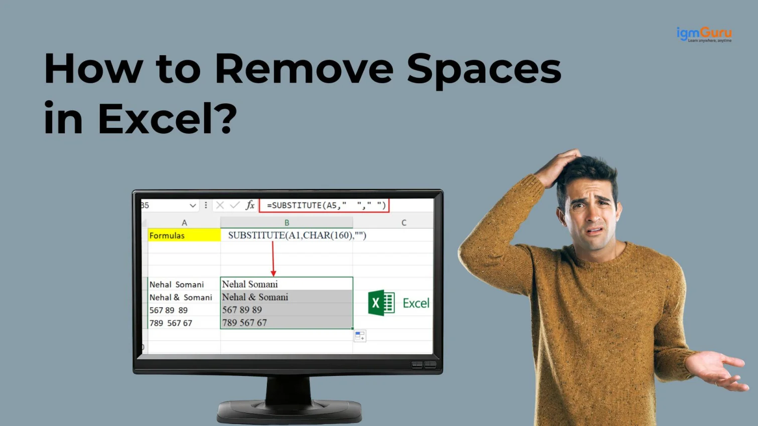
Ok, I will first create a field by using the following expression-
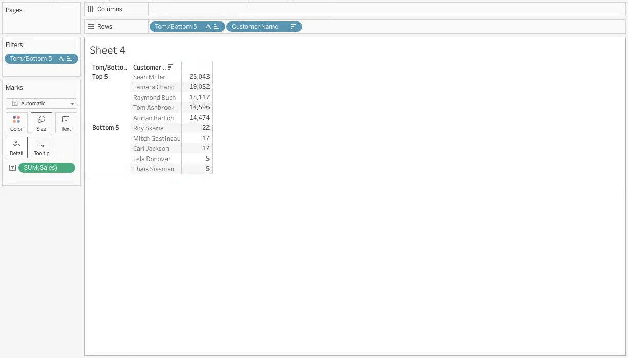
IF RANK(SUM([Sales]), 'desc') <= 5 THEN 'Top 5' ELSEIF RANK (SUM[Sales]),'asc') <= 5 THEM 'Bottom 5' ELSE NULL END |
Next, I drag the newly created field to the Filters shelf and choose only the 'Top 5' and 'Bottom 5' options. After that, I place the same field onto the Rows shelf. Then, I add Customer Name to the Rows shelf as well, and drag the Sales field onto the Text label to display the values. That completes the setup.
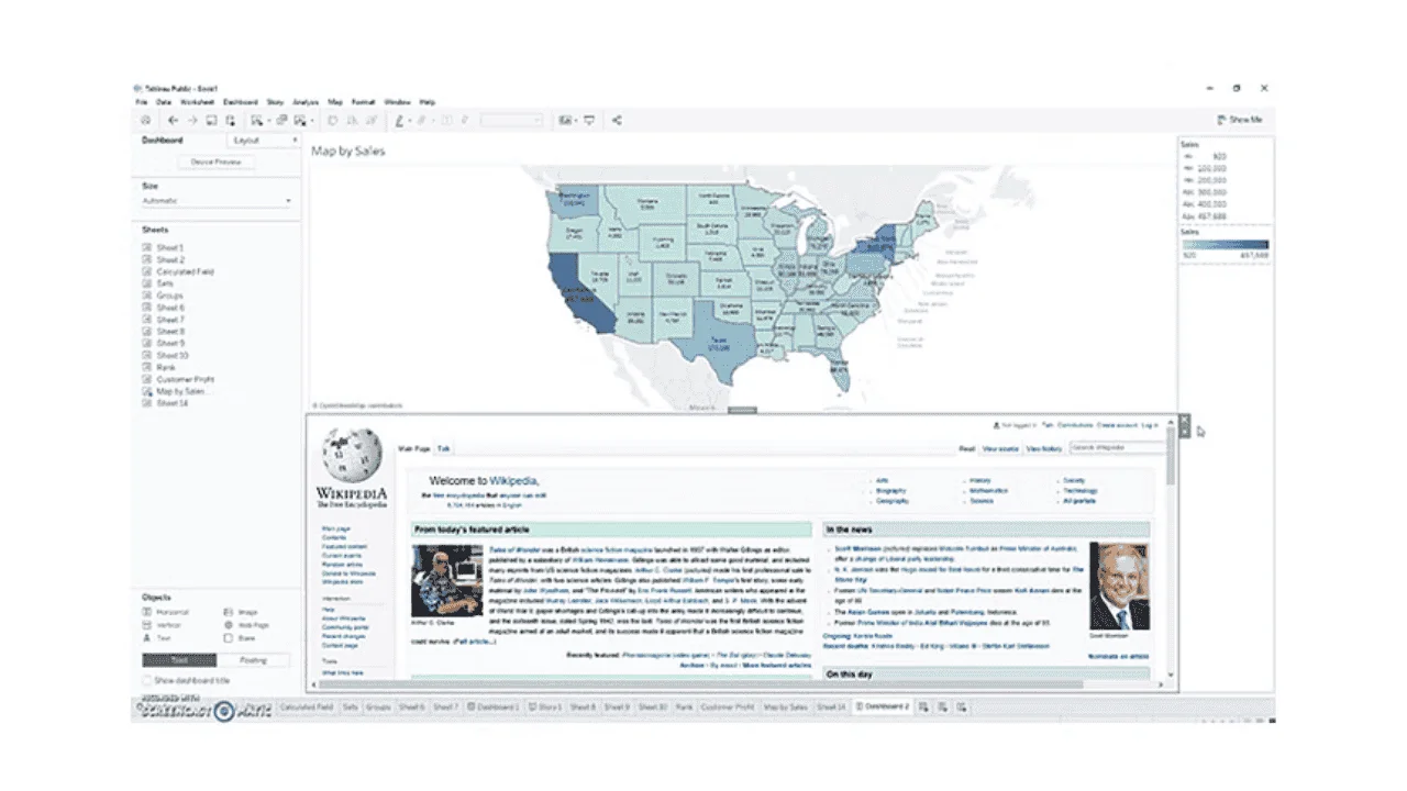
Using the following steps I can display a webpage directely in a dashboard.
Here is the result-
Scenario 1: Line Chart. It clearly shows trends over time and allows easy comparison between categories.
Scenario 2: Donut/Pie Chart. Best for showing parts-to-whole relationships for a few categories.
Scenario 3: Scatter Plot. It helps visualize the relationship between two measures and identify outliers or clusters.
You may also read- Data Science Tutorial for Beginners
Here are some of the most important Tableau interview questions and answers. These are designed to test the skills of candidates in real world tasks.
It would be a multi-step procedure, including the following steps:
A Live Connection queries the data source in real time, while an Extract stores a snapshot of data inside the platform. Live connections are useful when real-time data is required, but they depend heavily on database performance. Extracts are preferred for faster performance, large datasets, and scheduled refreshes. These are mostly useful when real-time updates are not mandatory.
Row-Level Security restricts data access so users see only the data relevant to them. It can be implemented using user filters, calculated fields with USERNAME() or USERFULLNAME(), or by applying security rules at the data source level. RLS is commonly used in Tableau Server or Tableau Cloud environments for role-based data access.
I would follow the given steps:
This approach keeps the dashboard clean, improves performance, and ensures users focus on actionable insights instead of overwhelming information.
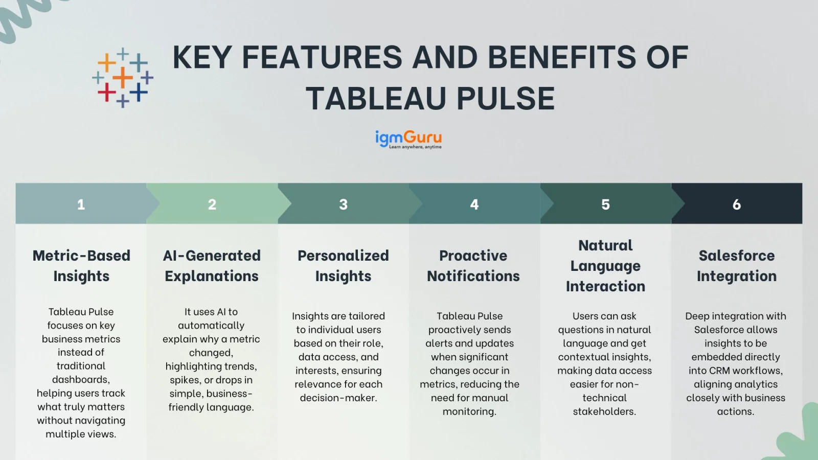
Tableau Pulse is an AI-powered insight experience designed to proactively deliver personalized metrics and insights to users. This means you can receive automated explanations, trend detection, and contextual insights driven by AI. No need for manually exploring dashboards. This helps business users focus more on decision-making rather than data exploration. It provides different features, including:
This platform automatically generates SQL queries based on the fields, filters, and aggregations used in a workbook. Writing SQL outside Tableau becomes necessary when dealing with complex joins, heavy transformations, large datasets, or performance-critical queries. Pre-aggregating data in SQL often improves dashboard speed and reduces load on Tableau.
The Tableau interview questions and answers discussed in this blog are enough to prepare for a desired job. Individuals can learn new or improve their data visualization skills with these questions. It has included various concepts of this platform from basics to the advanced ones. It is recommended to use some additional resources and do regular practice.
Not necessarily. One of the best things about Tableau is that it's designed to be user-friendly and doesn't require heavy coding. That said, knowing some basic SQL or scripting (like Tableau's calculated fields) can give you an edge. Interviewers might ask about logical functions or how you'd manipulate data within Tableau.
Expect practical, scenario-based questions. For example, "How would you handle a slow dashboard?" or "How do you approach cleaning messy data before visualization?" Interviewers want to see how you apply your Tableau skills in everyday business situations.
Absolutely. Sharing personal projects shows passion and initiative. Whether it's a dashboard you built for a hobby, a side project, or a course assignment, walking through it briefly can highlight your creativity and problem-solving skills.
Tableau is used to visualize data through charts and dashboards. It is used to analyze information and generate meaningful insights for businesses.