We live in a world where every click, sensor, and transaction generates mountains of data. And all this data holds valuable insights- if you know how to uncover them. That's the real challenge: people and organizations have plenty of data, but often lack the right methods to turn it into meaningful insights. This guide will show you how to bridge that gap through data analysis with Python.
By the end of this article, you'll know how to load real datasets, clean messy data, explore patterns, and visualize results in a way that makes sense to everyone- especially decision-makers. I'll keep everything practical and code-focused, but easy to follow. No matter if you are a beginner, developer, analyst, or IT professional, this guide will walk you through the exact workflow I use to turn raw, unstructured CSV files into clear, actionable insights using Python.
Before jumping into code, let's clear up what "data analysis" really means. In simple terms, data analysis is the process of examining, cleaning, and interpreting raw data to uncover useful information that supports decision-making.
Think of it like detective work- you are not just collecting clues (data), you are connecting them to form a story. Whether it's customer behavior, financial trends, or system logs, data analysis helps you understand why something happened and what to do next.
Why are we talking about Python for data analysis? Because it combines simplicity, flexibility, and power in one package. Many things make this programming language stand out in data analysis. Let's have a look at them:
You may have used Excel, which is a reliable and easy-to-use tool. This might raise a question: why delve into programming when it can be done with a few clicks and formulas? Well, Excel can be handy is easy tasks, but when it comes to complexity, Python is your solution. Let's see how:
| Task | Excel | Python |
| Data Cleaning | Manual, time-consuming | Automated, repeatable scripts |
| Data Volume | Limited by file size | Handles large datasets easily |
| Reproducibility | Difficult to automate | Fully reproducible |
| Visualization | Basic charts | Advanced visualizations with Matplotlib/Seaborn |
| Scalability | Not ideal for automation | Perfect for pipelines & integrations |
It is important to have a structured plan to make sense of any dataset. Jumping straight into coding without direction can usually lead to confusion. A solid data analysis workflow keeps you organized and ensures every insight is backed by evidence. This is why we do it step-by-step. Let's understand how?
Every successful analysis starts with a clear question, like What problem are you solving, what kind of decision will this analysis support, what outcome should you expect, etc. The cleanest dataset will be unuseful without a proper goal. Think of this as setting your destination before starting your journey.
After deciding on the plan and goal, you should collect the data into one place. You have many options to grab data from, including spreadsheets (CSV, Excel), databases (SQL, NoSQL), APIs or Web Scraping, Logs or internal tools and more. The best part it is very easy, just use this code:
import pandas as pd |
The third step is to clean the collected data. The raw data can have multiple errors like missing values, duplicates or inconsistent formats. This type of data is useless for finding patterns. Cleaning it involves:
data.dropna(inplace=True) |
Now, it is time to perform Exploratory Data Analysis (EDA). It helps you understand patterns, relationships, and anomalies through visualization. You can summarize data using:
data.describe() |
import seaborn as sns |
Once you have the visuals, you can analyze data and interpret visuals. This is where you extract the useful insights. This involves grouping data for summaries, calculating averages or correlations, identifying outliers or trends and more.
data.groupby('Region')['Sales'].mean() |
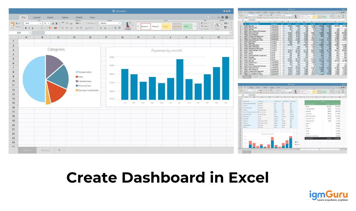
Data means little unless people can understand it. Present your insights using clear visuals, simple dashboards or short summaries. You can use libraries like shown below:
import matplotlib.pyplot as plt |
Last but not least step is to automate or literate your workflow for better productivity. You can schedule scripts to run periodically, reuse the code for future datasets, continuously refine your process as new data comes in and more. After all, Python provides easy-to-turn analysis into reusable modules or dashboards, which saves time and ensures consistency.
Python has a great ecosystem of libraries that powers the data analysis process. These libraries act like ready-made toolkits, each designed for a specific part of the workflow, from data manipulation to visualization. Let's look at the most essential ones every analyst should know.
NumPy (Numerical Python) is where most data analysis begins. It provides support for large, multidimensional arrays and mathematical functions to operate on them efficiently. It's fast, memory-efficient, and forms the foundation for many other libraries like pandas and scikit-learn.
import numpy as np |
If NumPy is the foundation, pandas is the building. It is the most popular Python library for working with tabular data. It is similar to Excel sheets, but with far more power and flexibility. You can use it for:
● Easy data loading from CSV, Excel, SQL, and JSON
● Filtering, grouping, and merging datasets
● Handling missing data and time-series analysis
import pandas as pd |
Matplotlib is Python's most widely used visualization library. It helps you turn data into charts, graphs and plots that make your analysis visually meaningful. Whether you need a bar chart, a pie chart, or a trend line, Matplotlib makes it easy.
import matplotlib.pyplot as plt |
While Matplotlib handles the basics, Seaborn builds on it with elegant styles and simpler syntax for statistical visualizations. It is perfect for visualizing relationships and distributions in your data. Seaborn automatically handles color palettes, aesthetics, and complex charts.
import seaborn as sns |
Once you are comfortable with basic data analysis, you will want to explore predictions. This is where Scikit-learn comes in. It is used for machine learning, but analysts use it for clustering, regression, and classification.
from sklearn.linear_model import LinearRegression |
Let's look at a quick, practical example to understand how data analysis with Python works in real life. Suppose you're working as a data analyst for a retail company, and you want to find out which product categories generate the most revenue and how sales vary month by month. Here's a complete, compact script to do that:
import pandas as pd |
Now, let's understand what this code does in plain English:
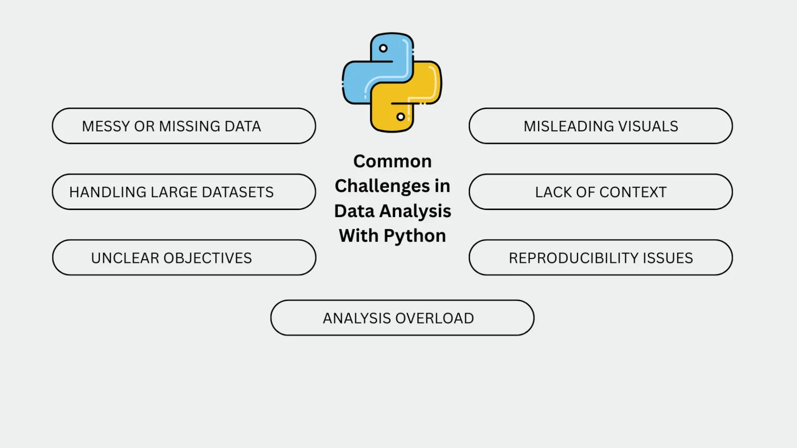
Every data analyst faces roadblocks, especially when starting with Python. Here are some common challenges and ways to handle them:
This Data analysis with Python guide has explained each step from loading and cleaning data to visualizing and interpreting it. You've now seen how data analysis with Python transforms raw numbers into meaningful stories with examples. But it is only a small step towards a great future. Further explore more guides and tutorials to master Python completely.
Yes, Python is one of the best languages for data analysis. Its clean syntax, large community, and vast ecosystem of libraries like pandas, Seaborn, and Scikit-learn make it beginner-friendly and powerful for professionals alike.
You need a basic understanding of Python programming, familiarity with data structures (lists, dictionaries, arrays), and a willingness to explore libraries like pandas and NumPy. Knowing basic statistics also helps.
The most popular Python libraries include: