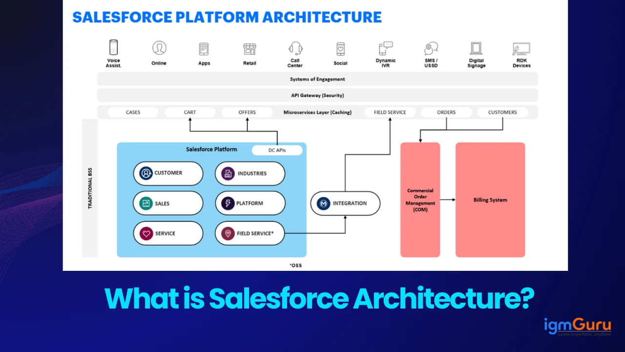
Reports and dashboards are the features of Salesforce. These give a clear view to the entire data for detecting patterns and making valuable decisions. This is why report and dashboard creation has become a must skill for Salesforce experts. Do you want to learn how to create Salesforce reports and dashboards? This blog post is the right spot to master this skill.
It covers all the knowledge required to build salesforce reports and dashboards effectively. This CRM platform is used in companies of all types and sizes. Each of these are in great demand for experts who can create reports, add filters and visualize data. Mastering this skill can benefit many experts with great salary packages and promotions.
TL;DR
Salesforce Reports and Dashboards are used for organizing, analyzing, and visualizing business data to support informed decision-making and performance tracking. This article explains how Salesforce professionals, administrators, analysts, and business teams can use different types of reports and dashboards to monitor key metrics, identify trends, generate insights, and share data effectively across an organization. It benefits users by improving data visibility, enabling better forecasting, supporting faster decision-making, enhancing collaboration, and helping organizations track performance through interactive visualizations and customized reporting. It belongs to the Salesforce Reporting, Analytics, and CRM category.
Salesforce reports and dashboards are a way to collect and view all the data stored in an enterprise. This gives many types of visuals into that data for making informed decisions and business forecasting. Both of these are different elements but related to each other.
Reports contain all the information of a company in a predefined and organized way. Different types of folders are used to store this information. These folders decide the accessibility of a particular report. Admins can hide, show and share these reports with user restriction. This feature only lets authorized users access the information.
Dashboards are a pictorial representation of these reports. These visualize all the organised data in graphical formats. Admins use dashboards to show reports in different formats like charts, graphs and images. They can also add different components to these dashboards. Each of these components are related to a particular report. A single report can be added to two or more components.
Explore igmGuru's Salesforce Certification Courses and start mastering essential skills today.
There are many types of reports available on Salesforce including tabular, matrix, summary and joined. Each of these reports is built to show different types of data. The choice will depend on the requirement of the user. The followings are the types of reports in Salesforce -
This is the easiest version of the reports. It only shows data in the form of lines and nothing else. It is quite similar to the Excel spreadsheets. This will not contain any calculations, totals or data groups. Tabular report is best to use when planning to export information. Admin can easily share these reports within a company.
Summary reports include some additional features. It can add data in groups for specific purposes. These reports are great in showing information in groups and probably are most used. Admin can visualize the value or amount of opportunities per account with these reports. They can also add subgroup fields by dragging them in an initial group.
Matrix reports are quite similar to summary. The only difference is that it groups data by rows and columns to view different totals. Let's take an instance just like above. We can divide the opportunities into particular months per account. This report will show that in January the leads were $100,000, in February these were $150,000 and so on.
Joined reports are basically a combination of two reports. These are best in comparing the data from different reports. Admins can forecast the future trends and opportunities or make informed decisions with these. These are used by almost every company.
Related Article- Top Salesforce Testing Interview Questions
Building reports in Salesforce is a simple and quick process. Anyone with proper resources and knowledge can build them in a few minutes. One can schedule these reports to run automatically and export them in different formats for further analysis. Let's explore the process of building reports in Salesforce.
We will create a Sales Pipeline report to understand where the open opportunities are available in the sales life cycle. This will view all open opportunities in the Sales Stage for the current and upcoming fiscal quarter.
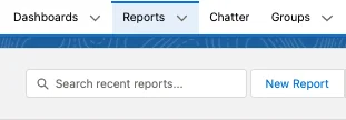
Step 1. Open the Salesforce application and log in to the association group. You will see a Report button there as given below -
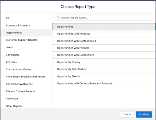
Step 2. Just search the report option which one you want to build. We will choose the Opportunities option as per our example. Now click on the continue button.
Step 3. A new report will be opened on your screen. All the measured line filters and fields are predefined in this report. You can also change them according to your requirements. Start from the filters that you defined above.

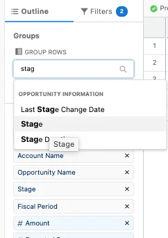
Step 4. Now go back to the Outline Tab and define the fields which you want to see in your report. Stage field should be added in the Group section.
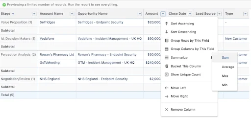
Step 5. Now you have to summarize the number of columns to view the combined amount of all Open Opportunities.
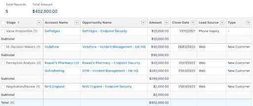
Step 6. Here you can also add or remove any unwanted fields in the columns section. Do not forget to Save & Run your report. Save this report in the public folder if you want to share it publicly.
Step 7. Now you can add charts to the report if required. You can only add charts with at least one summary column. Just click on the Add Chart option.
Step 8. This will ask you to select a chart type as given below. Select the one you want to add. We are using the funnel chart.
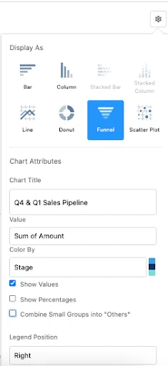
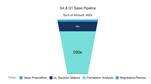
Step 9. Now you will see a humongous majority of the Sales Pipeline at the Perception Analysis stage. This insight benefits in taking action for the Sales team.
Related Article - Salesforce Career Opportunities
There are a total of three types of dashboards available in Salesforce. Each of them are best in different use cases. These dashboards are used to understand different data in different ways. This view can be from general overviews to role specified insights. Here are some Salesforce dashboard examples -
Standard dashboards are basically templates available on this platform. It gives an overview of basic business metrics. These dashboards are best for experts who want an easy and fast way to optimize their company's performance. It shows both key metrics and information in one place. It also highlights data from many sources including control, plan, contract, change, progress and platform.
Joined dashboards are a combination of multiple report types. This lets users view and analyze information from many sources simultaneously. This functionality is very beneficial for companies in monitoring and integrating connections among different datasets. These are also referred to as collaborative dashboards. They include up to 100 components.
Dynamic dashboards are best in creating personalized views of information based on role specific criteria. Its functionalities make sure that every user views only relevant information. This benefits in great decision making capability and collaboration within the enterprise. These are sillmar to the joined dashboards in many ways except the role specific criteria feature.
Related Article- Salesforce Service Cloud Interview Questions
Creating dashboards in Salesforce will only be possible after building a summary report or joined report. It can be created in Lightning. One can also add a tabular report to these dashboard components. But it will not give a summarized chart and only get access to table components. Creating dashboards in Salesforce includes many steps.
There are many instances of creating a dashboard in Salesforce. One can create a private dashboard which is restricted to some users or a public dashboard for every one. Dashboards are very beneficial across different areas of a business for monitoring performance and system activities. Let's create a new dashboard that is visible to every user.
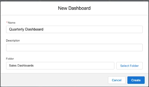
Step 1. Go to the Dashboard and click on the New Dashboard option. This will open a window where you will be asked to mention the Name, Description and Location for folder. Fill the mandatory option and select the Create option.
Step 2. You can also add components by clicking on the Component button.

Step 3. Select a report that you want to add to dashboard. We will select the same report we have just built in the previous section. We will add the chart settings from the previous report. It can be ignored to create a new chart for this dashboard.
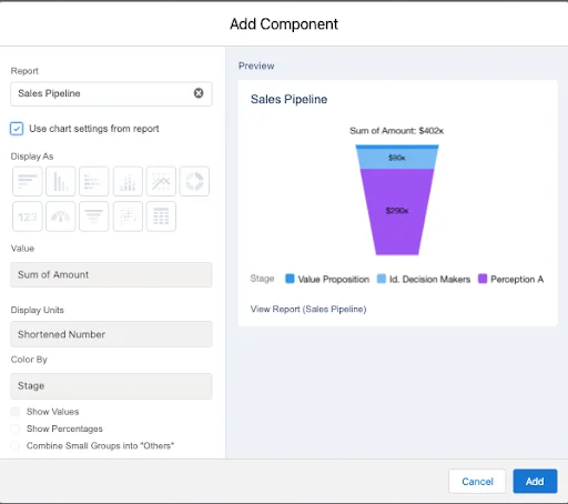
Step 4. You can also add a few more components using the same report. We have added the total pipeline is $402,000 and the target for next quarter is $2m. This will be beneficial as we will now have the insights needed to start making decisions and driving more pipeline.
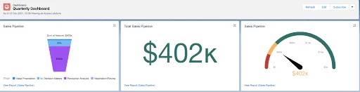
Step 5. You can also add more components into the reports behind each dashboard component. It will show you the information behind the visualization.
Salesforce reports and dashboards are powerful visualization tools. These give a detailed and well managed view on entire data within a company. We have already explained the types and methods to create Salesforce reports and dashboards in this article. This information will benefit you in taking your organizational performance one step ahead.
You can also read: Salesforce interview questions and answers
Both of these are visual representation tools but have different functionalities. Reports focus on a single criteria or topic. It only has a chart option. Dashboards are great for graphical representation of data. These combine with multiple reports and may have different graphical representation characteristics.
We can add many reports to a dashboard depending on the platform. We can add a maximum of 20 report charts and 25 components on a single dashboard.
Reports can display up to 2,000 rows in a single view. One can export a report to Excel or use the printable view for adding more rows. This can display up to 20,000 rows in a single view.
Related Article - Salesforce Tutorial
Course Schedule
| Course Name | Batch Type | Details |
| Salesforce Training | Every Weekday | View Details |
| Salesforce Training | Every Weekend | View Details |