Are you curious how raw data becomes beautiful visualisations? If yes, read on. I have four years of practical experience in Python, with considerable experience creating effective plots using data visualization software. I will share helpful tips and lessons learned from my experience so that you can learn how to make effective use of visualisation.
In this blog, I will explain you what is matplotlib library in Python, its architecture and working, its real world applications and many more.
Let’s get started!
Matplotlib is a Python library that is used for creating static, interactive and animated visualizations from data. It provides flexible and customizable plotting functions that help in understanding data patterns, trends and relationships effectively.
For example: Monthly Sales Analysis (Business Dashboard)
|
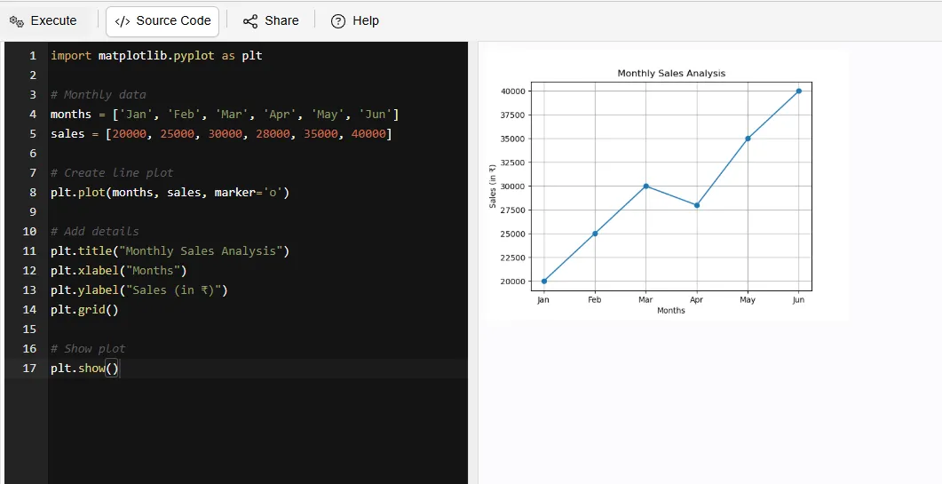
What this shows:
1. Tracks sales growth over time
2. Helps businesses:
Read Also: Python Tutorial for Beginners
Matplotlib offers powerful features such as customization of colors, labels, styles and layouts. It also supports multiple plots in a single figure, which makes it a highly versatile for creating detailed and informative visualizations.
There are multiple types of plots that can be created with Matplotlib, ranging from simple line graphs/plots through scatter plots, histograms and finally pie charts, all of these have different intended uses as they provide visual means to categorise and quantify information.
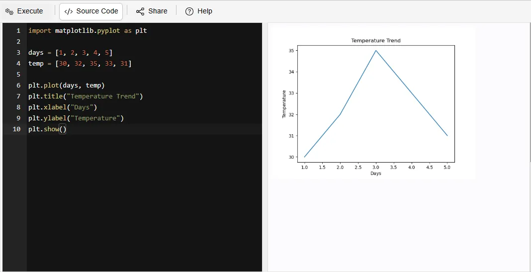
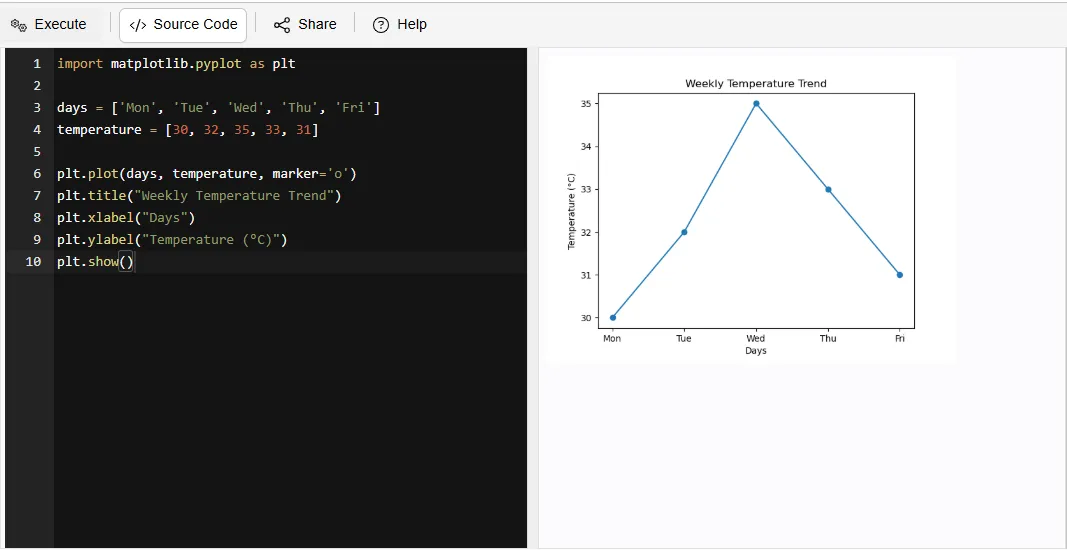
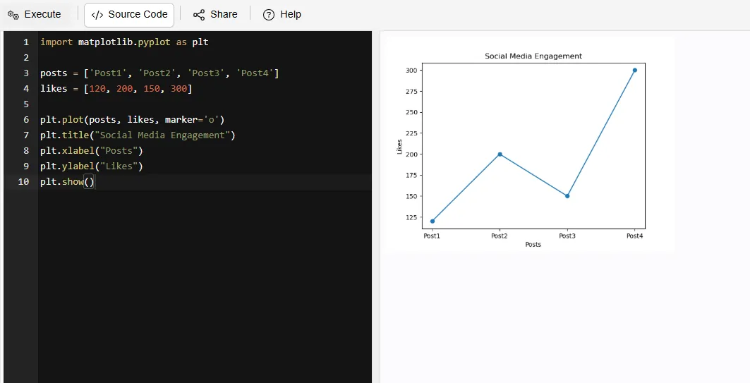
A line plot illustrates point changes in relation to time through connecting lines. This type of visual representation allows for quick identification of trends, patterns or progression within continuous datasets.
For example:
|
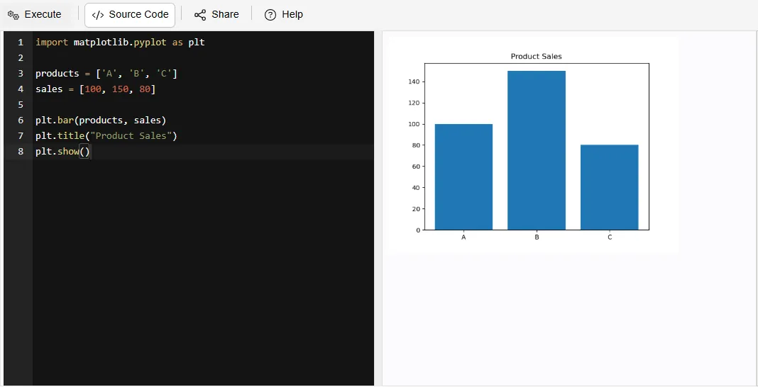
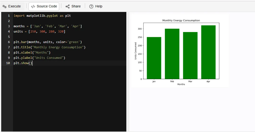
A bar plot displays information via bars with the height of each bar indicating respective values; bar charts offer an easy method for comparing across multiple categories.
For example:
|
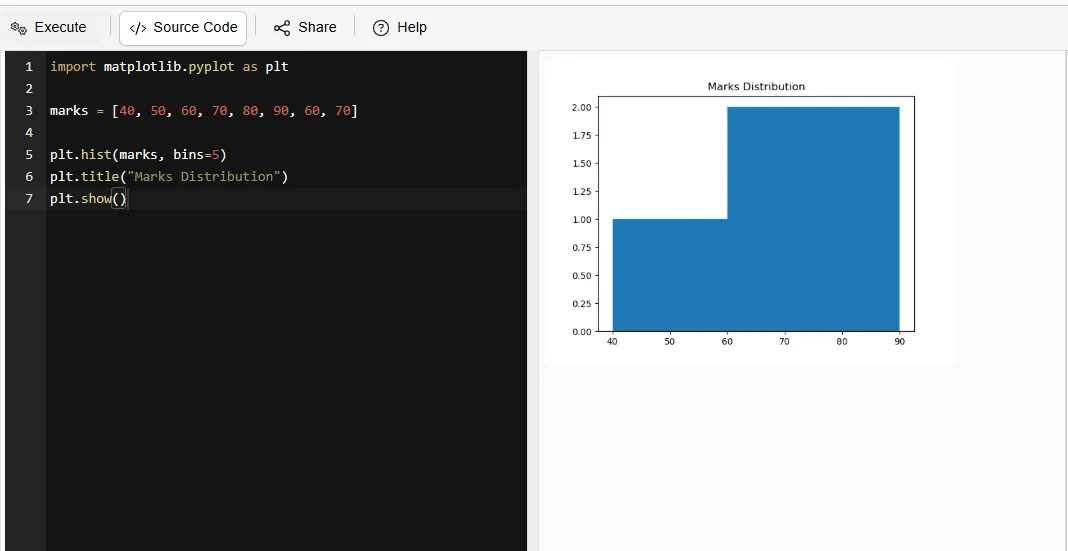
A histogram groups data into defined intervals (bins) and shows how often each interval contains data. This type of visualization allows for an easy means of analyzing data distribution and frequency.
For example:
|
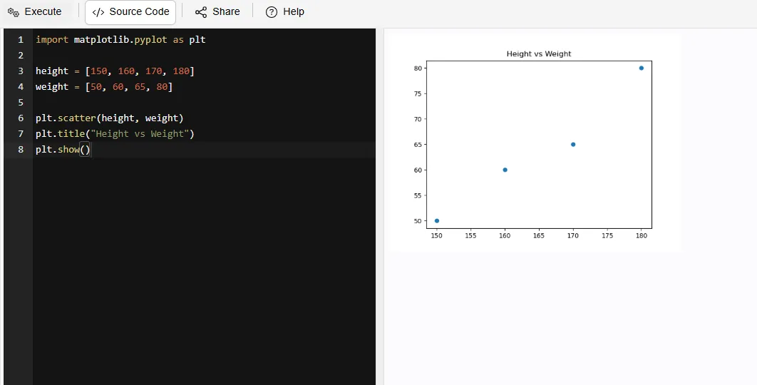
A scatter plot displays individual data points on a graph; while this does not create a direct line between them, it can provide insight into the relationship and possible correlation between two variables.
For example:
|
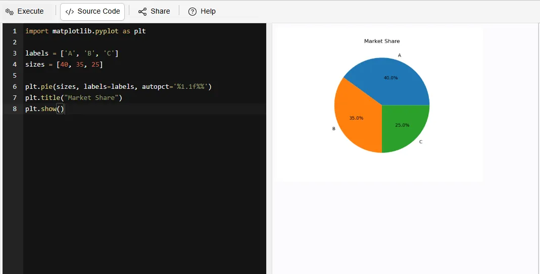
A pie chart segments a circle into parts (slices) to allow for displaying the proportional contribution of each segment in relation to the total.
For example:
|
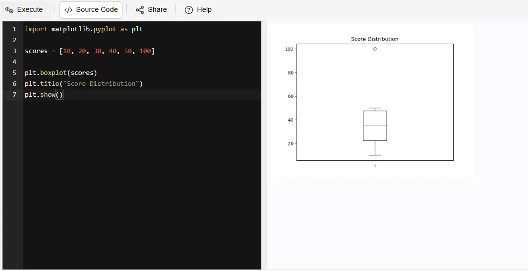
A box plot displays the distribution of data using quartiles and the median, whilst additionally providing the user with outliers in order to gain insights about the amount of variability in the data set.
For example:
|
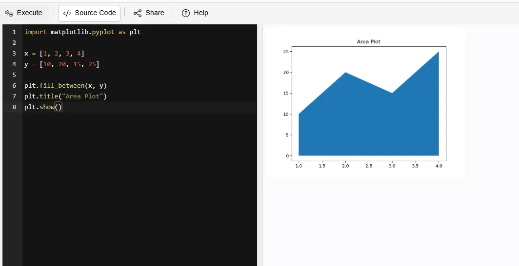
An area plot is like a line plot but with the area filled underneath. It helps you see both trends and the overall magnitude of data.
For example:
|
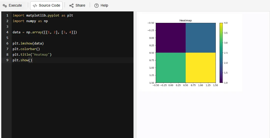
A heatmap uses colors to visually display values in a grid format. A heatmap will display color, so you can quickly identify trends, patterns and high/low values of the available data in large datasets.
For example:
|
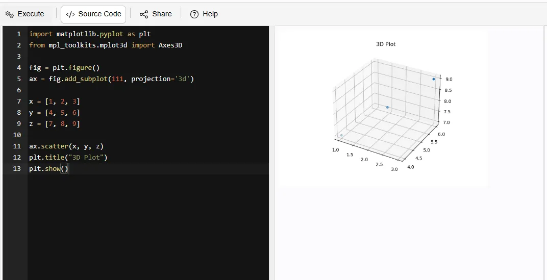
3-D plotting uses 3 different axis (X, Y and Z). 3-D plotting allows for the visualization of complicated relationships and patterns that are not as easy to see in 2-D graphs.
For example:
|
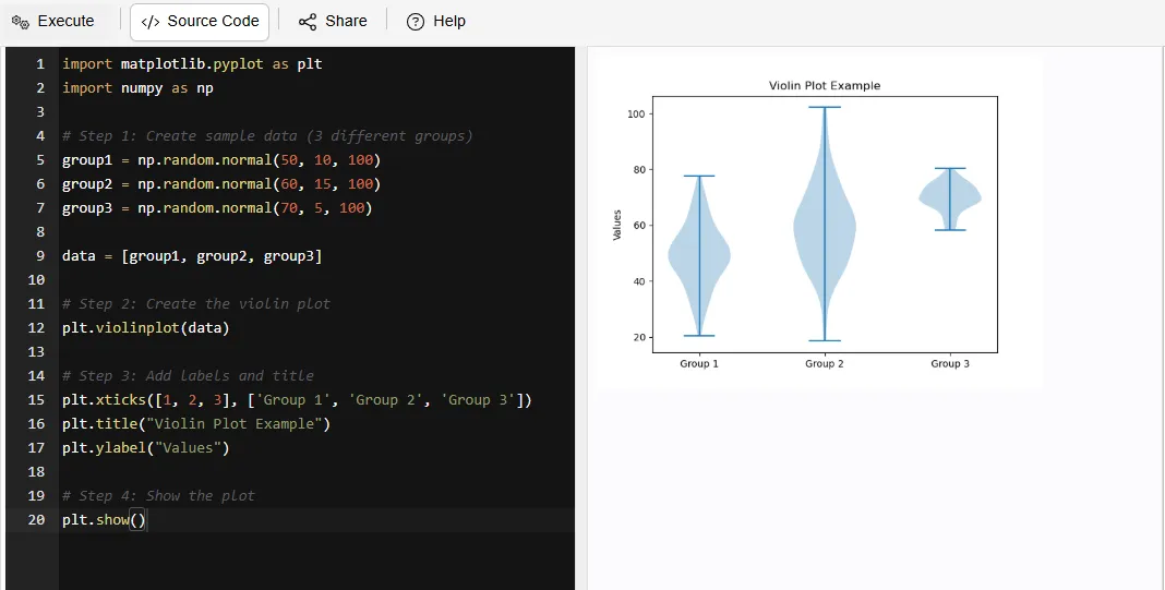
A violin plot displays both the distribution of data and the density of data. A violin plot allows you to understand how the data is dispersed and where the majority of the data points cluster.
For example:
|
Read Also: Python Interview Questions and Answers
If you want to use Matplotlib, then you should know that to use it, you should already have a basic understanding of Python programming language and knowledge about how to manipulate data because it is easy for people who have little experience working with MATLAB to learn how to use Matplotlib due to PHP script web-based framework being able make installation process very simple through built-in features provided by common package managers such as PIP. After installing matplotlib, you will be able to start creating graphs/charts and plotting data becomes not complicated as there are a lot of example code and sample images found within the tutorial provided by author called "Data Visualization with Matplotlib."
Its installation is very simple, you just have to follow these steps:
1. Open your Terminal / Command Prompt
2. Type the following command:
|
3. Press Enter
4. Wait for the installation to complete
After installation, you can check if it works by running this Python code:
|
Read Also: Pandas Interview Questions And Answers
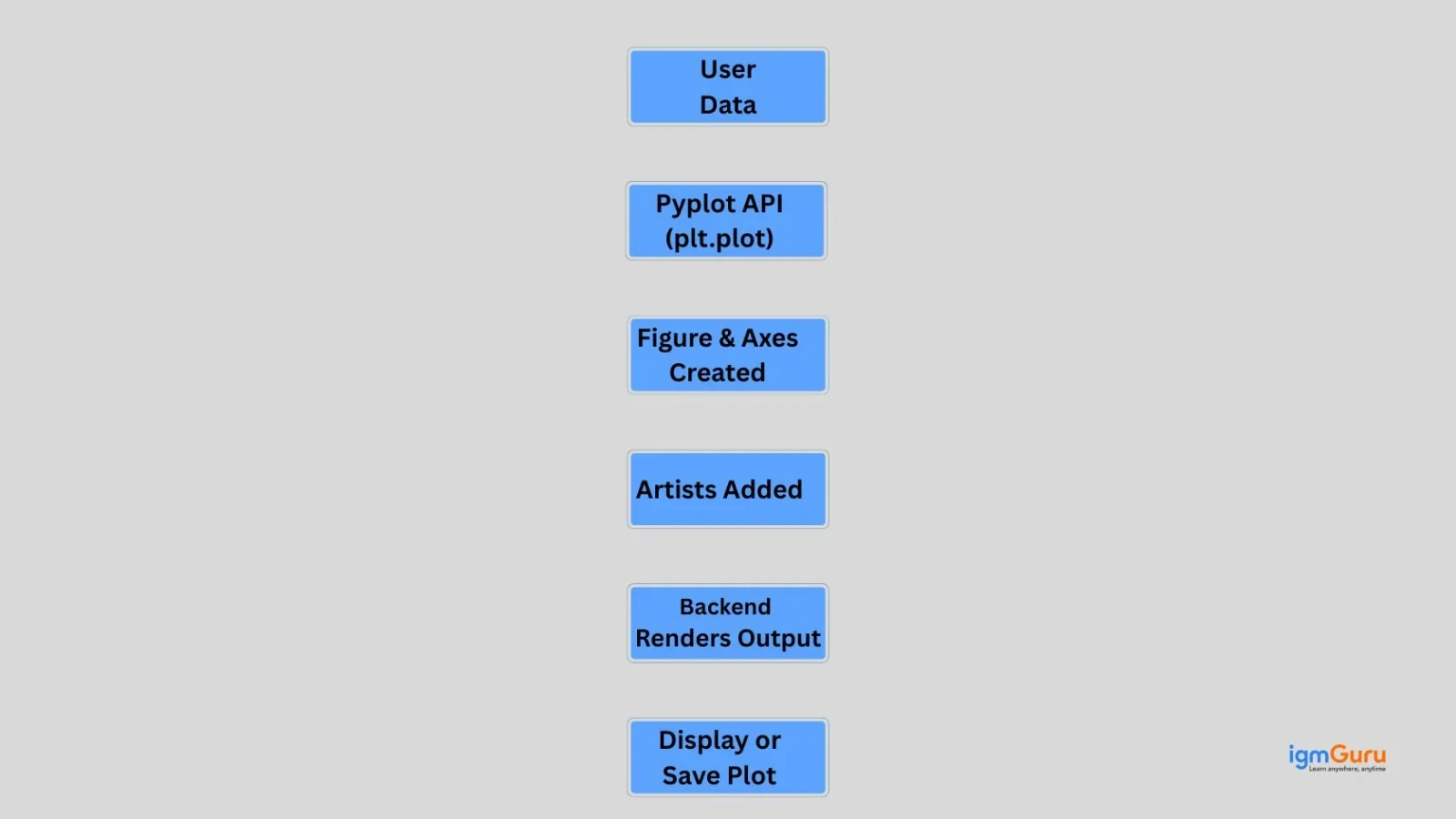
Matplotlib takes your data input and produces a visual representation by converting it into visual elements. It works in a stepwise manner, where data is passed through three stages of plotting function calls until the final visualization of the data has been rendered.
Matplotlib follows a layered architecture that transforms raw data into visual plots through a structured pipeline. It uses the pyplot interface, artist objects and rendering backends to efficiently create, manage and display high quality graphical visualizations.
1. Figure (entire canvas)
2. Axes (plot area)
3. Line, Text, Labels
1. Interactive backends: show plots (Tkinter, Qt)
2. Non-interactive backends: save files (PNG, PDF)
While creating plots may seem simple on the surface, but there is a structured flow happening behind the scenes. When you understand this flow, you can easily gain better control over your visualizations.
Let’s break it down step by step:
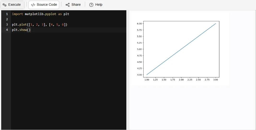
Every graph starts with a data.
For example:
x is the horizontal axis and y is the vertical axis
x = [1, 2, 3, 4] y = [10, 20, 25, 30]
Pyplot is used to create plots in Matplotlib.
For example:
|
This command tells Matplotlib to create a line graph using the given data.
Matplotlib creates a figure and axes to display the graph.
For example:
|
The figure is the overall canvas and the axes are the area where the graph is drawn.
Artists are the elements that make the graph clear and readable.
For example:
|
These include titles, labels and other visual elements.
The backend displays the final graph.
For example:
|
This command shows the graph on the screen.
You can also save it using:
|
Read Also: Python Libraries for Machine Learning
Matplotlib is widely used across different industries to visualize data from business analytics to scientific research. With its toolset, Matplotlib can assist people with transforming raw data into meaningful insights that they can use in their decision making processes as well as in identifying trends and patterns.
Using Matplotlib allows for easy analysis of temperature, precipitation and Humidity changes over a determined period of time. This provides insight into overall Climate change.
For example:
|
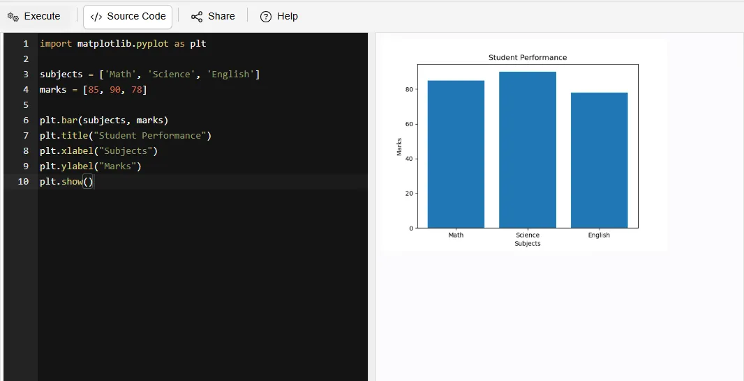
This enables educators to monitor each individual student's performance and compare grades based on Class.
For example:
|
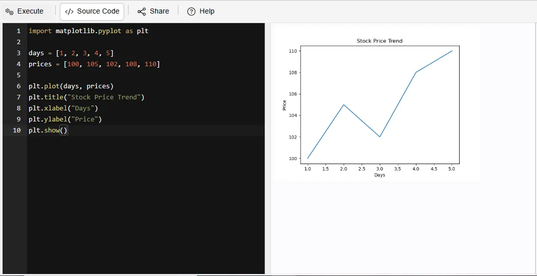
This enables individuals to visualize trends in Stock prices and variations throughout the time period analyzed; providing assistance with making financial decisions.
For example:
|
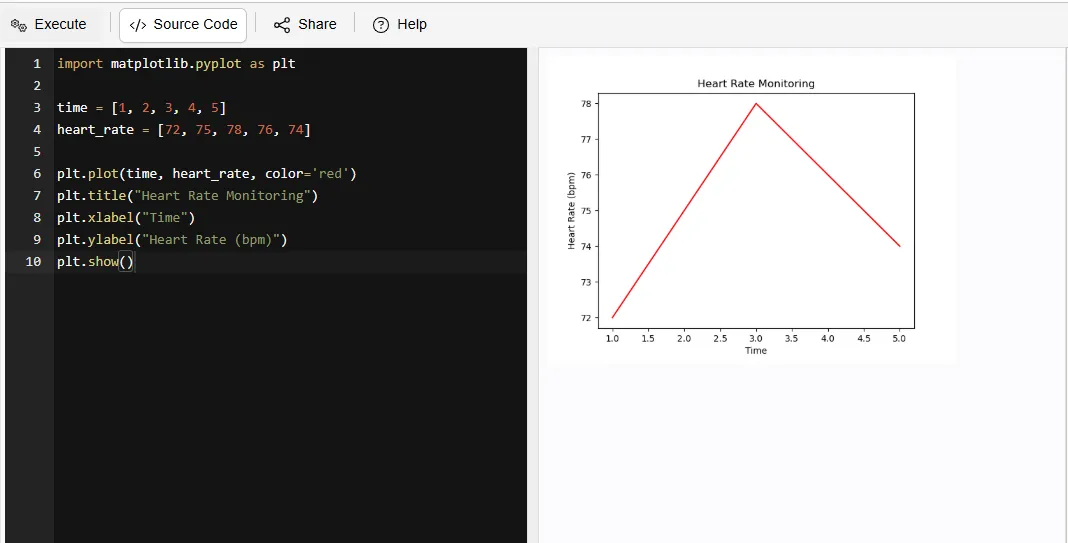
Hospitals use Matplotlib to track patient information (e.g. heart rate, blood pressure, etc.).
For example:
|
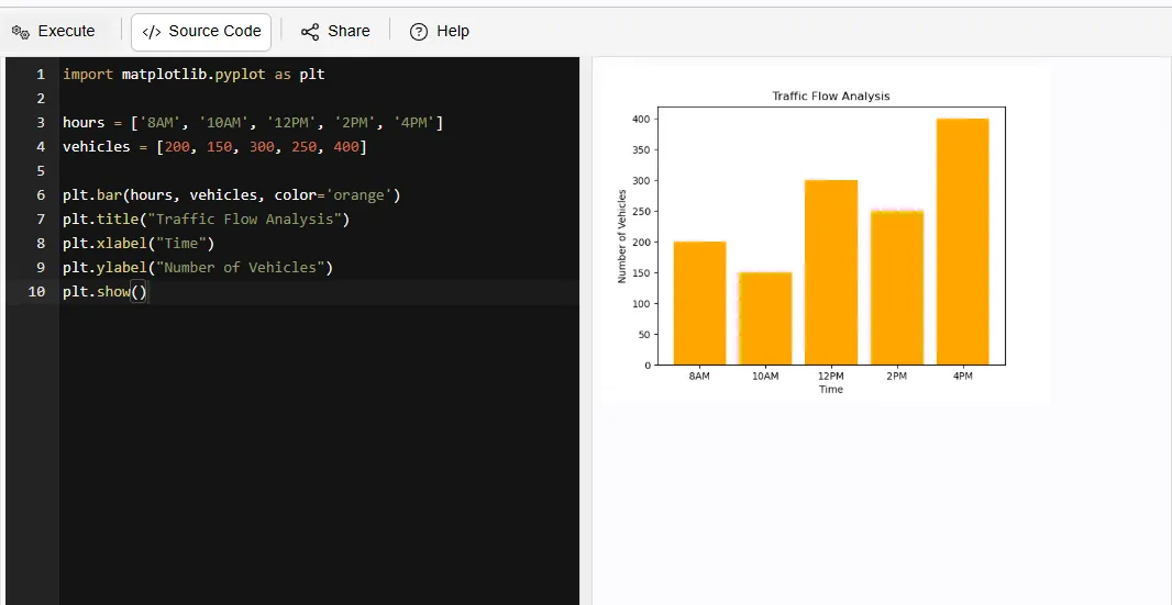
This provides Municipal Planners with the ability to analyze the movement of vehicles and identify areas of congestion.
For example:
|
Matplotlib enables analasys and tracking of the number of times a piece of content has a "Like", "Comment" or "Share". This will assist marketers in determining the level of audience engagement and measure the effectiveness of their Marketing Responses.
For example:
|
Can be employed to monitor electric consumption in businesses or residential dwellings to help identify methods for optimizing overall energy use.
For example:
|
Read Also: NumPy Interview Questions and Answers
When faced with so many choices for a data visualization library, it can be hard to decide which one is best for you. Some libraries such as Matplotlib, Seaborn and Plotly have similar capabilities; however, there are some significant differences between them that allow you to decide which option is right for you.
| Feature | Matplotlib | Seaborn | Plotly |
| Ease of Use | Moderate – requires more code but very flexible | Easy – simple syntax with better defaults | Easy – especially for interactive charts |
| Customization | Very High – full control over every element | Medium – less control than Matplotlib | High – customizable but within framework limits |
| Visual Appearance | Basic by default (needs styling) | Attractive and modern by default | Highly polished and interactive visuals |
| Interactivity | No (static plots) | No (static plots) | Yes (zoom, hover, click features) |
| Best Use Case | Learning, research, detailed control | Statistical analysis and quick insights | Dashboards, presentations, web apps |
| Learning Value | Strong fundamentals (must-learn) | Builds on Matplotlib (easy upgrade) | Useful for real-world applications |
Both Matlab and Matplotlib offer excellent ways to visualize data. However, due to the nature of the programming languages used, Matlab is generally a better option due to its integrated environment, whereas Python has more open-source flexibility and access to more components. The choice between these two languages depends on your specific needs and access.
| Features | Python (Matplotlib) | MATLAB |
| Cost | Free and open-source | Paid software (license required) |
| Ease of Use | Slight learning curve; flexible but needs coding | Easier for beginners with built-in functions |
| Flexibility | Highly customizable; integrates with many libraries (NumPy, Pandas) | Less flexible compared to Python ecosystem |
| Performance | Good performance; depends on libraries used | Optimized for numerical computing and matrix operations |
| Visualization Quality | High-quality plots with customization options | High-quality plots with simpler commands |
| Community Support | Huge global community; lots of tutorials and resources | Strong but smaller community compared to Python |
| Use Cases | Data science, machine learning, web apps, automation | Engineering, simulations, academic research |
Matplotlib is popular for its simplicity as well as for being customizable enough that you won’t be constrained by any limits on what you can create. It provides the tools needed for beginners and experienced users alike to create clear visualizations that communicate their data effectively.
Here are some of them:
1. Ease of Use: It provides a straightforward and intuitive interface for creating a wide variety of plots and charts.
2. Customizability: The library offers extensive customization options allowing users to tailor visuals to precise specifications.
3. Community Support: It has robust community support that can be a boon in troubleshooting issues.
4. Wide Variety of Plots: Matplotlib supports numerous plot types such as line plots, bar charts, histograms, scatter plots, pie charts and even 3D visualizations. This makes it a one stop solution for most data visualization needs.
5. Integration with Python Ecosystem: It works seamlessly with libraries like NumPy and Pandas, which allows you to directly visualize processed data without complex conversions.
Although Matplotlib has many positive attributes, it can feel complex when it comes to the advanced customization of visualizations. The syntax used within Matplotlib can be lengthy compared to more modern libraries and as a result creating highly interactive or aesthetically pleasing visualizations often requires additional resources or libraries.
Here are some of them:
1. Steep Learning Curve for Advanced Features: While basic plots are easy, it can master advanced customization can be complex and time consuming.
2. Verbose Syntax: Compared to modern libraries like Seaborn or Plotly, Matplotlib sometimes requires more lines of code to create aesthetically pleasing visualizations.
3. Less Interactive by Default: It is primarily static. Interactive features are limited unless combined with additional tools or libraries.
In conclusion, Matplotlib stands as a powerful and versatile tool for transforming raw data into meaningful visual insights. From basic plots to real-world applications, its flexibility and depth make it essential for data analysis, which helps the users communicate patterns, trends and decisions effectively.
After reading this, you should start practicing by creating simple plots and gradually explore advanced features to strengthen your skills
The name was coined by combining "MATLAB" and "plotting library," which reflects the fact that it was inspired by MATLAB's graphing capabilities.
The creator of Matplotlib is John D. Hunter and the project started in 2003, as he wanted to develop a plotting library in Python that emulates what is available with MATLAB.
No, Microsoft Excel does not make use of Matplotlib; Excel provides its own charting tools which differ from the purpose of Matplotlib - an open source programming interface used by many software applications written in Python to create visual representations of data.
The latest stable version of Matplotlib is 3.10.8, released on November 13, 2025.