Visual interpretations of numbers can often help us understand the context that numerical data cannot easily convey, because large datasets can often provide us with very complex information to interpret. Visualization tools, including pie charts, allow you to visualize your data in ways that are visually appealing and are much easier to read than just the numbers alone.
If you are looking at sales performance, reviewing survey findings, looking at your total expenses or have business trends that you want to share with others, pie charts can provide your audience with the essential data you wish to convey as quickly as possible. You can create a pie chart in about five minutes in Excel and immediately show your audience how parts of the data contribute to the total amount.
In this guide, you will learn everything about pie charts in Excel, from the basics all the way to advanced tricks that most users never discover. Every step is written so you can follow along directly in Excel as you read. No guesswork. No skipping steps.
Let us get started.
Read Also: How to Find Standard Deviation in Excel?
A pie chart in Excel is a circular chart that divides your data into slices. Each slice represents one category, and the size of that slice shows how much that category contributes to the total. Think of it like a pizza. If Digital Marketing takes 40% of your budget, Digital Marketing gets 40% of the pizza.
Excel builds pie charts from just two things:
Use a pie chart in Excel when:
Avoid a pie chart when:
Related Article: How to Subtract in Excel?
Excel gives you six types of pie charts. Each one serves a different purpose. Here is what each does and when to use it.
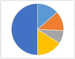
This is the standard pie chart. It is flat, clean, and easy to read. Use this for most everyday presentations and reports.
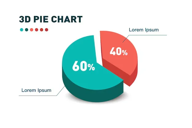
This adds a three-dimensional effect to your chart. It looks impressive in presentations, but the 3-D angle can visually distort slice sizes. Use it carefully.
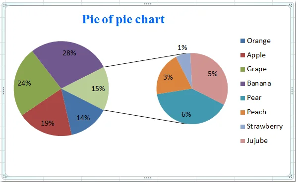
This chart splits small slices into a second, separate pie. It is perfect when you have several tiny categories that are hard to see in the main pie.
Also Read: How to Separate Names in Excel?
Similar to Pie of Pie, but the secondary chart is a bar chart instead of another pie. Some people find this easier to read than a second pie.
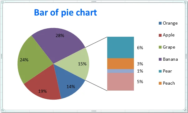
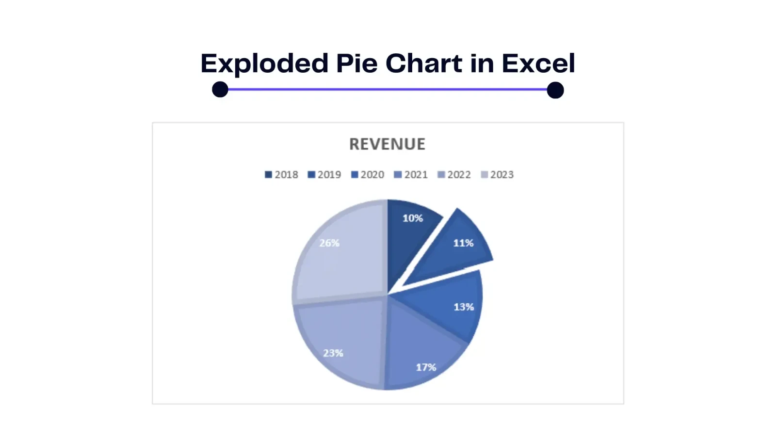
This pulls all slices apart slightly from the center. It highlights the entire chart and works well when you want emphasis on the whole, not just one slice.
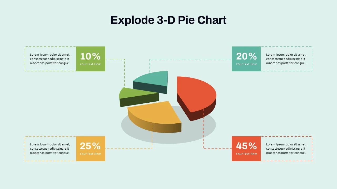
Same as the exploded version but with a 3-D look. Use it sparingly since the effect can become visually noisy.
I will use this dataset in every single section of this guide. Enter it into your Excel worksheet now so you can follow along step by step.
| Department | Budget (USD) |
|---|---|
| Digital Ads | $45,000 |
| Content Marketing | $30,000 |
| SEO | $20,000 |
| Events | $15,000 |
| PR & Outreach | $10,000 |
Total Budget: $120,000
This is a 2025 Annual Marketing Budget broken down across five departments. The numbers are realistic, the categories are clear, and the spread is wide enough that every chart type we cover will look good and make sense.
Enter this data with "Department" in cell A1, "Budget (USD)" in cell B1, and the five rows of data below in rows 2 through 6. Enter the budget values as plain numbers (45000, not $45,000) so Excel reads them correctly.
You already entered the marketing budget data above. Now turn it into a working pie chart in four steps.
Confirm your worksheet looks exactly like this before moving on:
| Cell | Content |
|---|---|
| A1 | Department |
| A2 | Digital Ads |
| A3 | Content Marketing |
| A4 | SEO |
| A5 | Events |
| A6 | PR & Outreach |
| B1 | Budget (USD) |
| B2 | 45000 |
| B3 | 30000 |
| B4 | 20000 |
| B5 | 15000 |
| B6 | 10000 |
Tips for clean data setup:
Read Also: Excel Multiply Formulas
Click on cell A1. Hold your mouse and drag down to cell B6 to highlight all six rows, including the header row.
You will see a blue-highlighted box around the range A1:B6. That is your selection.
Pro tip: Click A1, then hold Shift and click B6 to select the same range without dragging.
1. Click the Insert tab at the top of Excel
2. Look for the Charts group in the ribbon
3. Click the Pie Chart icon (it looks like a circle with one slice cut out)
4. A dropdown menu will appear with chart subtype options
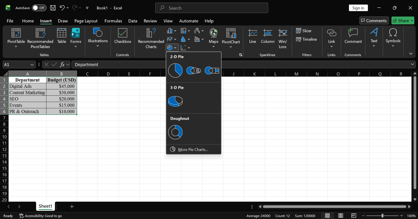
5. Click 2-D Pie (the first icon at the top left)
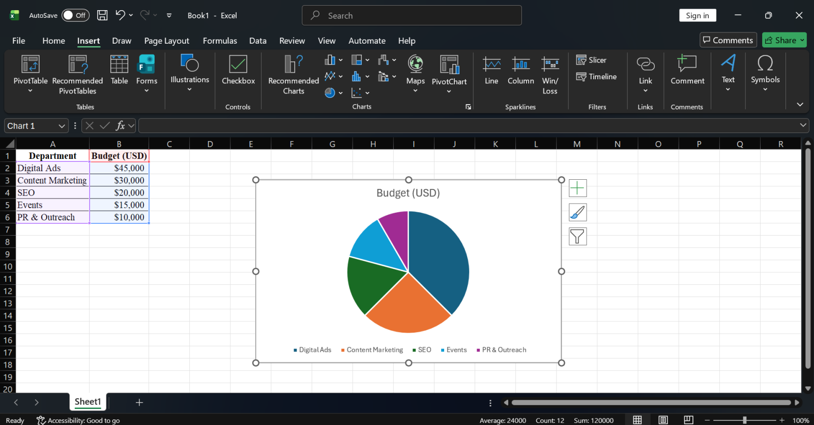
Excel will instantly create your pie chart on the same worksheet. You will see five colored slices, one for each marketing department. Digital Ads take the largest share at 37.5% of the pie (45,000 out of 120,000).
Click anywhere on the white border of the chart. Drag it to an empty area below your data, around row 9 or 10. This prevents the chart from overlapping your data table.
Your pie chart is now live. If you go back and change the Digital Ads budget in cell B2 from 45000 to 50000, the slice will instantly grow larger. That is how tightly connected Excel charts are to their source data.
Also Read: How to Create Dashboard in Excel? A step-by-step Guide
The default pie chart works, but a customized pie chart communicates. Here is how to make your marketing budget chart professional and polished.
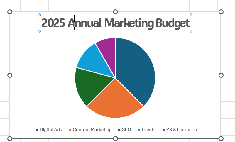
Excel adds a generic placeholder title or none at all. Let us replace it with something meaningful.
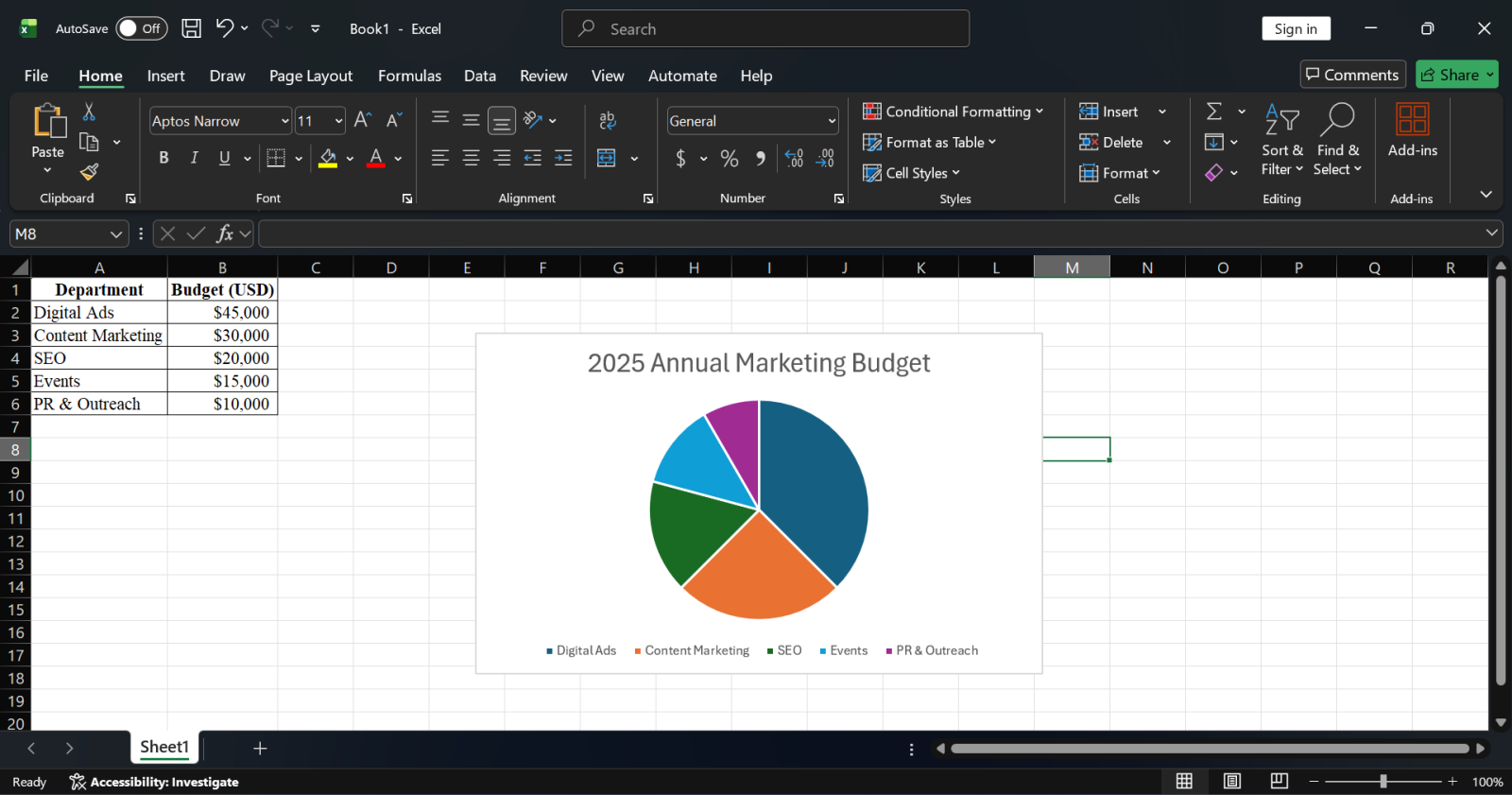
To change the title font or size:
Read Also: What is Power Query?
Right now the chart shows five colored slices with no numbers on them. Data labels fix that immediately.
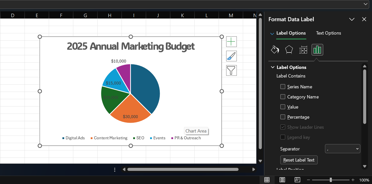
Those raw numbers are useful, but percentages tell a clearer story for a budget chart. Here is how to show percentages instead:
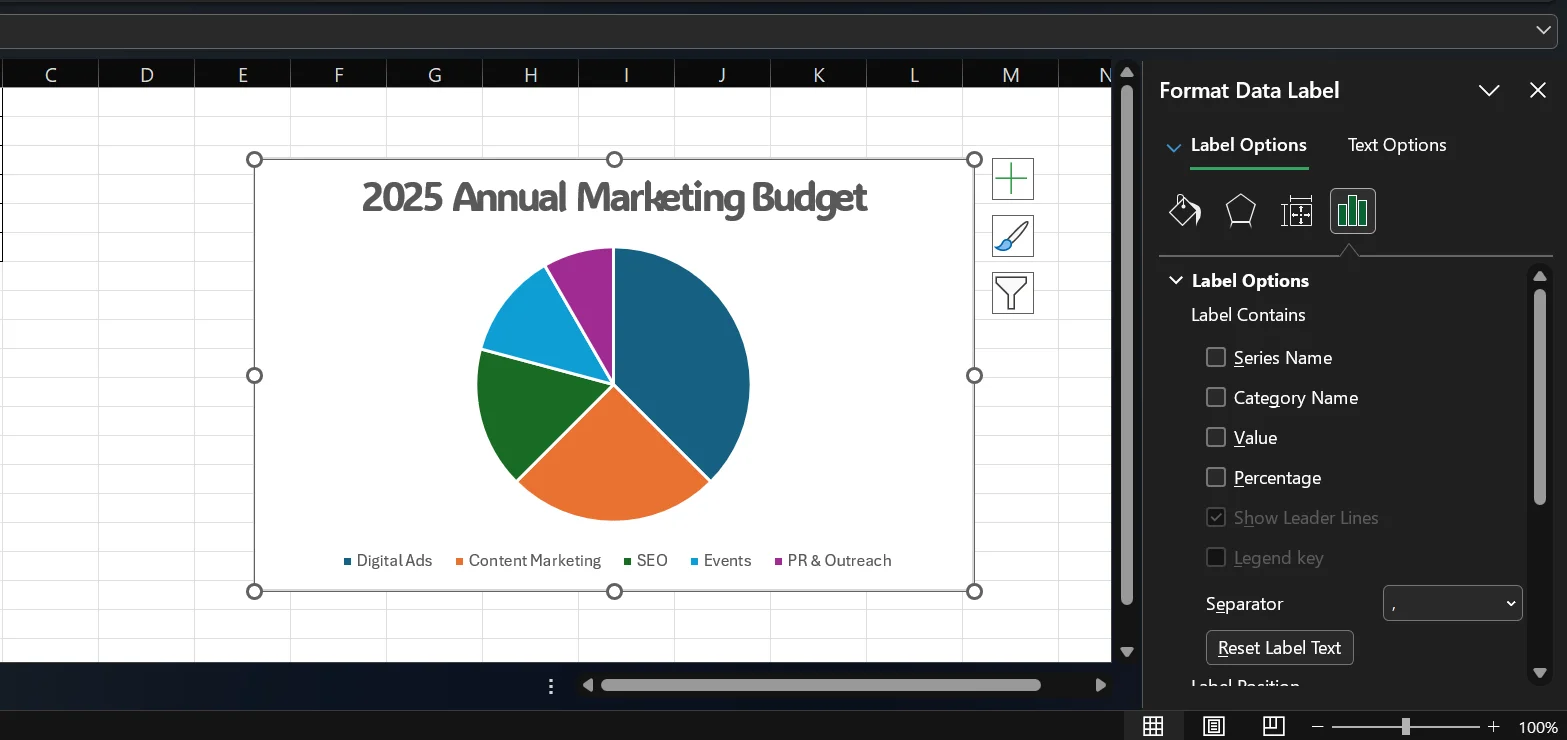
Each slice will now read something like Digital Ads, 37.5% — giving your reader both context and proportion without any extra effort.
To move a label that overlaps another:
Related Article: XLOOKUP() vs. VLOOKUP()
The default Excel colors are fine, but you can match your company brand or presentation theme.
To change one specific slice (for example, the Digital Ads slice):
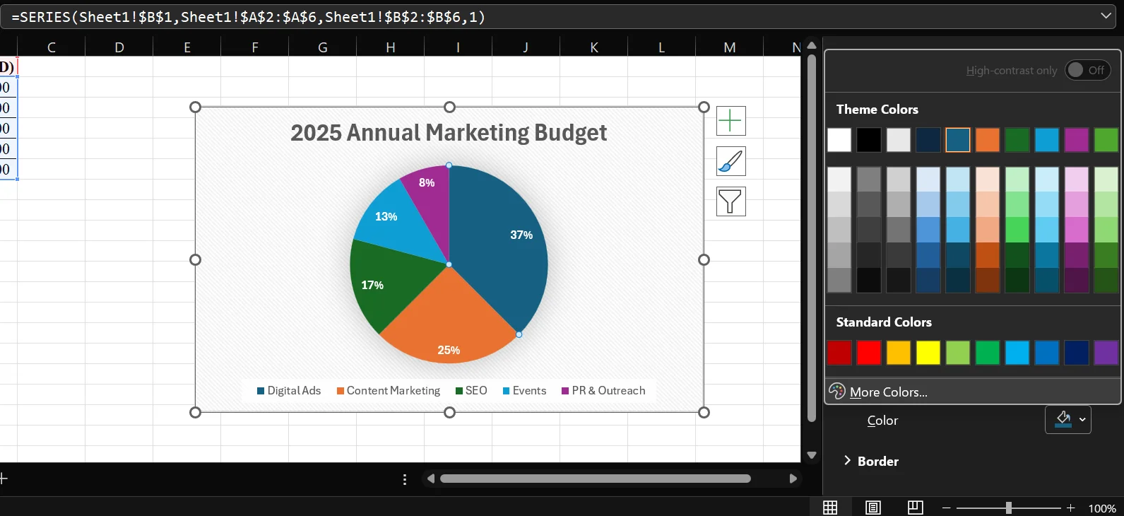
For example, make the Digital Ads slice your company's primary brand color since it is the largest and most important segment in the budget.
To change all colors at once using a theme:
The legend shows which color corresponds to which department. By default, Excel places it at the bottom of the chart.
To move the legend:
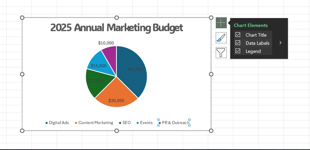
For our marketing budget chart, placing the legend on the Right works well. If your slices already show department name labels, you can remove the legend entirely to reduce visual clutter.
To remove the legend:
Also Read: How to Remove Spaces in Excel?
These options let you handle special scenarios and create more impactful presentations with our marketing budget data.
An exploded pie chart pulls one or more slices away from the center. This is useful when you want to draw attention to a specific department — for example, highlighting that Digital Ads takes 37.5% of the entire budget.
To explode just the Digital Ads slice:
To explode all five slices equally:
Imagine you added three more small items to our marketing budget: Sponsorships ($3,000), Affiliate ($2,500), and Print ($2,000). Those tiny slices would be nearly invisible in the main pie.
A Pie of Pie chart solves this by grouping the small slices into a secondary pie next to the main one.
Excel will automatically move the smallest slices into a secondary pie on the right side.
To control which slices go into the secondary pie:
For our extended data, setting Value to less than $5,000 would automatically move Sponsorships, Affiliate, and Print into the secondary pie
Read Also: Top 10 In-Demand Microsoft Certifications
The steps are identical to Pie of Pie:
The small slices (Sponsorships, Affiliate, Print) will appear in a bar chart on the right side. Many readers find this easier to compare than two circular charts next to each other.
By default, Excel starts the first slice (Digital Ads) at an arbitrary angle. Rotate it so the largest slice starts at the 12 o'clock position for a cleaner, more professional look.
Showing percentages instead of raw dollar values often tells a clearer story. For our marketing budget, "Digital Ads takes 37.5% of the budget" is more immediately meaningful than "Digital Ads gets $45,000."
Your five slices will now show: 37.5%, 25%, 16.67%, 12.5%, 8.33%
If you already have labels on your chart:
Related Article: Pivot Table in Excel
This combination is the most useful for our marketing budget chart. It gives your reader both the context (which department) and the proportion (what percentage) in one label.
Each slice will now read: Digital Ads, 37.5% and Content Marketing, 25% and so on.
Excel defaults to one decimal place (37.5%). To change this:
For a boardroom presentation of our marketing budget, 0 decimal places looks cleanest. For a detailed financial report, 1 decimal place gives more precision.
Even experienced Excel users run into these problems. Here is how to fix each one using our marketing budget chart as an example.
Problem: Your pie chart shows three or four slices instead of five.
Fix:
Problem: Your pie chart shows only one giant slice or looks completely wrong.
Fix:
Your chart will immediately update to show the correct five slices.
Problem: Your chart has a sixth slice, or the legend shows "Budget (USD)" as a department name.
Fix:
Also Read: KPI in Power BI: Key Performance Indicators Dashboards
Problem: Labels for small slices like PR & Outreach (8.33%) and Events (12.5%) are sitting on top of each other because those slices are too narrow.
Fix:
Problem: You changed the Digital Ads budget in cell B2 from 45000 to 50000, but the chart did not change.
Fix:
The chart should now reflect the updated budget.
Problem: The SEO ($20,000) and Events ($15,000) slices are too similar in shade to tell apart at a glance.
Fix:
Follow these rules and your marketing budget pie chart, or any pie chart you ever build, will always look clean, professional, and easy to read.
Our marketing budget has five departments, which is ideal. If you later add 10 more budget line items, do not show all 15 as separate slices. Group anything under 3% of the $120,000 total into one "Other" slice. Use a Pie of Pie chart if you need to preserve the detail of those small categories.
For our chart, Digital Ads is the largest slice. Start it at the top by setting the Angle of First Slice to 0 in Format Data Series. This follows the natural reading direction and helps your audience immediately identify the dominant category.
Do not force your reader to look at the legend and then back at the chart. Show Category Name + Percentage directly on each slice. Your reader should understand what each slice means without looking elsewhere.
The title "Chart 1" says nothing. The title "2025 Annual Marketing Budget by Department" tells the full story. Write a title that answers this question: "What is this chart about?"
In a 3-D view of our budget chart, the Digital Ads slice at the front of the 3-D perspective appears even larger than its actual 37.5%. This can mislead your audience into overestimating how dominant one department is. Stick with 2-D for accuracy.
In our chart, do not place two blue shades next to each other. If Digital Ads is dark blue, make Content Marketing orange or green so the boundary between slices is immediately clear.
Sort your budget data from largest to smallest before inserting the chart. This way, slices appear in a logical descending order starting from 12 o'clock.
To sort: select A1:B6, go to Data > Sort, sort Column B from Largest to Smallest. Digital Ads ($45,000) will move to row 2 and the chart will plot slices in that clean descending order.
Read Also: Excel Certifications
Sometimes a pie chart is not the right tool, even for clean budget data like ours. Here are the best alternatives and when to use each one.
Use a bar chart when the differences between your department budgets are small and hard to see in a pie. If Digital Ads was $22,000 and Content Marketing was $21,000, those two slices would look almost identical in a pie chart. A bar chart makes the $1,000 difference clearly visible.
How to insert: Select A1:B6 > Insert > Bar Chart > Clustered Bar
Use a column chart when you want to present the same marketing budget data in a more traditional report format. Columns feel formal and are standard in financial presentations.
How to insert: Select A1:B6 > Insert > Column Chart > Clustered Column
Use a stacked chart when you want to compare the 2025 marketing budget against the 2024 budget, showing both the total and the department breakdown at the same time.
How to insert: Set up your multi-year data > Insert > Bar Chart > Stacked Bar
If your marketing budget had 15 departments instead of five, a treemap would handle that data far better than a pie chart. Each department gets a rectangle, and larger budgets get larger rectangles. No slices become too thin to read.
How to insert: Select A1:B6 > Insert > Hierarchy Chart > Treemap
Both charts work with our exact same marketing budget data (A1:B6). Here is how they compare.
| Feature | Pie Chart | Doughnut Chart |
|---|---|---|
| Definition | A circular chart divided into slices to show parts of a whole. | A circular chart with a hollow center that also shows parts of a whole. |
| Appearance | Solid circle with slices. | Ring-shaped chart with an empty center. |
| Best Use | Showing simple percentage distribution. | Comparing multiple data series or adding extra information in the center. |
| Data Series Support | Supports only one data series. | Can support multiple data series. |
| Readability | Easier to read with fewer categories. | Can become complex with too many rings or categories. |
| Space for Labels | Limited space inside slices. | Extra center space can hold totals, icons, or labels. |
| Visual Style | Traditional and simple look. | Modern and visually appealing look. |
| Ideal For | Basic reports and quick comparisons. | Dashboards and advanced visual presentations. |
| Example | Market share by brand. | Monthly sales comparison across categories. |
| Limitation | Difficult to compare similar-sized slices. | Multiple rings may confuse viewers if overused. |
Use a pie chart when you want the simplest, most universally understood view of your marketing budget.
Use a doughnut chart when you are building a modern dashboard and want to display the total budget figure ($120,000) prominently in the center.
Read Also: Excel ROUND(): A Quick Guide to Rounding in Excel
Your marketing budget will change throughout the year. New campaigns are approved, budgets reassigned. Here is how to make your pie chart update automatically without rebuilding anything.
Your data is now an Excel Table with a striped style. Now build your pie chart from this table. When you add a new department below the table, the chart will automatically grow to include the new slice.
To add a new department (for example, Podcast with a $5,000 budget):
Your pie chart will immediately update to show a sixth slice for Podcast.
If you prefer not to use a Table:
This method makes your chart more resilient to structural changes in the spreadsheet.
Now when you edit the chart's data source, you can reference Departments and Budgets by name instead of fixed cell addresses. This is especially useful if you restructure your spreadsheet or add new sheets later.
These shortcuts and tips will save you significant time when working with your marketing budget chart or any pie chart in Excel.
| Action | Windows | Mac |
|---|---|---|
| Insert a chart instantly after selecting A1:B6 | Alt + F1 | Fn + Option + F1 |
| Open Format pane for selected chart element | Ctrl + 1 | Cmd + 1 |
| Select the next chart element | Tab | Tab |
| Select the previous chart element | Shift + Tab | Shift + Tab |
| Delete a selected chart element | Delete | Delete |
| Nudge chart position on the worksheet | Arrow keys (chart selected) | Arrow keys |
Related Article: How to Remove Blank Rows in Excel?
You now have a complete, step-by-step understanding of how to build, customize, and manage a pie chart in Excel, using one consistent marketing budget dataset from start to finish.
You started with five rows of raw data totaling $120,000. You built a standard 2-D pie chart, added department labels and percentages, changed colors, rotated the pie, and explored advanced options like Exploded Pie, Pie of Pie, and Doughnut charts. You also learned how to fix six common errors, set your chart up for automatic updates, and work faster with keyboard shortcuts and templates.
The key is always to keep things simple. Use pie charts when the data is proportional, the categories are manageable, and the differences are clearly visible. When the data gets too complex or the categories multiply, a bar chart or column chart will serve you better.
The best pie chart is the one your audience understands immediately. Build it clearly, label it honestly, and let the data speak for itself.
Select your full table including headers (for our example, that is A1:B6), go to Insert > Pie Chart, and choose your chart type. Excel will automatically use your column headers as the series name and your department names as slice labels.
Click your chart, click the + (Chart Elements) button, hover over Data Labels, click More Options, and check the Percentage box while unchecking the Value box. Your slices will then show 37.5%, 25%, 16.67%, and so on instead of raw dollar amounts.
No, a standard pie chart only accepts one data series. If you want to compare the 2024 and 2025 marketing budgets in one chart, use a Doughnut chart with two rings, or create two separate pie charts side by side.
This usually happens when Excel reads your budget values as text instead of numbers. Select cells B2:B6, go to Home > Number format, and change it from Text to Number. Then re-type one of the values (like 45000 in B2) and press Enter to force the conversion.